
SciFi and Fantasy Book Club discussion
GoodReads Authors' Discussion
>
Judging a Book by its Cover
date newest »
 Hugh Howey's original (self-published) cover for Wool, the first in the Silo series, was incredibly cartoonish and gave no indication of the apocalyptic nature of the story. I still have it on my Kindle and had heard about it through word of mouth. Now the book has been traditionally published and been through several cover iterations, though the cover design I'm seeing on Amazon is still very simplistic and not at all consistent with the content/theme.
I think with sci-fi it depends on the sub-genre and the story itself. Is it a space opera with aliens and inter-planetary battles? Then that sort of lends itself to a cover with those images. Is it a story that has a powerful message about human behavior? Then that would require a cover that conveys a sense of the deeply spiritual or mysterious. Is it a horror, or mystery, or survival type story? Again, all have different looks/feels.
But I think your point is also about "bad" covers which is not the same as a cover that doesn't embody the 'feel' of the story. Bad covers are simply that...bad, and they can certainly disguise a good story by the fact that people are less likely to pick it up if the bookjacket synopsis doesn't immediately grab them.
 I personally am a fan of more abstract-y cover art. I like a striking image, and for it to pertain to the story, or have a FEEL for the story in some way, without really reproducing any particular scene or anything. And, generally, the simpler, the better.
 Browsing through my Science-fiction shelf, some of the ones that I have liked are:


 or
or

I do NOT like these kinds of covers:
 Better version:

 Better version:

 Better version:

I think I really just don't like the hand-drawn style. It feels dated and awkward to me, and unless it comes with a very strong recommendation, I generally won't even give them a second look, unless it's to marvel at how bad the cover is. (Sorry.)
Some exceptions to my own rules though - I really like the covers for the Expanse series, which usually depict more action and closer representations of the content than I indicated above. I also really like Paolo Bacigalupi's cover for The Windup Girl:
 It's in a hand-drawn style that generally isn't my jam, but it is intriguingly detailed and I really enjoyed examining it.
 I'm a bit of a cover art geek. I'm drawn to covers giving hints of what I can expect from the book or covers that show some painterly qualities but are not too abstract.
I love the Windup Girl cover art Becky mentioned.
My favorite cover artist is Chris McGrath. I love his style, the moods. I would love to have an original hanging in my house and he makes me want to buy a book based just on the cover art.
https://www.artstation.com/mcgrath
Al wrote: "My favorite cover artist is Chris McGrath. I love his style, the moods. I would love to have an original hanging in my househttps://www.artstation.com/mcgrath"
Oooh, I do like his style!
 Sometimes a publisher's choice of cover art is just plain weird.
Not to point a finger at recent examples: in the 1960s, when Pyramid Books was still in existence, and publishing a lot of science fiction, they changed the cover art on one of E.E. Smith's "Skylark" novels, which was well and good.
But some years later they used the same art, but in different colors, for, I think, Asimov's "Caves of Steel."
Of course, the cover had nothing to do with either book....
At one time, Ballantine Books used a lot of abstract cover art on its science fiction line, which was eye-catching, and gave nothing away, but wasn't to all tastes. When they changed to representational art they sometimes ran into problems, giving wrong impressions about the contents.
The most notable failure was the original covers for their edition of "The Lord of the Rings." It was a rush job, and Barbara Remington didn't have a copy of the books available very long before the deadline, so she used her imagination, a lot. The results were striking, and the covers of the three volumes formed a triptych, which later made a nice poster, but, except for maybe "The Two Towers," they had only the slightest resemblance to the contents, and annoyed the author.
It was done in a hurry, because Ballantine was in competition with an unauthorized edition from Ace Books (long story about confusing US copyright laws).
The Ace editions had nice covers by Jack Gaughan, which showed that he had actually read the book. However, I've seen slides of alternative cover art which Ace rejected, and I think that Gaughan's work on them was even better. The choice may have been made because the art used allowed bold primary covers as the background, so the books stood out on a rack.
 If I don't like the cover, I won't buy the book. For one reason, there will be this thought every time I open it that (I don't like this cover.) :)
 I just bought a book, ebook and paperback, last night, and I remembered it because of the cover. I couldn't stop reading the 'look inside' - seriously could not find a place to stop.
Back when The Wheel of Time books came out, I was a huge fan of the story, but I hated the cover art. I avoid any book with Sweet's cover art on it, and I know that's silly, but the cover art is a visual cue for me, and his visual cues don't resonate with me. I'm sure he has a lot of fans.
 Isn't that funny. I also hated the cover art from Wheels of Time and only ever read the first one (I think).
Thanks guys, some great comments which are giving me a little more food for thought. Reflecting on GR's comments regarding sub-genre and story, my own does feature a little bit of space opera (aliens are involved) but is mostly about human behaviour (a satire on the ravages of psychopathic leadership).
I'd love to show the suggested cover art but not allowed yet.
 I'm also a sucker for good cover art and have a very hard time getting over it if it's not at least a little appealing. Every reading challenge I've done with a "Read a book with an ugly cover" is a struggle for me.
That doesn't mean it has to have a good/attractive cover, mostly it means it can't be ugly.
And I don't necessarily think it has to be representative of the contents either, but should maybe be indicative of genre?
Interestingly, I'm much more forgiving of pre-2000 covers, especially on mass market paperbacks, of which I feel most were, maybe not ugly, but not super appealing.
My favorite cover artist is Victor Mosquera, but he took down the images of all his book covers it seems.


(At least I'm pretty sure the last two Terra Ignota books are all by the same artist)
 Anything that looks like romance or erotica is “not my jam” (I think I’m using that phrase correctly). That’s seeded my mind against realistic paintings or photographs of figures (especially if they look like their skin is coated in oil). If I see Fabio, I’m gone. After joining Goodreads, I see lots of fantasy/horror covers that I assume are supernatural romance/erotica because of photographs exuding hotness, and move on.
Bad art - subjective of course - puts me off. Stylistically, generic looking cover art - like, oh yeah, more of the same - makes me think the book will be too, but I may still read the back and become interested. Sometimes I do want more of the same (ice cream is a perpetual example).
A “Raiders of the Lost Ark” style title just gets an eye roll and a shake of the head - typography is important!
A purely graphic cover, with little or subtle imagery (and decent typography, of course) seems to work best for me - maybe that’s me buying into the idea that the writing is the focus. But I also realize it’s all marketing.
I originally looked at House of Leaves purely because the cover told me it was in color - lol!
 Covers are so important. I think about them a lot. I not infrequently buy international versions of books with really great covers; American publishers so often have bad cover sense. I noticed recently that someone has shelled out to get new art for several Zelazny covers (which they are charging a surprising amount for given the age of the works). Honestly? It's effective. I bought one and might buy a few more, because pretty.


I think you were right to discourage the spaceship; it's overdone in SF. Publishers sometimes think they're telegraphing the story to the correct market when they're really losing the book in a sea of look-a-likes. (Unless it's a really cool spaceship! Or a really beautiful composition, like Doorways in the Sand above.)
Edit: My current cover obsession is non SFF. It's trying to understand why the publishers of Lemon (a murder mystery of a sort) traded this amazing cover:

for this absolutely substandard cover in the US:

There is no understanding some things in life.
Love those Zelazny covers. Doorways in the Sand has just gone to the top of my pile.
 I remember picking up Latro in the Mist because the cover just spoke to me. And really, the character of Latro was a kind of pensive lost soul so the cover really fit.
 Al wrote: "Back when The Wheel of Time books came out, I was a huge fan of the story, but I hated the cover art. I avoid any book with Sweet's cover art on it, and I know that's silly, but the cover art is a ..."
I enjoyed the stories when they came out, but also hated the cover art. I can get past cover art, but do enjoy seeing marvellous covers.
This cover of Dragonquest by Anne McCaffrey is one of the worst I've seen:
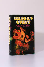
 It is a truly dreadful cover but if you have a copy it is worth a little money! I think it is the first edition.
 I think this thread makes it clear that readers do, to some extent, judge a book by its cover. A good cover provides some idea of what the reader will find in the story, and it catches the eye. As some of the comments illustrate, a cover may make it clear that the book contains steamy romance; this will attract people who want this type of story and alert people who don't that they shouldn't spend their money.
This even more important for authors who are not "household names". Anne McCaffrey can survive a bad cover; others will not. For an indie, the cover is maybe the first (and last) chance to interest the reader. Since we are in the Authors' Discussion section, I think it is okay to share some of my own experience. (If not, please accept my apology and the mods can delete.) A couple of years ago, I planned some advertising for two books. The first thing the marketing person told me was to change the covers. I had new ones done and, in fact, I saw an uptick even before the ads. For the new book, the artist questioned me about the type of armor the protagonist was wearing and the swords she was holding. The result, I think, is visually appealing and conveys some of the story.
 Princess of Shadows: The Girl Who Would Be King. I do think the cover is very important.
Best, Colin
Amy (Other Amy) wrote: "Edit: My current cover obsession is non SFF. It's trying to understand why the publishers of Lemon (a murder mystery of a sort) traded this amazing cover:
for this absolutely substandard cover in the US:

There is no understanding some things in life."
*cough* I prefer the US cover. I like the simplicity, and the lack of anything specifying what it's about would make me curious, so I would pick it up. The less I know (or think I know) about a book going in, the better I like it. Including cover art.
Becky wrote: "*cough* I prefer the US cover. I like the simplicity, and the lack of anything specifying what it's about would make me curious, so I would pick it up. The less I know (or think I know) about a book going in, the better I like it. Including cover art."Ah, to each their own then. I would never have read it or even bought it without the international cover. The US cover is boring and offers me nothing to make me curious at all.
 I was going to stay out of this since I'm not a writer... but I am a reader and have some marketing background so...
 The cover is a sales tool. Ideally, it attracts people who are likely to want what the book offers. Putting spaceships and battles on a cover for a book that's an intimate study of the meaning of identity likely isn't going to work well. The cover should get people to notice a book and pick it up. Then the back cover copy should reinforce the message the cover sends. If the reader flips the book open and reads a few pages, those should further reinforce the cover and back copy.
BUT... the cover isn't for you authors. While it's nice if you like the cover, ask yourselves this... would you rather have a cover you don't like but which causes a lot more sales or one which you really like?
If you don't like a cover, don't get in a battle with the publisher over likes and dislikes... press them on whether they know that this kind of cover will increase sales. If so, how do they know that? If you're indie, go look at similar books in your country (what people like in the US may not work as well in other markets). Some publishers, though, seem to have a collection of fairly stock covers and use those for new/smaller authors.
Covers like McCaffrey's are likely a product of the era as much as anything, but some publishers just have incredibly poor taste on occasion. Witness the US cover to Charlie Stross' Saturn's Children a book I actively avoided even though I like his stuff:
 Amy (Other Amy) wrote: "Becky wrote: "*cough* I prefer the US cover. I like the simplicity, and the lack of anything specifying what it's about would make me curious, so I would pick it up. The less I know (or think I kno..."
The color… well, let’s say I’d want a lead suit before I handled the book. The layout is interesting, but the typography suggests something like cheesy teen angst to me.
I would want to like a cover for any book I wrote - but if it was part of what put my food on the table, deference to marketing experts would be my way.
Amy (Other Amy) wrote: "Ah, to each their own then. I would never have read it or even bought it without the international cover. The US cover is boring and offers me nothing to make me curious at all."Yeah, it's not interesting, but that's what I kind of like about it. The color snags my attention, and the lack of anything else makes me curious. But I'm probably in the (far) minority for liking plain jane covers.
Ian mentioned the Lord of the Rings books before, and I specifically bought a new set plus the Silmarillion because they were graphically minimalist and I loved them.
Daniel wrote: "The color… well, let’s say I’d want a lead suit before I handled the book. The layout is interesting, but the typography suggests something like cheesy teen angst to me."LOL!
Oddly, the dress cover feels more that way to me.
It's so interesting how we all react differently to different covers. I guess it's a good thing that there are so many different variations out there. Something for everyone.
Now if they would just make it so that I can get and keep the cover I want on the books on my GR shelves, I would be happy. >_<
Art is subjective. I love the cover of Wheel of Time. :)Favorite colors, blue & orange; a woman on the cover who did not need rescuing. And horses. I love, love, love horses. Night time! I could see what they were doing, what they were about. From there, the prologue. I was hooked.
When I heard Jordan would be signing and of course selling Book 6, I took all the others with me - and he signed and inscribed them. That's amazing. I wasn't the only one with an armload of books. Who does that anymore? At a bookstore, not convention. So many people in line.
I happily still have my signed copy.
 M.L. wrote: " Who does that anymore? At a bookstore, not convention. So many people in line."
Brandon Sanderson does - at least as far as the last of his events that I attended, which was a few years back. But that's how I got all of his signed. I practically had to wheelbarrow them in, but he signed every single one anyone brought or bought and put in front of him.
Rick wrote: "I was going to stay out of this since I'm not a writer... but I am a reader and have some marketing background so... The cover is a sales tool. Ideally, it attracts people who are likely to want ..."
I absolutely agree with this and would always defer to the publisher in the end (as I think I said in the OP). They are the ones who ought to have the best idea as to how to reach the market etc.
BUT as Amy said, a spaceship for its own sake causes the book to vanish in a sea of other spaceships. Something else visually striking - clearly suggestive of sci-fi - sets the book apart.
That's the way I see it, and a comparatively obscure writer needs to be distinguished from the rest somehow. The cover is probably your best chance for that.
Phrynne wrote: "It is a truly dreadful cover but if you have a copy it is worth a little money! I think it is the first edition."It was the one in our library when I was a teenager. I wonder if they still have it!
Personally, I like that a cover reflects the kind of book/story it advertises to the potential reader. If you wrote a Space opera with lots of Space battles, then go ahead and show a Space battle scene or some kind of heroic Space image, but be imaginative and creative. Don't simply replicate some stock image without modifications. One thing I dislike is the use of 'sexy' covers when you didn't write a romance or erotica book. I know that sex sells (supposedly) but do you really need to show some young, half-naked woman in a caricature of a spacesuit to illustrate your sci-fi novel, or a woman in 'bikini armor' as a cover for a medieval/history action story? The cover should reflect what the book is all about, while being attractive and innovative. I find that old historical pictures that accords well with the book theme normally work very well.
 To me, I want the cover to reflect the story. If there's a spaceship it better feature in the story!
But it's hard to say what qualities attract me to book covers.
Some from GR lists that would make me pick up a book because of the artwork:


Some I really hate:


I really love the more colorful Fantasy covers:


And I like the ones with colorful images over a dark background like:

 Now I'm biting my fingernails. Last month I released my 3rd Sci-Fi book, Meteor Shooters at Relay Station #4163. One of the thoughts I brought up in the book is the Milky Way galactical plane. All Sci-Fi shows depict space travel as going through a sky with evenly space, sparse stars. Yet, most of them are in our galaxy. Anyone that's been out away from a city knows the darker the sky, the brighter the Milky Way is. If you are outside a solar system, it must be brilliant. So, in my book I describe what it looks like, and it's used for navigation.
 I want my cover to be a picture of the Milky Way. I've bought new camera equipment, I've been studying astrophotography, but I live in Montana and everything is covered in snow. So, I need to wait until late spring or summer to get the shot I want. I didn't want to hold up the book release, so I drew up a sketch of what I hope to later photograph. It looks a little bit like 80s special effects, but I figured it's just a temporary cover until I get the shot I want. Now, I'm worried that's why I don't have any sales.
 C.E.,
C.E.,Self-published books are always going to have a hard time finding an audience. After looking at the cover, it's more the text than the picture that looks like it needs refreshing. If you can do anything to make the lettering look more like graphic design and less like something in the Word drop-down menu next to Arial, then it will look a bit more appealing. That's just my two cents.
C.E. wrote: "Now I'm biting my fingernails. Last month I released my 3rd Sci-Fi book, Meteor Shooters at Relay Station #4163. One of the thoughts I brought up in the book is the Milky Way galactical plane. All ..."It could do with some spicing up!
The image falls into my category of “subtle” - it definitely reads as the Milky Way, but it’s not an eye catcher. If the image doesn’t make an impact, it’s often down to the typography, which doesn’t entice me either. It reads (visually) like an internal tech report or something; lack of color only adds to that effect.
AI programs generate some beautiful conceptual art which you can use for free. I’ve toyed a little with “wombo.art”, but the best I’ve seen is from “Disco Diffusion”. I haven’t even tried the tutorials - it takes a little more effort to get into and other folks have been doing a fine job exploring its potential.
Brandon wrote: "C.E.,Self-published books are always going to have a hard time finding an audience. After looking at the cover, it's more the text than the picture that looks like it needs refreshing. If you can..."
Yep, the text definitely looks amateurish (for want of a better word, sorry).
They do say that if you want attention for your self-pubbed book that you should be paying professional rates for a professional looking cover. That might mean paying out money that you'll never recoup from sales but at least you're more likely to find readers.
Readers who might be prepared to pay for your next book (and tell others).
It usually takes a few books before any sort of writing career starts to take off.
C.E. wrote: "Now I'm biting my fingernails. Last month I released my 3rd Sci-Fi book, Meteor Shooters at Relay Station #4163. One of the thoughts I brought up in the book is the Milky Way galactical plane. All ..."Hi C. E.,
In thumbnail the picture disappears. The book needs a compelling cover, something of interest. I love night sky but this one doesn't translate.
As already stated, it's a challenge for SPAs to stand out, but the cover is the first marketing tool. Also, promotion helps and helps most with a price of .99. Lots of folks go the free route for a short promo but again you need that cover.
I did a 'look inside' and it's an interesting lead into the story. Before reading more, I read the blurb for an idea of where the story was going. The blurb gave me some information, but it needs more in terms of what are the stakes, what's at risk.
Hope that helps. Good luck!
Thank you all for the feedback. I've struggled with the text. A lot. I needed to be reminded not to settle and to keep looking for the right thing.

SciFi and Fantasy Book Club
Books mentioned in this topic
Meteor Shooters: at Relay Station #4163 (other topics)Dark Matter (other topics)
The Fifth Season (other topics)
Spin (other topics)
Pushing Ice (other topics)
More...

I guess it's interesting that passionately artistic people can have such different ideas as to what best represents a story visually/semiotically. I wanted something visually striking but not too precisely representative in terms of story content, whereas the publisher is insisting on a spaceship on the cover.
The publisher will always win the debate in the end (it's their money) but at least I've been heard and what I wanted will be incorporated.
But it got me thinking about covers - the importance (or not) of close representation of content versus striking images which take a tangential view as to content. Reflecting on many of my favourite sci-fi covers, it seems that the best don't necessarily relate in any way to the story content - although a spaceship always screams sci-fi.
For example, I love the cover to Consider Phlebas even though it has bugger all to do with the story (and I think it's a terribly boring book). Consider Phlebas Most of the Dune sequels (IMO) were pretty bad but their covers were amazing.
By the same token, any number of brilliant sci-fi books have had terrible covers.
What do others think? Which sci-fi covers are good/bad? Are any so good that they insist on being plucked off the shelf.
As for bad, the first book I ever DNF had an appalling cover (it looked like an alien in a diving mask and snorkel dancing on a beach). I had grave suspicions about the book which were quickly confirmed.