
Art Club discussion
Your Artwork / Feedback
>
Stevie's S.M.F.A.H. art (high five if you get the referance)
date newest »
 Mod
Mod
SO AWESOME :DDDD
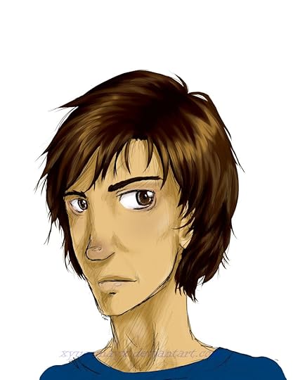
I really like your one of Isabelle from MI.
 Mod
Mod
Mod
Mod
No problem! We give praise where it's due. :)
 Mod
Mod
 Talia wrote: "I don't get the reference D:"
It's from A Very Potter Musical. Super mega foxy awesome hot. HARRY POTTER NERD FOREVER! :) now you're even more awesome than your already were because you know what smfah means, yay!
Mod
Mod
It's from A Very Potter Musical. Super mega foxy awesome hot. HARRY POTTER NERD FOREVER! :) now you're even more awesome than your already were because ..."
Oh wow. I didn't realize that's what it stood for :P PIGFARTS FTW.
Mod
pigfarts pigfarts here I come, pigfarts pigfarts yum yum yum

This is my fan art for mortal instruments that Laura liked.
this is Connor from Unwind by Neal Shusterman. I love this book!
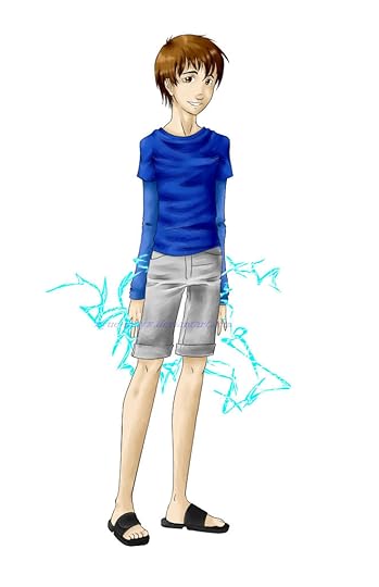
This is just a guy with electric/lightning powers.
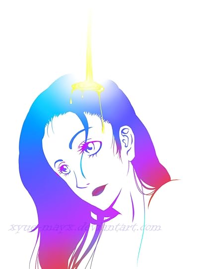
I was going for a baptism like theme here.

This is a girl with magic powers that channel through her hands.

This is just another picture of a girl.
I used graphite pencils for the pencil sketches and Paint Tool SAI for the colored works.
Mod
Jia wrote: "My favourite of the six is the girl with the magical hand powers. The folds on the clothing are really nice and she just has this real natural expression on her face. But a bit critique here, I fee..."Thanks for the compliment and critique! I'm not well known on DA so not many people see my art so I don't really get critiques and most of my friends just think I'm really good so no critiques there either.
Mod
Mod
Good things: I like the way you draw hair in general, kind of long and flowy. Try to experiment with curly hair too :) The clothing's great, you know where the folds go, and it just fits on the person. Colors and lighting on that baptist picture are well done.
Critique: Like Jia said, some parts of the clothing are over-emphasized on the girl with magic powers. Also, on the headshots, observe the way a head looks from a 3/4ths point of view (it's a challenging perspective, so look at a reference) it's a little different from what you have, but I'm sure you'll improve if you keep practicing. It's all about practice. The pose on the guy with electric lighting hands is unnatural, try changing his hand or leg position so that he is doing something (i.e. walking or channeling powers via hands) On your second picture, you did one solid color for the skin. Now, skin varies greatly depending on the lighting (here's a good example: http://fc07.deviantart.net/fs71/f/201... by alicexz on deviantART. Notice how Katniss has shades of gray, blue, orange, red, yellow, etc. on her skin? It's very subtle but it creates that atmosphere and realism.)
So that's pretty much it, I can't think of anything else at the moment. :) I've said this before to many people after writing my lengthy critiques: don't take this badly, I'm not saying it's terrible, I'm giving you points to improve on or fix. I like your pictures, they are creative. Keep drawing, cuz that's what we're all here for ;)
I really want some opinions on this piece because I'm really proud of it. I went for a semi-realistic approach but you can still see the manga influences in the anatomy, especially the eyes. I tried something different from what I usually do so please comment and critique!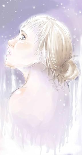
Here's the like to it on my DA account: http://xyue-mayx.deviantart.com/art/A...
 Mod
Mod
:-)
 Really good job! I love the colors and the mood of the painting ^^


Link to my photobucket account: http://s824.photobucket.com/profile/R...
Art Samples:
The two actual drawings are old.