Ted Petrou's Blog
December 1, 2022
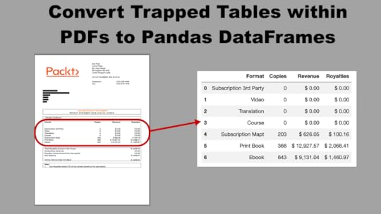
Convert Trapped Tables within PDFs to Pandas DataFrames
Pandas is the most popular Python data analysis library available today and can read in data directly from a wide variety of sources, including CSVs, Excel Workbooks, JSON files, SQL databases, parquet files, and even from your clipboard. Currently, there is no direct method using pandas to read in data trapped within a PDF file. Thankfully, the tabula-py library is available to read in these tables within a PDF as pandas DataFrames.
The tabula-py library itself is a wrapper around tabula-java, a command line tool for extracting trapped data within a PDF. Get started by installing it with pip install tabula-py.
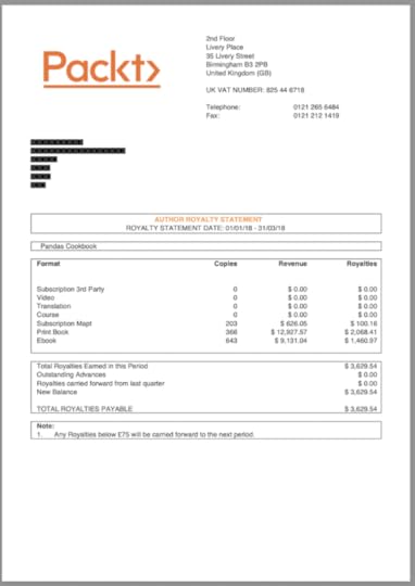
Sample PDF — Book SalesFor this tutorial, we will extract a single table within the royalty statement from Pandas Cookbook, a book I published in 2017. An image of the PDF is displayed below.
 Automatic table detection
Tabula-py automatically detects all tables on the pages provided with its read_pdf function. All we have to do is provide it the file path of the PDF document and the pages to extract. The returned result is a list of DataFrames, stored here as the variable dfs.
import pandas as pdimport tabula
dfs = tabula.read_pdf('2018Q1.pdf', pages=1)
len(dfs)1
Tabula has detected a single table. Let’s output the DataFrame to see how well the extraction worked.
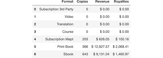
df = dfs[0]df
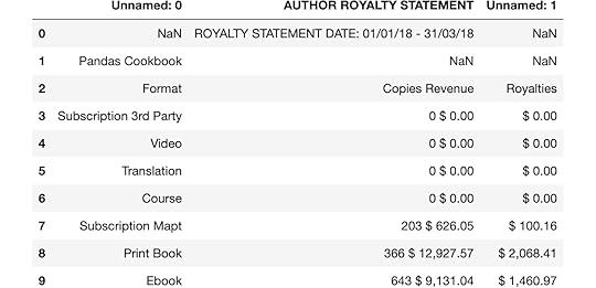
For this PDF, I wanted to extract the table beginning in the middle box with the four columns Format, Copies, Revenue, Royalties. Instead, Tabula extracted the two boxes above this and returned a three-column table combining Copies and Revenue. While the result isn’t bad, it’s not usable in the current form. We could use pandas at this point to clean up the data, but tabula-py provides us parameters to define the boundary of the entire table itself and the positioning of the columns.
The relative_area and relative_columns parameters are set to True which allows us to provide boundaries to both the area and columns parameters as a percentage of the page, as opposed to point coordinates. In my opinion, it is easier to define a boundary using relative page percentage.
The area column is passed a four-item list of top, left, bottom, and right. These represent the boundaries of the table relative to the page. The three-item list for columns represent the vertical lines separating the four columns. Let's re-read in the data and output the resulting DataFrame.
dfs = tabula.read_pdf('2018Q1.pdf', pages=1,relative_area=True,
relative_columns=True,
area=[42, 0, 60, 100],
columns= [45, 65, 82])
df = dfs[0]
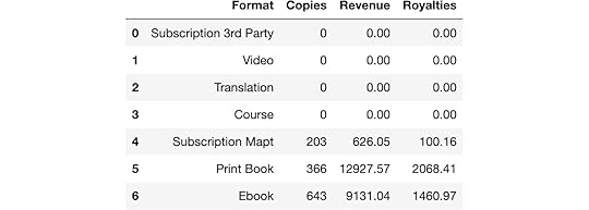
df
 Convert to numeric
This extraction looks much better and almost exactly what we want. Let’s check the data types of each column to understand which ones need more processing.
df.dtypesFormat objectCopies int64
Revenue object
Royalties object
dtype: object
Conveniently, the Copies column was successfully converted to an integer. The Revenue and Royalties columns were read in as strings. We’ll now have to turn to pandas to convert these columns to floats. We do so by replacing any dollar signs, commas, and spaces with empty spaces using a regular expression.
df[['Revenue', 'Royalties']] = (df[['Revenue', 'Royalties']].replace('[$, ]', '', regex=True)
.astype('float64'))
df
 Summary
In this tutorial, we passed custom inputs into tabula-py’s read_pdf function to extract a table trapped within a PDF as a pandas DataFrame. We then cleaned up the result with pandas ability to replace characters using a regular expression. Several more options are available to tabula-py to customize the extraction process.
Master Data Analysis with PythonIf you enjoyed this lesson and are looking to become an expert with Pandas, then check out my book, Master Data Analysis with Python. It is the most comprehensive Pandas book available, and comes with video lessons, 500+ exercises with solutions, and certification exams.
[image error]Convert Trapped Tables within PDFs to Pandas DataFrames was originally published in Dunder Data on Medium, where people are continuing the conversation by highlighting and responding to this story.


October 24, 2022
Use the Pandas String-Only get_dummies Method to Instantly Restructure your Data
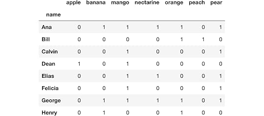
In this post, you’ll learn how to use the fantastic str.get_dummies Pandas Series method to instantly restructure trapped data within a string. We begin by reading in a small sample dataset containing people's favorite fruits.
import pandas as pddf = pd.read_csv('data/fruits.csv')
df
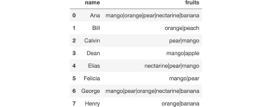
Notice that the fruit column has multiple fruit names in each cell separated by a pipe character. While this format compactly represents the data, it isn’t the most suitable for answering basic questions such as:
What is the number of fruit per person?How many people enjoy banana?Which people enjoy both oranges and bananas?How any fruits are in-common with each person?Attempt to answer questions in current formIt’s possible to answer these questions in the current format using Pandas, though, we will see how these ways are sub-optimal. Here we find the number of fruit per person by adding one to the count of the pipe characters.
s = df.set_index('name')['fruits']s.str.count(r'\|') + 1name
Ana 5
Bill 2
Calvin 2
Dean 2
Elias 3
Felicia 2
George 5
Henry 2
Name: fruits, dtype: int64
The number of people who enjoy banana.
s.str.contains('banana').sum()3The people that enjoy both oranges and banana.
s.str.contains('(?=.*orange)(?=.*banana)')nameAna True
Bill False
Calvin False
Dean False
Elias False
Felicia False
George True
Henry True
Name: fruits, dtype: bool
Finding the number of fruits in-common with both people is particularly difficult and is a clear case for reformatting the data.
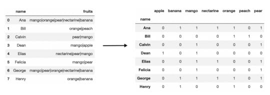
Better formatting of the dataAll of these questions can be bettered answered if the data is in a different format. The get_dummies string-only method will split all values in a single cell into their own columns creating 0/1 indicator variables. Here, we pass in the pipe character to get_dummies, producing the following DataFrame.
df1 = s.str.get_dummies('|')df1
We can now answer the same questions as before. Here, we count the number of fruit for each person.
df1.sum(axis=1)nameAna 5
Bill 2
Calvin 2
Dean 2
Elias 3
Felicia 2
George 5
Henry 2
dtype: int64
We sum up a single column to count the total number of people who enjoy bananas.
df1['banana'].sum()3Here, we use the query method to select each person who likes both oranges and bananas.
df1.query('orange + banana == 2')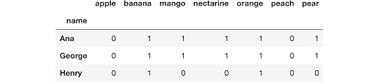
Finding the number of fruits in-common with each person is where the largest gain from restructuring comes from. Here, we use the matrix multiplication operator to multiply the DataFrame to itself.
df1 @ df1.T Master Data Analysis with Python
If you enjoyed this tip and area looking to become an expert with Pandas, then check out my extremely comprehensive book, Master Data Analysis with Python. It is the most comprehensive Pandas book available, comes with 500+ exercises, video tutorials, and certification exams.
[image error]Use the Pandas String-Only get_dummies Method to Instantly Restructure your Data was originally published in Dunder Data on Medium, where people are continuing the conversation by highlighting and responding to this story.
October 5, 2022
Use this One Line of Code to Create Beautiful Data Visualizations in Python
In this post, you’ll learn the absolute quickest path to create beautiful data visualizations in Python. Specifically, we will be issuing a command from Seaborn, a popular library for creating static two-dimensional plots. We begin by reading in some data from Airbnb listings in Washington D.C.
import pandas as pddf = pd.read_csv('../../data/airbnb.csv',
usecols=['neighborhood', 'accommodates', 'price'])
df.head()
 Create the default box plot
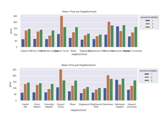
Here, we will use Seaborn to create a box plot of prices by neighborhood splitting by the number of persons the space accommodates.
import seaborn as snssns.boxplot(x='neighborhood', y='price', hue='accommodates',
data=df);
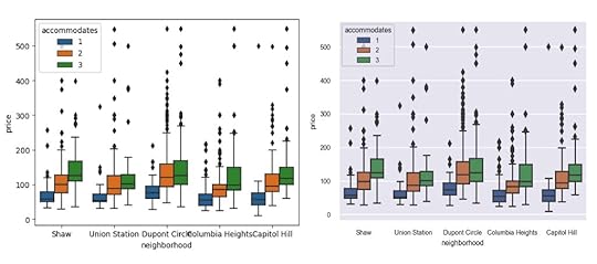
 The set_theme function
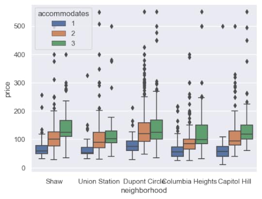
While the default plot settings are not bad, they can be improved upon using a single command and that is with the set_theme function in Seaborn. By default, it will use the darkgrid style along with the deep color palette.
sns.set_theme()After running this command, the same plot will appear substantially different.
sns.boxplot(x='neighborhood', y='price', hue='accommodates',data=df);
 Customizing matplotlib run configuration settings
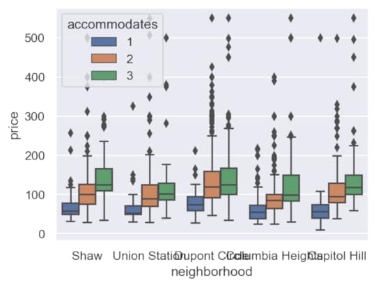
You may call the set_theme function without arguments, but I suggest increasing the DPI (dots per square inch) and reducing the font scale. The default DPI is 100 for matplotlib (the library Seaborn uses for all of its plotting), which is a lower resolution than most modern monitors and is the reason why the default image size (6.4 inches by 4.8 inches) does not match the actual screen inches on your monitor.
Any plot settings (formally, the matplotlib run configuration parameters) are able to changed with the rc parameter. Here, the DPI is increased to 150 and the default figure size decreased.
sns.set_theme(rc={'figure.dpi': 150, 'figure.figsize': (5, 3.75)})sns.boxplot(x='neighborhood', y='price', hue='accommodates',
data=df);
 Scaling the font
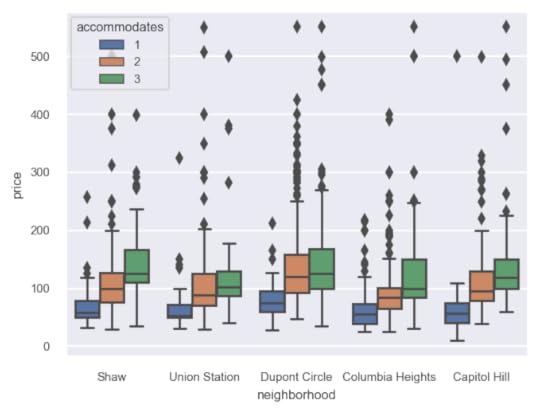
While the image is sharper and larger, the text is clearly too big. The set_theme function provides a font_scale parameter to decrease the relative size of the text in the image. Here we set it to 0.65.
sns.set_theme(rc={'figure.dpi': 150, 'figure.figsize': (5, 3.75)},font_scale=0.65)
sns.boxplot(x='neighborhood', y='price', hue='accommodates',
data=df);
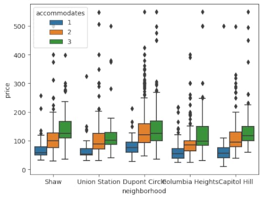
 Choosing other styles and color palettes
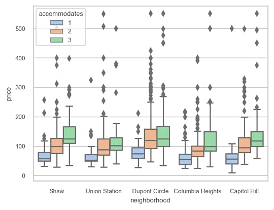
There are several built-in styles (white, dark, whitegrid, darkgrid, ticks) as well as color palettes (deep, muted, bright, pastel, dark, colorblind) available as well. Here, we choose the whitegrid style paired with the pastel color palette.
sns.set_theme(style='whitegrid',palette='pastel',
rc={'figure.dpi': 150, 'figure.figsize': (5, 3.75)},
font_scale=0.65)
sns.boxplot(x='neighborhood', y='price', hue='accommodates',
data=df);
 Summary
In summary, use the set_theme function in Seaborn to easily choose a style, color palette, customize the matplotlib run configuration settings and to scale the font.
Master Python, Data Science and Machine LearningImmerse yourself in my comprehensive path for mastering data science and machine learning with Python. Purchase the All Access Pass to get lifetime access to all current and future courses. Some of the courses it contains:
Master the Fundamentals of Python — A comprehensive introduction to Python (300+ pages, 150+ exercises, 25 hours of video)Master Data Analysis with Python — The most comprehensive course available to learn pandas. (800+ pages and 500+ exercises, 10 hours of video) Master Machine Learning with Python — A deep dive into doing machine learning with scikit-learn constantly updated to showcase the latest and greatest tools. (300+ pages)[image error]Use this One Line of Code to Create Beautiful Data Visualizations in Python was originally published in Dunder Data on Medium, where people are continuing the conversation by highlighting and responding to this story.
June 24, 2022
Awesome Pandas Tricks — Advent of Code Problems 1–5
 Awesome Pandas Tricks — Advent of Code Problems 1–5
I have a new tutorial where I show interesting, unusual and just plain awesome ways to use the pandas library to solve data problems. Pandas is such a versatile library with so many ways to solve so many different problems.
The Advent of Code is a series of 25 fun problems released every December 1st, each containing some kind of data that require some sort of computing power to solve. While pandas is probably not the goto choice for these challenges, it is absolutely has the ability to solve these problems and often quite impressively. Many of these challenges require advanced and unusual usages of the pandas library, which is why I chose them for this tutorial. Hope you enjoy the tricks.
All of the material is located here on GitHub with the video below covering a detailed presentation of all of the tricks used to solve the problems.
https://medium.com/media/0c6bcebe174bb566b0b3c89bb0e61e4c/href[image error]Awesome Pandas Tricks — Advent of Code Problems 1–5 was originally published in Dunder Data on Medium, where people are continuing the conversation by highlighting and responding to this story.
June 21, 2022
How to become an Expert at Pandas for Data Analysis for FREE

In 2014, I was first introduced to pandas and had no idea how to use it. By 2017, I had written the 500 page book Pandas Cookbook. This is…
December 15, 2021
December 13, 2021

December 10, 2021
Build an Interactive Data Analytics Dashboard with Python — A Comprehensive Course
I’m excited to announce the launch of Build an Interactive Data Analytics Dashboard with Python, a comprehensive course that teaches you every step to launch your very own dashboards with Python.
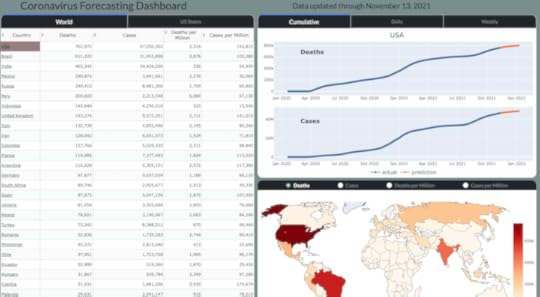
Specifically, you will be building a Coronavirus Forecasting Dashboard (available at https://coronavirus-project.dunderdata.com/) that shows historical and predicted values for deaths and cases for all countries in the world and US states from the ongoing coronavirus pandemic. The final product will be a live dashboard, automatically updated daily, hosted on a remote server for anyone, anywhere in the world to see!
You will learn and complete the entire process for building the dashboard including the following topics:
Getting, Cleaning, and Transforming the Data — You will learn how to collect the data, find and clean bad data, and transform it so that it can be used for building models capable of prediction.Data Smoothing — You will learn several different techniques such as LOWESS to smooth the jagged raw data so that the model can better detect trends.Exponential Growth and Decline Models — You will begin modeling coronavirus cases for each area of the world with these simple models that can capture a single exponential growth or decline phase, but not both.Logistic Growth Models — You will learn about a separate class of “S-Curve” models capable of capturing both exponential growth and decline in the same model.Modeling New Waves — Coronavirus cases appear in waves over different time periods. You will learn how to change your model so that it can detect any number of new waves in the future.Encapsulation into Classes — After selecting your model, you will encapsulate all of the code together into Python classes, eventually to be used in your final production code.Visualizations with Plotly — You will learn how to use the Plotly Python library to create interactive data visualizations targeted for the webHTML and CSS — You are building a web application and will learn the fundamentals of HTML and CSS to help add customization with the help of Dash.Building the Dashboard with Dash — You will learn how to build all of the components and interactivity of the dashboard with the Dash Python library.Deployment — One of the most exciting parts of a project is deploying it on your own server for the world to see. You will learn two different deployment options — one simple and the other more complex, but with more flexibility.What’s Included?This course comes with a massive amount of material including:
13 Jupyter Notebooks26 Exercises with detailed solutions200 page PDF of the entire course contentAll production code for the dashboard12 hours of video tutorialsStart building the dashboard today!I believe this is a really fun and exciting course that covers a wide range of topics and provides you with all the tools to launch your own dashboard, on your own server for the world to see. Purchase the course on Udemy to get a steep discount to start building the dashboard today.
[image error]Build an Interactive Data Analytics Dashboard with Python — A Comprehensive Course was originally published in Dunder Data on Medium, where people are continuing the conversation by highlighting and responding to this story.
December 9, 2021
Why Matplotlib Figure Inches Don’t Match Your Screen Inches and How to Fix it
If you’ve worked with the matplotlib data visualization library before, then you’ll be familiar with the term figsize, which is measured…