Use this One Line of Code to Create Beautiful Data Visualizations in Python
In this post, you’ll learn the absolute quickest path to create beautiful data visualizations in Python. Specifically, we will be issuing a command from Seaborn, a popular library for creating static two-dimensional plots. We begin by reading in some data from Airbnb listings in Washington D.C.
import pandas as pddf = pd.read_csv('../../data/airbnb.csv',
usecols=['neighborhood', 'accommodates', 'price'])
df.head()
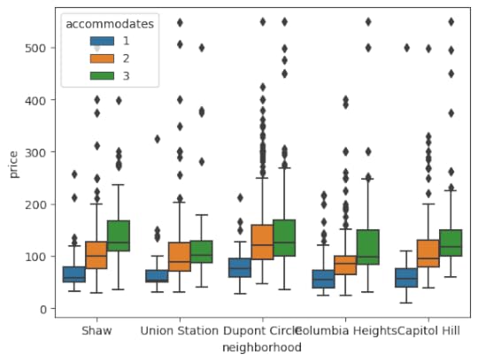
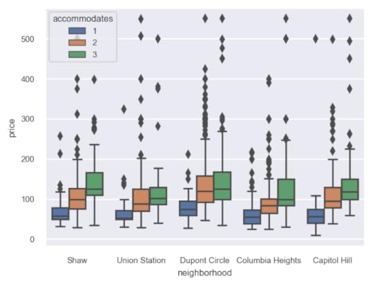
 Create the default box plot
Here, we will use Seaborn to create a box plot of prices by neighborhood splitting by the number of persons the space accommodates.
import seaborn as snssns.boxplot(x='neighborhood', y='price', hue='accommodates',
data=df);
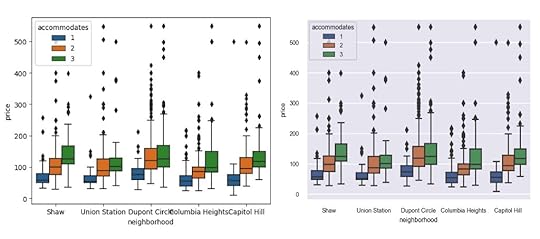
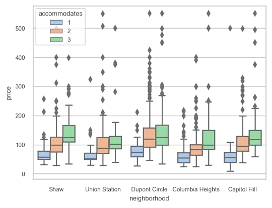
 The set_theme function
While the default plot settings are not bad, they can be improved upon using a single command and that is with the set_theme function in Seaborn. By default, it will use the darkgrid style along with the deep color palette.
sns.set_theme()After running this command, the same plot will appear substantially different.
sns.boxplot(x='neighborhood', y='price', hue='accommodates',data=df);
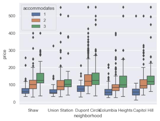 Customizing matplotlib run configuration settings
You may call the set_theme function without arguments, but I suggest increasing the DPI (dots per square inch) and reducing the font scale. The default DPI is 100 for matplotlib (the library Seaborn uses for all of its plotting), which is a lower resolution than most modern monitors and is the reason why the default image size (6.4 inches by 4.8 inches) does not match the actual screen inches on your monitor.
Any plot settings (formally, the matplotlib run configuration parameters) are able to changed with the rc parameter. Here, the DPI is increased to 150 and the default figure size decreased.
sns.set_theme(rc={'figure.dpi': 150, 'figure.figsize': (5, 3.75)})sns.boxplot(x='neighborhood', y='price', hue='accommodates',
data=df);
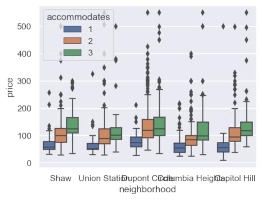 Scaling the font
While the image is sharper and larger, the text is clearly too big. The set_theme function provides a font_scale parameter to decrease the relative size of the text in the image. Here we set it to 0.65.
sns.set_theme(rc={'figure.dpi': 150, 'figure.figsize': (5, 3.75)},font_scale=0.65)
sns.boxplot(x='neighborhood', y='price', hue='accommodates',
data=df);
 Choosing other styles and color palettes
There are several built-in styles (white, dark, whitegrid, darkgrid, ticks) as well as color palettes (deep, muted, bright, pastel, dark, colorblind) available as well. Here, we choose the whitegrid style paired with the pastel color palette.
sns.set_theme(style='whitegrid',palette='pastel',
rc={'figure.dpi': 150, 'figure.figsize': (5, 3.75)},
font_scale=0.65)
sns.boxplot(x='neighborhood', y='price', hue='accommodates',
data=df);
 Summary
In summary, use the set_theme function in Seaborn to easily choose a style, color palette, customize the matplotlib run configuration settings and to scale the font.
Master Python, Data Science and Machine LearningImmerse yourself in my comprehensive path for mastering data science and machine learning with Python. Purchase the All Access Pass to get lifetime access to all current and future courses. Some of the courses it contains:
Master the Fundamentals of Python — A comprehensive introduction to Python (300+ pages, 150+ exercises, 25 hours of video)Master Data Analysis with Python — The most comprehensive course available to learn pandas. (800+ pages and 500+ exercises, 10 hours of video) Master Machine Learning with Python — A deep dive into doing machine learning with scikit-learn constantly updated to showcase the latest and greatest tools. (300+ pages)[image error]Use this One Line of Code to Create Beautiful Data Visualizations in Python was originally published in Dunder Data on Medium, where people are continuing the conversation by highlighting and responding to this story.