
Jason Santa Maria's Blog
April 14, 2026
BTW № 5: Simply Syndicated Edition
 © NASA 2026, from the Artemis II mission
 RSS is still one of the best opt-in relationships ever invented. Here are some selections from my subscriptions. Reciprocal RSS links provided where available.
🌔 NASA’s Flickr PhotostreamI’ve been swept up in the Artemis II mission to the moon the last few weeks. There is so much awful shit happening in the world right now (and no small amount of it perpetrated by the elected goons running my country!), I feel like I go through my days with tensed shoulders and a clenched jaw. There was some catharsis in watching smart people being really good at their jobs, solving problems, and doing big things. I watched with my family and we kept tabs on the mission progress daily. For a few days I was able to see hope and optimism writ large. NASA shares photos regularly on Flickr, and it’s a balm for me. RSS
📡 Joy Division’s Unknown Pleasures Album Cover OriginsThis album cover was one of the first things I encountered when becoming aware of “graphic design” (as well as the work of Peter Saville). It feels mysterious and recognizable at the same time. This was also around the same time I had first listened Joy Division. Yes, the image is ubiquitous and basically designer catnip. I still love it. I have a shirt with a remixed version by Peter Saville and it makes me happy to wear it. And bonus reading on the science behind pulsars and the stacked plot. via Simplebits RSS
 🔠
Modulator by Zuzana Licko
🔠
Modulator by Zuzana Licko
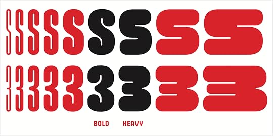
New work from type designer Zuzana Licko is always worth my attention, but her latest typeface family Modulator really knocked me off my chair. She’s making connections across decades of her work, picking up threads from her earlier designs, 1995’s Modula Round Black and 2023’s Lo-Res Monospaced, and weaving them together into something new. It flexes beautifully from thin and narrow to wide and heavy, and the personality morphs throughout. I love the simple (on the surface) system of expansion and negative space at play here and how she’s pursued it to its conclusion.
🖊️ Typographic Scales and Technical PensRob Weychert has been operating in the 95th percentile for detailed graphic design with CSS for ages now, and his latest article is no exception. He delves into his approach for achieving a relative even line weight for type across sizes in a system, and even extends it to other parts of the toolkit like borders and icons. It’s a small detail, but a challenging one to nail. Like most details in design, this one feels invisible and natural when they are dialed in. You really only notice them when they stick out as wrong. I’ve struggled with getting icons to feel like they are part of the same visual system as type for as long as I can remember. I usually veer the opposite way, if I can’t make them similar, I ensure they are contrasted instead. I’m excited to try out these methods! RSS
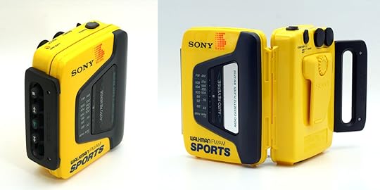 Sony Walkman WM-AF59, courtesy of Walkmanland 🎧
Walkmanland
Sony Walkman WM-AF59, courtesy of Walkmanland 🎧
Walkmanland
An online museum of the cassette tape players of yesterday. These were pervasive during my youth and having one meant bringing your music anywhere you went. I had this model back in the day. I remember it so vividly because it was the first player I had that wasn’t a busted hand-me-down. The latch made such a big thunk when it closed, and I would fidget with these huge buttons endlessly while listening. RSS
Loose EndsMarcin Wichary has been on a publishing tear over at his (sub)blog Unsung where he writes about the small and sometimes hidden details that go into software design. RSSLynn Fisher has created an archive of all the concerts she’s attended. But because she is Lynn Fisher she also nailed the design with embossed labels and tickets. It sends me back, I feel like I can smell the ink and plastic. RSSAmy Hood of Hoodzpah interviewed at Making Type Work by Jake Giltsoff. From a growing collection of awesome interviews. RSSThe End of Analogue by Elizabeth Goodspeed. I know I basically just link to everything Elizabeth publishes, but her writing has such a nice way of cutting to the really tangible bits. RSSTangible Media, an online museum of physical information storage. Pins, holes, grooves and more!Elizabeth Saloka paints rocks to look like everyday objects, and the results are mesmerizing. RSSWhy were so many control rooms seafoam green? Beth Mathews investigates and turns up a color coded system for urgency. RSSMD UI, an awesome new type family for interfaces by Rutherford Craze at Mass Driver. And his post about the process is great, love the honest and earnest sentiments around design and trying to reach for quality. RSSJackson from Okay Type has been posting type explorations to a new sketches section of his blog each week and it’s all great stuff. RSSPropellant, where Ethan admirably tries to shine a light on how AI can 10x evil too. Proponents are quick to speed past the cost of what goes into making the tools because their ends justify the means. The wholesale pilfering of copyrighted works, the environmental and societal impacts, and now wider use by military in war. Seems like you should be able to draw a line in there somewhere. RSS

March 25, 2026
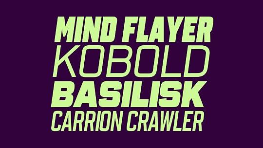
Citywide Updated and Expanded
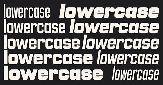
Big Citywide update today! I’ve added lowercase to the family, plus over 170 new characters, expanded diacritics and symbols, and a fresh round of refinements to existing letterforms, spacing, and stylistic sets. And because I’m doing things DIY Future Fonts style, this is a free update for anyone with a Citywide license!
A quick recap because my blog wasn’t yet revived when I launched Citywide last year. It’s a typeface that has been rattling around in my head for a long time, mostly because it draws inspiration from an old bus roll destination sign that I look at every day on my wall. My specific roll sign was made by H.K. Porter, Inc. from Pittsburgh, but there are countless variations in shapes, widths, and sizing to be found in this era of signage.
I’ve always loved the simple and odd gaspipe-esque style letterforms. It moves between fussy and informal, neighborly and gruff, simultaneously feeling like a broken in pair of jeans and a crisp sports jersey. It’s a sturdy sans serif that can really hustle. I think it works best for medium to larger sizing, posters, book covers, headlines and the like.
Citywide grew into a family of five widths and five weights, plus italics: 50 static fonts and 1 variable font.
I wasn’t originally planning on drawing a lowercase, but the more I sat with the family, the more I thought it could really use it. And that it would be a fun learning exercise. Both of those things turned out to be true, but it also turned out to be more challenging than I anticipated.
The caps had real reference material behind them from my signs, but lowercase had no such anchor. I looked to some neighborly references like Eurostile, Druk, Microgramma, and more. I found the line between harmony and staleness to be genuinely tricky, and I spent a long time on the wrong side of it before things started clicking.
This release is officially v1.0, and I think I’m calling Citywide done for now. I could see revisiting things in the future to add more extreme widths and weights. Or to continue to improve my letterforms and spacing. I went deeper into this typeface than I originally intended, and I’m glad I did. But it also made me realize what I want right now is to go wider rather than deeper, and explore more styles to see what else I can make.
Thank you to CJ Dunn, James Hultquist-Todd, and David Jonathan Ross for their critiques and advice along the way. They all make some of the best fonts around and you should check them out.
Citywide is available at my studio Loud Room, where I’m planning to publish all future typefaces too. And as before, this is a free update for anyone with a Citywide license!
January 28, 2026
Meet Loud Room
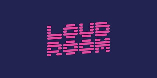
Early last year I ventured out on my own again, taking on contract design work after a long stretch away. Not long after, I settled on a name to work under, and now I’m excited to share that name and a website to go along with it: Loud Room.
The name is inspired in part by my time in Brooklyn working in shared spaces with friends, but honestly, I also just liked the sound and look of it. It feels a little mysterious and kinetic, and the rhythm of two four-letter words is handy for a logo. Once I managed to reclaim the domain from a squatter, it felt like everything had aligned.
Loud Room is me, and it may always be just me. As I wrote last year, I want to stay small to get closer to the work and create space for quality. I want to work directly with clients who care about craft and want to dig into the details of where their projects could go.
I bring deep experience across many types of design, including branding, product, publishing, and marketing. I enjoy wearing all of those hats, whether on a one-off project or as a founding designer helping companies that are just starting out.
I’m aiming to work with local clients when possible, as well as organizations trying to make the world better. I’m trying to build something sustainable, and I want to work with people who are doing the same. With so much upheaval in the world, I want to put my energy into useful work and relationships that help people, even in small ways.
When projects need more hands, I pull in trusted colleagues to help, something I’ve already done a few times since last year. I’m enjoying the energy of reconnecting with other freelancers and supporting one another along the way.
A New WebsiteThe Loud Room website is intentionally minimal right now. It’s less a portfolio and more a statement of purpose, something to put out into the world. The site will evolve over time, and I’ll add work samples as projects wrap up. For now, I’m comfortable with the simplicity and the small amount of friction in asking someone to read a few paragraphs.
I had a blast creating the logo and making a simple static website without any frameworks. I can’t stop using HEX Franklin, and I’ve always wanted to make a site with a randomizing color palette. I tried to ensure that each color scheme maintains enough contrast for basic accessibility, and love the bit of chaos when a garish palette shows up.
I’ve also moved all of my font designs under Loud Room, which will now serve as my foundry. I admire the multidisciplinary models of companies like Coudal Partners, Panic, and Young Jerks, and I want Loud Room to be a place where I can experiment, play, and make things that don’t fit neatly into one category. Fonts are the focus right now, but not the limit.
If you care about craft, working closely with humans, and not having generic design spat out by a machine, consider me for your next project.
You can find Loud Room here.
December 18, 2025
BTW № 4: People Make Amazing Things Edition
One last BTW collection for the year! In this edition: There’s something so satisfying about watching people being good at things. I’ve been enjoying putting these together, especially moving a little slower and seeing what themes might coalesce. See you in 2026!
🔵 A2ZDesigner Pedro Neves organized a graduate course at the University of Illinois Chicago’s School of Design to explore creating letterforms within a modular system, and that system is LEGO! And they created letterpress prints of their work. Stunning compositions abound in this project. I’m particularly struck by some of the surprising forms achieved and the addition of overprinting too. Obviously, part of that is inherent from using LEGO bricks, but many feel so expressive and new. This combines so many things I’m into, and I’d love to try this out myself sometime.
🧶 Knit HelloA “typeknitting” typeface by Rüdiger Schlömer based on a simple letterform grid and made for hand knitting. I know next to nothing about knitting, but this looks like fun! Schlömer also offers patterns for Knit Hello and other knitting typeface projects.
📓 The Ohno BookFrom James Edmondson of Ohno Type Co, the brains behind so many great contemporary typefaces. Billed as “A Serious Guide to Irreverent Type Design”, it’s chock full of helpful tips for designing type. I love how naturally James writes about a highly technical craft, it makes it feel approachable while not overly simplified.
🤖 Beyond the MachineGood buddy Frank Chimero gave a great talk in October at the Kinference conference in Brooklyn, and he’s made it available online as an essay. Beyond the Machine is one of the most clear-eyed takes on creative existence, coexistence, and resistance in a world with AI. I love the framing of over/beside/under when it comes to machines, and the artist examples really sing (especially Spirited Away as allegory). He also posted outtakes and extras that didn’t make it into the talk. And here I thought I was alone in not clicking with Rick Rubin’s book!
🔠 Designing GothamAnother great retrospective by Tobias Frere-Jones (written by Doug Wilson from interviews conducted with Tobias) on the design of Gotham, now 25 years old. I’ve heard bits of the inspiration behind Tobias’ approach to Gotham’s in various places, but to have it all in one place feels like a gift. Don’t miss the other great histories on Archer, Landmark, Surveyor, and Whitney.
Loose EndsThe Mel Brooks Questionnaire: I only just discovered this! Mel Brooks devised a one-page personality test for The New York Times and it gets some really insightful and (of course) hilarious answers from celebs. I love the career ambitions at different ages. Some other past interviewees include Maya Rudolph and Rob Reiner (R.I.P.).Color Palette Pro: A synthesizer for color. I love the interface and the approach to assembling color combinations. Read more about why and how Ryan Feigenbaum made it.Shop Sans: A new in-progress typeface from Nick Sherman of HEX Projects. This one is a variable font with axes that let you tailor letterforms for settings on a circle or curved paths. Wizardry!Matthew Hinders-Anderson: Some great fonts for “people fighting for a better future”. Fonts are free for all non-commercial use and some were recently used in the Zohran Mamdani NYC mayoral campaign design. New to me!Fran Sans: Awesome monospace typeface project by Emily Sneddon inspired by the digital segmented displays for San Francisco’s transit system. Perfect name too.Size of Life: Beautifully constructed comparisons in size from strands of DNA to the largest living thing on Earth. The arthropleura is some new nightmare fuel for me.October 30, 2025
Learning Curves
Over the summer I’ve been chipping away at adding a lowercase to my typeface Citywide. I’ve been busy with client work, so most of the time I spend on it is serendipitous, catching quiet moments between projects. Working sporadically is not ideal, but it does afford one nice perk: distance. Coming back after a break with fresh eyes is great for creative work. It can really help you see new ways past problems that once felt insurmountable.
I’ve been in a funny loop on Citywide’s lowercase for a couple of months, drawing and redrawing ns. When plotting out the forms for a typeface family, it’s common to start with the letters H, O, n, and o. These letters give you some of the basic rules for what your family is going to look like. You define fully round and fully perpendicular characters, set character widths, an x-height, and establish counters and stroke styles.
These letters don’t give you all the pieces you need to fully realize your typeface (diagonals are still a thing to figure out), but they give you a lot. In the case of the lowercase n, you likely have enough information to rough out a, b, d, g, h, i, l, m, p, q, r, and u. Over halfway there — not bad!
Lowercase is related to uppercase, but typically has some unique strokes that the uppercase lacks, like the curved joining stroke on the lowercase n. Seasoned type designers know all of this already, but I’m not seasoned. I’ve been moonlighting as a type designer because it’s fun and I love the heck out of it. It’s humbling and nourishing to be a beginner at something again. I know a lot about typography, but making fonts has been a whole other beast. Sure, there is crossover knowledge, but it doesn’t all equate. Like how an expert chef’s knife skills wouldn’t necessarily translate to excellence in topiary.
In the case of Citywide, I had great reference for the capital letterforms, but no true reference for lowercase. So I'm pulling inspiration from a few neighborly typefaces (Eurostile and Microgramma being useful models) and trying to find forms that complement the caps. Hence drawing dozens of ns to try and find the best form. When something clicks and feels right, it’s like finding the right note to play. It rings out, in time, in tune, in melody.
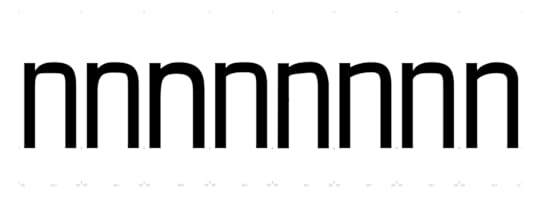 A small selection of n explorations, some more resolved than others.
 All of these ns have some relation to existing forms in the uppercase. Some early ones were rigidly geometric or tried to replicate the uppercase’s curves. I don’t know exactly how the original letterforms that inspired Citywide were made, but I like to imagine a person with a brush and a guide curve creating them. My first attempts felt machined rather than human or painterly. Where I ended up is closer to the version on the right in the image above, emulating the uppercase’s curves while adding an upward connecting stroke.
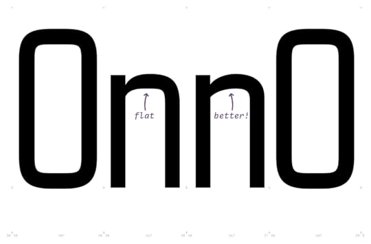 Following the uppercase too closely made the letters feel stale.
 The resulting process was about pushing shapes toward an extreme (angular or curved) and feeling out what “too much” was. In the image above, the n on the left introduced a deeper cut in the top where the curve joins the vertical, but I think it got too narrow. And the way the middle of the curve flattens out was a nice reference to the uppercase, but also made it feel stodgy. The version on the right pulled together more of what was working — a generous cut at the top that wasn’t too narrow, and a “faster” curve that added life to the letterform, while still keeping a similar right-side radius to the uppercase. It all seems so straightforward, but it really takes ages of squinting at proofs trying to see the letterforms with fresh eyes.
I’ve been at this a few years now, and I’m getting better. The first versions of Citywide were baaad. I’m sure there are mistakes that’ll be obvious to more experienced type designers, but I’m embracing the learning process. Like growing any skill, it takes time, feedback, and reps. And like many design-related skills, that repetition is how you develop your eye.
The journey is the fun part—and so is looking back to see the progress you’ve made. Special thanks to CJ Dunn (of CJ Type, go check out his awesome typefaces) for his advice and guidance in shaping Citywide’s lowercase. I have a few more bits to button up and always more proofing, but the lowercase should be out in a couple of months.
October 3, 2025
New Work: Megazoid Microsite
 Megazoid specimen, showing off variable depth and stroke axes.
 I recently had the pleasure of working with David Jonathan Ross (of DJR) to create a microsite for his type family Megazoid. Megazoid is a big, blocky exploration of raw geometry. It’s such a fun typeface! The font itself draws inspiration from stark geometric forms and shares some DNA with works like Milton Glaser’s Baby Teeth or RadioShack’s previous logo, but also leans into some of that quirkiness with depth layers and offsets like the best of Photo-lettering.
The brief for these kinds of projects is almost always the same: Showcase what the font can do and examples for what it feels like in use. Beyond that, have fun with it. Since it’s a playful typeface, the site should be playful too.
I had a blast making the site and iterating through ideas with David. When we met, we gathered inspiration we both liked, leaning into retro packaging design like VHS and cassette tapes, Polaroid, and Trapper Keepers as well as analog devices like calculators, keyboards, and game controllers. This material is also rife with great color motifs that go right up to the line of “clashing” while still feeling energetic.
The text samples are largely sci-fi and space themed, and the longer passages are game descriptions from an old Atari catalogue. I layered in a subtle paper texture to evoke the feeling of discovering these materials in an attic box, preserved but aged, like a time capsule from my youth.
I capped it all off with lots of little moments of motion and play. Almost everything on the site reacts to hover or touch — letters bounce, shift, and extrude. Because this is the very place to have fun with web design, all while trying to show how cool it is to use Megazoid.
Check out the site, and grab a copy of Megazoid for your next project.
More on DJR and Font of the Month ClubMegazoid started out as an entry in DJR’s Font of the Month Club where members receive a new surprise font every month. It’s a fantastic membership that I highly recommend, it pays for itself many times over. Some fonts feel experimental at first, while others are revivals, expansions, or future workhorses. All are fully baked and usable, and serve as the seeds for future expansions. I love how David makes room for experimentation and play in his work, it’s both a labor of love and a dare he puts forth every month. Also, members get discounts on past months’ releases!
DJR is a friend and collaborator. He’s one of the most generous people in the type community, often giving his time and expertise to teaching and lifting up others. When I’ve taken type workshops in the past, he invariably shows up as a guest critic. Other type designers often tell me they turn to him for advice when they hit tricky scripting challenges. Just last week, he used ad space he bought on Fonts In Use to promote other designers. A+ human right there.
August 20, 2025
BTW № 3: Analog Edition
 © Nanako Kume 💡 Pencil Lampshades
Nanako Kume is an artist that makes giant lampshades that look like pencil shavings. How do they do it? By making a giant pencil and giant pencil sharpener, of course! Don’t miss the video, the process is mesmerizing. They’re beautiful, and I totally want one.
✏️ Pencils Are the BestSpeaking of pencils, they’re still my all-time favorite tool. I love getting ideas out quickly in their roughest form. In the last few years I’ve also made a habit of taking notes from meetings and conversations on paper — I swear it has helped me remember things better. What I love about pencils is the balance they strike: you can geek out on materials, production, or mark-making, and yet some of the best pencils being made will only run you a dollar or two. So you don’t have to sweat lending one out or losing one.
I wrote a little Mastodon thread about some favorites a couple of years ago, and it still holds true. Most days I’m using a Camel HB or some kind of Tombow. I’m also enjoying the pack of Musgrave’s 1101 Yellow Special pencils earlier this summer.
👾 Arcade MarqueesDan Sinker visited the Galloping Ghost Arcade in Brookfield, Illinois, and came back with loads of beautiful pictures of vintage arcade game marquees. I agree with Dan: the combination of color and light makes this such a pleasing canvas for expression. It scratches a specific corner of my brain, the same way looking at the VHS covers of movies in the horror section of the video store did when I was young. For a deeper trip down retro lane, Bitmap Books has a great book called ARTCADE all about classic game art.
📚 Video Game Research LibraryMore games! The Video Game History Foundation is a non-profit that has started a video game history research library. You can already dig through old video game magazines and other ephemera. Bonus: you can buy a monthly subscription to receive a random vintage video game magazine issue every month in the mail!
🗒️ Good NotepadsWrite Notepads has stopped doing general retail and moved to a custom bulk/branded business. I’m so sad, they’ve been my favorite notebooks for years. Once I run out of the few blank ones I have left, I’ll need to find a new go-to. I’ve been eyeing Maruman Mnemosyne and Rollbahn notebooks. Have any you like?
📐 Iconfactory, Better Than EverIconfactory are craftspeople of the highest order. They’re the brains behind countless apps that made spending a day at the computer enjoyable (CandyBar, xScope) and have made services usable (Twitterrific, Tapestry). Icons. Wallpapers. Custom work that will knock your socks off. Every detail shows their care and artistry. If you have a need for their kind of work, you can’t do better.
🪡 Handmade CMYKArtist and designer Evelin Kasikov has been making CMYK embroidery since formulating the technique in grad school. The results are beautiful and effective. Her body of design work is vast, but she often returns to these CMYK expressions. Found via Ethan’s great new links stream.
Loose EndsFeeling stuck in a loop? Read Eject Disk, by Greg Storey.Robin Sloan pens a consistently great newsletter about books, media, and life. I also highly recommend his last book Moonbound .The old Pizza Hut restaurants had such an iconic look. Filmmakers Matthew Salleh and Rose Tucker made a documentary about the second life many of these buildings have had after Pizza Hut moved out.Ever wonder how Muppets manage to ride bikes or move in ways that seem impossible? Check out How Muppets Break Free from their Puppeteers .To celebrate David Attenborough’s 99th birthday, 99 smart folks (Michael Palin, Jane Fonda, Hans Zimmer, and more) share how he’s inspired them.“ Good Internet is a volunteer-run, not-for-profit print and digital biannual magazine for personal website owners and those interested in using the internet as a means of self-expression, art, and recreation.” Yes please!June 3, 2025
Large Language Muddle
 Cycling Art, Energy, and Locomotion
, 1889, Robert Pittis Scott
Cycling Art, Energy, and Locomotion
, 1889, Robert Pittis Scott I wanted to collect the thoughts that have been swirling in my brain about AI. Not to add another think piece to the pile, but to record them so I can understand where my head was at on the topic. Kind of a future letter to myself.
I’ve been pretty allergic to the wave of AI and all of the services popping up around them. Admittedly, part of it is fear. I’ve tried out many AI offerings. I can see how they are handy, they work quickly and seemingly make a lot of tedious things easier. They’ll likely help cure diseases or unlock breakthroughs in many fields. And that’s awesome. But I can’t shake the anger I feel about these models being trained on work taken without consent — including from artists, writers, and sites that explicitly opted out.
As someone who has spent their entire career and most of their life participating and creating online, this sucks. It feels like someone just harvested lumber from a forest I helped grow, and now wants to sell me the furniture they made with it.
The part that stings most is they didn’t even ask. They just assumed they could take everything like it was theirs. The power imbalance is so great, they’ll probably get away with it. There are countless lawsuits out against the AI companies. They say they can’t make these models without sucking up everyone’s copyrighted work. That should set off alarms. And still, do they acknowledge the imposition made on the sources of their training models? Nah, they are asking the government for absolution.
They’ve broken so many of the spoken and unspoken contracts of the web. And they want us to welcome them as a friend, like they didn’t just kick down the front door and invite themselves to dinner.
It’s worth saying it out loud as an affirmation: making things is not about the destination, but about the journey. The journey is what you put into creation: the thought, the mistakes, the sweat, the time, the lived experiences, the refinement in technique. What you get back is knowledge. The output is an artifact of that knowledge. When you get that artifact without the journey, you make nothing, you learn nothing.
Do most people make that distinction? Does it matter? Of course I care, but talking about it seems to backfire, making you look like a curmudgeon resistant to technological progress. As people accept AIs and become more reliant on them, their origin will probably just be a footnote in history, something only pedants care about.
Lately I’ve been thinking about how certain skills erode, how we lose touch with things we once worked hard to learn. Early on, driving a car for me meant memorizing directions. I got good at it because I had to, but it also felt nice to develop a sense for direction. The weekend before the iPhone came out, a friend and I pulled over to the side of the road and unfolded a big paper map on the hood of my car to figure out our route. They laughed and said, “I wonder if we’ll ever need to do this again after next week.”
They were right. Since then, I’ve become reliant on map applications when driving somewhere unfamiliar. My ability (and maybe patience) to follow ambling directions has completely atrophied. And I think about that sometimes when I sit down to write, or design, or solve a problem. When you aren’t made to use a muscle, that muscle stops working. How long can you still be a good writer if you aren’t writing? Painting? Coding? Reasoning?
These tools have already injected themselves into so many of the ways we learn and work. Regardless of your like or dislike of AI, I don’t think there is an unwinding that can happen here. Will there come a point when it’s no longer possible to work in our industry without opting in?
And still that anger. It’s not just that they didn’t ask. If these tools have so much promise, could this have been a communal effort rather than a heist? I don’t even know what that would’ve looked like, but I can say I would feel much differently about AI if I could use a model built on communal contributions and opt-ins, made for the advancement of everyone, not just those who can pay the monthly subscription.
Behind that anger is sadness. How do we nurture curiosity and the desire for self growth? Not just because your brain and body are great things that need tending to, or because it’s fun, or because it’s part of being alive. But because you simply must? Or maybe you must because of all those things.
I honestly don’t know.
I imagine there will be a time when using these tools or not creates a rift, and maybe it will be difficult to sustain a career in our field without using them. Maybe something will change, and I’ll come around to using these services regularly. I don’t think I’ll ever not be angry about it.
For now, I’m planning on continuing to roll up my sleeves. I want to make things because I’m human and alive. I want to go on journeys and grow. I’m not always looking for an easy path, I want the friction. Because if I give up the journey, what am I really making? What do I actually learn?
May 14, 2025
BTW № 2: Letterforms Edition
 ✍️ Kermit, a typeface for kids
A new type family from Underware in partnership with Microsoft geared towards helping kids learn to read and write. It strikes a smart balance of legibility, playfulness, and variability. They even created a variable “writable” version of Kermit that can interpolate its shapes to mimic the motion of the letterforms being written!
I have a love/hate relationship with handwritten style fonts. They usually feel limited or contrived, like too much of the typography is pre-baked. I sour on them as soon as I see an identical repeating letterform, the veil drops and the illusion is ruined. But Underware are probably the best in the biz on these kinds of fonts: Scribo, Bello, Liza, and more. Kermit contains tons of alternates and variability, the illusion is clean and whole. And bringing it to Office? Let’s put Comic Sans to bed forever. Don’t skip the in-depth notes around Kermit’s design and how it might be able to help those with dyslexia learning to read too.
 ✉️ Behind the Scenes with Licko & VanderLans
Following up on the last BTW’s mention of Emigre, Stephen Coles got to interview Zuzana Licko and Rudy VanderLans. Loads of great tidbits like Zuzana’s original proofing markups and details on how much they spent on those mailings in the ’90s. Wild that they recouped the costs and more! Different times:
Licko: By the mid-nineties, our mailing list was reaching upward of 40,000 to 50,000 potential customers. So we would mail out these promotional materials, be it a specimen booklet, a poster, or an issue of Emigre, to the entire list, free of charge. This would run upward of $30,000 to $40,000 per mailing. Each time we did this, it seemed like a lot of money, but we would usually recoup those costs and then some.🤖 Are Em Dashes Really a Sign of AI Writing?
Apparently AI generated text is rife with em dashes. Sorry, I use em dashes a lot and will not cede this to the bots. I probably overuse them, but will now think of it as a badge of my own human imperfection. A cheatsheet: option + hyphen for an en dash, option + shift + hyphen for an em dash.
 🕰️ Poltik
A new typeface from TypeTogether by Patrycja Walczak, the 2023 Gerard Unger Scholarship winner. Poltik was inspired by the numerals on a 1970s clock design Patrycja found in her grandfather’s drawer. Its text styles are warm and a little quirky in Light and Regular, but get really expressive as it gets bolder. Then the Display styles just hit you with retro goodness.
 🕹️ Cartridge 3
A big update to Dan Cederholm’s Cartridge type family, now with 5 weights across both Regular and Soft styles. Plus new alternate letterforms, revised kerning, and lots of under-the-hood improvements.
 🦋 Soft Text
A new in-progress family by Kyle Letendre (Soft Type) at Future Fonts. I love the gentle contrast here, it’s a beautifully laid-back design. And $35 as an introductory price is a steal. More styles and weights on the way!
Loose EndsThe Ohno Book, A Serious Guide to Irreverent Type Design: This promises to be a great read with insight from James Edmondson on his type design process.Yes to Kagi: I’ve been using Kagi search for two months now and am hooked on having useful, AI-free search results.Line height units: I totally missed when these got added to browsers, but they look super useful for typesetting.Webrings are back! I love this and totally want to get on board.Ryan Coogler on film aspect ratios: It’s always a treat to hear an expert geek out on something technical. Also, Sinners is great. You should see it.Alphabet in Motion teaser: Kelli Anderson made an activation video (to tease bookstores) of her upcoming pop-up book on how letters got their shapes. Unsurprisingly, it looks bananas, Kelli consistently brings so much artistry to everything she does.May 6, 2025
Funsizing
 Spiraea aruncus (Tyrol), 1851–54, Anna Atkins
 Earlier this year I started taking on contract work again, something I haven’t done steadily for about 10 years. The spark was getting laid off, which turned out to be a great moment to step back and reflect on things.
After some soul searching, I started to see a pattern I’ve been repeating: I’d start a new job with a company and team I felt good about, and a few years later I’d have some reason to move on. Sometimes it was a mismatch with leadership or my manager, other times it was burnout on that specific work. All valid reasons to leave! But when I think back on those companies, I remember most of them fondly—good teams, supportive managers, and companies making things I believed in. So why did I leave?
Reader, it was me.
I don’t think I actually mesh well with the structure of in-house design. I loved working among designers, mentoring, and shaping the direction of things; but at the same time, I was drowning in the reporting, OKRs, and earnings metrics of it all. I was often too far from the actual design happening, stuck hovering at some low altitude over the work. And that often left me feeling depleted.
Basically, I’ve always felt best when I was making things, and I miss being more hands-on. But I really miss the flexibility to try different things, work with different people, and learn while I’m doing it.
So I decided not to look for a new full-time position and instead go solo and hang out my own shingle again. I started a new LLC to work under and wrestled a domain name away from a domain squatter (boo! hiss!) last week.
Is this a good time to start a business? I dunno. But for my own health, I want to break the pattern of chasing fulfillment in the next shiny new role. It feels like an extra bad time to count on big companies to look out for their employees. That’s always been true, but it’s even clearer in economic downturns.
I’m excited about the chance to steer what I’m doing and who I work for again. I want to carve out something small and sustainable for me and collaborators. Something that doesn’t need to scale just to stick around. Something that takes on useful work, things I believe in, that works locally—in geography or community—and builds relationships. I want to will some optimism and fun back into my workday.
I want to work alongside people again, maybe in a shared studio space a couple times a week. Even better if we’re collaborating on projects together. I want to mentor designers. I want to keep learning. I want space to experiment and take on side quests just for the joy of it.
I’ve been having a blast designing typefaces and love making artifacts around design—books, shirts, games, who knows. I’ve always admired the polymathic studios like Coudal Partners, Young Jerks, Panic, and others. Places that found a niche doing things that nourished them creatively.
I’m taking it slow and trying to be intentional right now about what fills me up. I’ve booked a couple of gigs already, which is reassuring, and I hope I can grow that into something fun-sized and steady.
If you or anyone you know is looking for contract design help, please drop me a line.
Thanks to Ethan for feedback and a second set of eyes on this post.
Jason Santa Maria's Blog

- Jason Santa Maria's profile
- 5 followers

