Learning Curves
Over the summer I’ve been chipping away at adding a lowercase to my typeface Citywide. I’ve been busy with client work, so most of the time I spend on it is serendipitous, catching quiet moments between projects. Working sporadically is not ideal, but it does afford one nice perk: distance. Coming back after a break with fresh eyes is great for creative work. It can really help you see new ways past problems that once felt insurmountable.
I’ve been in a funny loop on Citywide’s lowercase for a couple of months, drawing and redrawing ns. When plotting out the forms for a typeface family, it’s common to start with the letters H, O, n, and o. These letters give you some of the basic rules for what your family is going to look like. You define fully round and fully perpendicular characters, set character widths, an x-height, and establish counters and stroke styles.
These letters don’t give you all the pieces you need to fully realize your typeface (diagonals are still a thing to figure out), but they give you a lot. In the case of the lowercase n, you likely have enough information to rough out a, b, d, g, h, i, l, m, p, q, r, and u. Over halfway there — not bad!
Lowercase is related to uppercase, but typically has some unique strokes that the uppercase lacks, like the curved joining stroke on the lowercase n. Seasoned type designers know all of this already, but I’m not seasoned. I’ve been moonlighting as a type designer because it’s fun and I love the heck out of it. It’s humbling and nourishing to be a beginner at something again. I know a lot about typography, but making fonts has been a whole other beast. Sure, there is crossover knowledge, but it doesn’t all equate. Like how an expert chef’s knife skills wouldn’t necessarily translate to excellence in topiary.
In the case of Citywide, I had great reference for the capital letterforms, but no true reference for lowercase. So I'm pulling inspiration from a few neighborly typefaces (Eurostile and Microgramma being useful models) and trying to find forms that complement the caps. Hence drawing dozens of ns to try and find the best form. When something clicks and feels right, it’s like finding the right note to play. It rings out, in time, in tune, in melody.
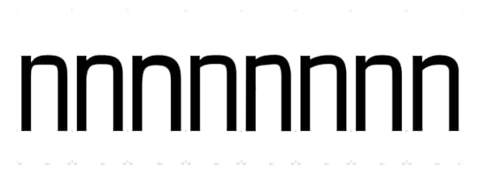
 A small selection of n explorations, some more resolved than others.
 All of these ns have some relation to existing forms in the uppercase. Some early ones were rigidly geometric or tried to replicate the uppercase’s curves. I don’t know exactly how the original letterforms that inspired Citywide were made, but I like to imagine a person with a brush and a guide curve creating them. My first attempts felt machined rather than human or painterly. Where I ended up is closer to the version on the right in the image above, emulating the uppercase’s curves while adding an upward connecting stroke.
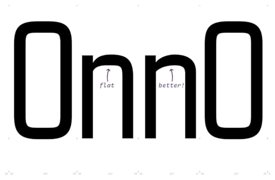
 Following the uppercase too closely made the letters feel stale.
 The resulting process was about pushing shapes toward an extreme (angular or curved) and feeling out what “too much” was. In the image above, the n on the left introduced a deeper cut in the top where the curve joins the vertical, but I think it got too narrow. And the way the middle of the curve flattens out was a nice reference to the uppercase, but also made it feel stodgy. The version on the right pulled together more of what was working — a generous cut at the top that wasn’t too narrow, and a “faster” curve that added life to the letterform, while still keeping a similar right-side radius to the uppercase. It all seems so straightforward, but it really takes ages of squinting at proofs trying to see the letterforms with fresh eyes.
I’ve been at this a few years now, and I’m getting better. The first versions of Citywide were baaad. I’m sure there are mistakes that’ll be obvious to more experienced type designers, but I’m embracing the learning process. Like growing any skill, it takes time, feedback, and reps. And like many design-related skills, that repetition is how you develop your eye.
The journey is the fun part—and so is looking back to see the progress you’ve made. Special thanks to CJ Dunn (of CJ Type, go check out his awesome typefaces) for his advice and guidance in shaping Citywide’s lowercase. I have a few more bits to button up and always more proofing, but the lowercase should be out in a couple of months.
Jason Santa Maria's Blog
- Jason Santa Maria's profile
- 5 followers


