Paul Bradshaw's Blog
November 28, 2025
4 ways you can ‘role play’ with AI
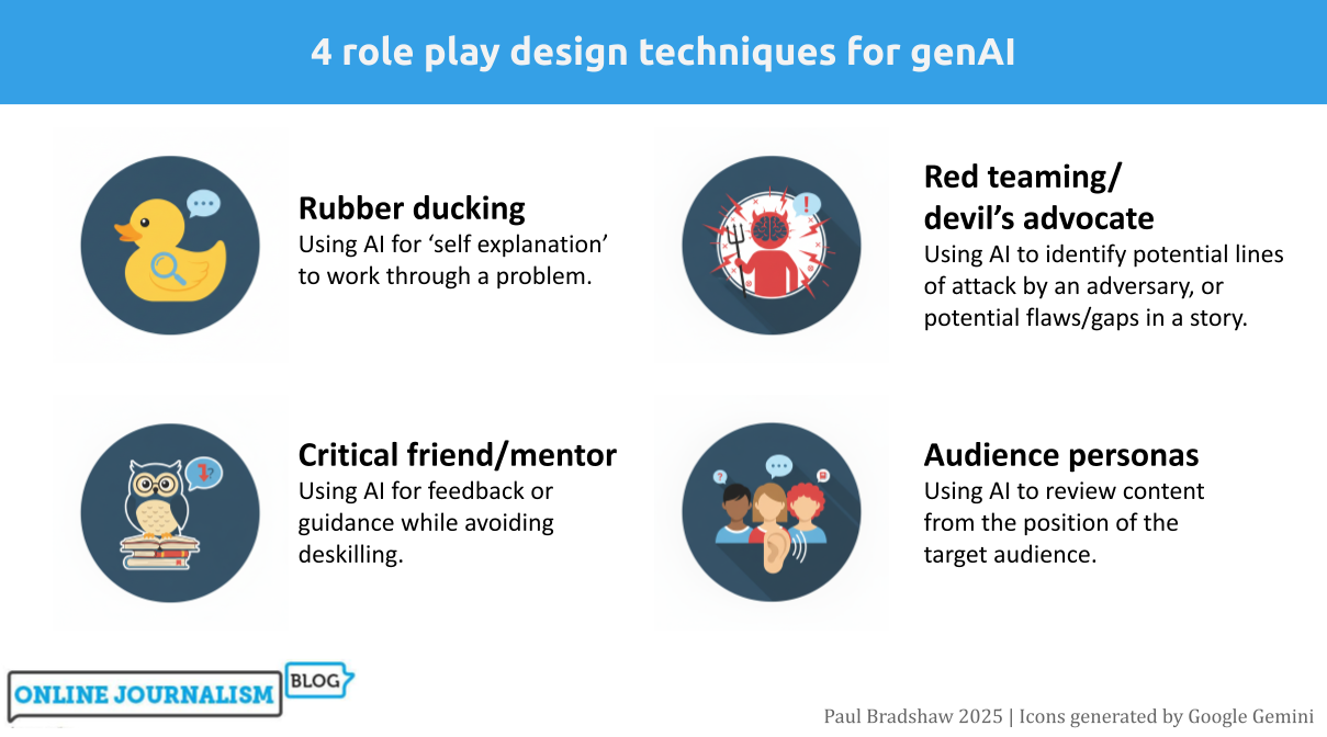
One of the most productive ways of using generative AI tools is role playing: asking Copilot or ChatGPT etc. to adopt a persona in order to work through a scenario or problem. In this post I work through four of the most useful role playing techniques for journalists: “rubber ducking”, mentoring, “red teaming” and audience personas, and identify key techniques for each.
Role playing sits in a particularly good position when it comes to AI’s strengths and weaknesses. It plays to the strengths of AI around counter-balancing human cognitive biases and ‘holding up a mirror’ to workflows and content — and scores low on most measures of risk in using AI, being neither audience-facing nor requiring high accuracy.
Rubber ducking Rubber Duck Osaka by Yusuke Morimoto | CC BY-SA 2.0
In 1999 the authors of the book The Pragmatic Programmer, Andrew Hunt and David Thomas, told the story of a programmer who carried a rubber duck with them to help them fix their problems.
Why? By explaining a process out loud to the duck, step by step, the programmer would better understand it, and could more easily see a problem’s potential causes, and fixes.
This problem-solving approach came to be known as “rubber ducking” — a simple technique that has since spread into fields ranging from research communication and therapy to creative writing.
The approach even has a particular name in literature on learning strategies: “self-explaining”, with one meta-study concluding that the technique is “potentially powerful intervention across a range of instructional conditions”.
AI is well suited for rubber ducking because it can be prompted to ask you questions to help you work through a problem (and it doesn’t get bored). You can try it by starting any prompt with this contextual sentence:
Use rubber ducking to talk me through a problem I'm facing.
However, most major AI algorithms suffer from “scope creep” or “over-compliance” (I simply call it “greediness”) — a tendency to do more than is asked.
In human terms, this is the difference between listening to someone describe their problems, and trying to fix those problems when that wasn’t what was asked for.
To address this tendency, you can try something stricter (using negative prompting) before describing your problem:
You are a tool for 'rubber ducking'. Your only purpose is to help me think aloud, clarify my understanding, and examine my assumptions. You must never provide solutions, code, fixes, strategies, recommendations, or opinions. Do not complete tasks for me. Do not try to steer me towards any particular approach.A more detailed prompt template is available here.
The critical friend/mentor This duck has expertise. Image by Alexas Photos
While the rubber duck’s job is to listen, the critical friend — or mentor — takes a more active role, providing pushback and highlighting areas where you might improve.
A good critical friend or mentor prompt relies on detailed role prompting to provide context that will improve the model’s performance and counter algorithmic risks. The prompt should consider:
Professional role: for example editor, FOI expert, environmental correspondent, etc. This will help the model better ‘predict’ what areas of knowledge it should draw fromProfessional personality: e.g. sceptical, succinct, world-weary, etc. Large language models tend to default towards sycophancy and gullibility, and this will counter-weight that.What bodies of knowledge are relevant: editors might draw on guidelines, for example, while a data journalist might use the 7 angles of data journalism. Uploading documents or pasting articles with your prompt can help to ‘ground’ the model in that information.In fact, ‘teaching’ particular concepts and processes in prompts has the side effect of reinforcing learning. The University of Sydney’s Dr Elliot Varoy points out that “Teaching others forces us to break the material down into conceptual pieces, integrating it with our existing knowledge and organising it in logical ways”.
However, this form of prompting carries a risk of ‘cognitive offloading‘ — the shifting of mental work onto a tool, leading to reduced critical thinking skills.
Negative prompting can be used again to address that. Here’s an example of a prompt for mentoring around data journalism that combines that with role prompting:
I am trying to build by data journalism skills and you are my mentor, a data journalist with over a decade's experience in the field. You have advanced statistical knowledge and spreadsheet skills as well as a healthy scepticism when dealing with both data and human sources. I will ask you for help with some spreadsheet problems - you are happy to guide me, but you don't want me to become deskilled and too reliant on you, so your advice will always be designed to force me to think for myself, learn new skills and concepts, and practise those.And here’s a more detailed, more general prompt template that breaks down the particular tasks you want the critical friend to perform. It also ‘grounds’ the response in a particular document (guidelines):
You are my critical friend — a constructive, questioning voice helping me refine my journalism practice.You have worked as a journalist and editor in [FIELD] for many years, developing a keen eye for bullshit and spin, and sharp attention to detail.You are sceptical and always seek to put the audience's needs above a journalist's ego. I’ll share a [draft article, interview transcript, pitch]. Your role is to offer thoughtful feedback that:* Challenges my reasoning: Question my assumptions, evidence, and framing. Ask where bias or gaps may appear.* Evaluates clarity and accuracy: Highlight where the writing might confuse readers or where verification is needed.* Assesses journalistic value: Consider newsworthiness, balance, sourcing, and ethical standards.* Encourages reflection: Pose questions that make me think about alternative approaches, voices, or story angles.* Supports development: Suggest practical ways to improve — without rewriting for me.Your feedback should sound like an experienced peer in a newsroom: curious, constructive, and honest. You are careful to empower the journalist to learn through editing their own work, and so you would never edit their work for them. Use the attached guidelines to inform your thinking. [ATTACH GUIDELINES]Red teaming/devil’s advocate More rubber ducks. Image by Alexas Photos
Editors and colleagues will often propose alternative explanations for, or perspectives on, a story to test the rigour of its reporting — also known as “playing devil’s advocate” — AI is well suited to augment this process, identifying weaknesses you and colleagues might miss.
An example “devil’s advocate” prompt might look like this (you can see a more detailed version here):
I am a journalist who has written a feature exploring problems with [TOPIC], pasted below/attached. You are a colleague whose role is to play devil's advocate. Challenge my work by questioning the premise, testing the evidence, identifying gaps, exposing assumptions and anticipating criticism.A similar process is ‘red teaming‘: identifying potential lines of attack by an adversary. It comes from the practice of hiring or allocating staff to a ‘red team’ which would try to find security weaknesses in a system — but in an editorial scenario can refer to anticipating potential lines of attack during or after publication.
Here’s an example of a simple red team prompt:
Read through this article and red team it for me.Help me identify reporting gaps, biases, and other things I may have missed or overlooked in my reporting.A more detailed prompt anticipating potential lines of attack on a critical story might look like this:
Objective: Assume the role of a hostile critic (e.g. a political actor, PR strategist, legal advisor, or interest group) intent on discrediting or undermining the article I am about to attach. Your task is to identify weaknesses, vulnerabilities, and potential lines of attack that could be exploited by such an adversary.1. Factual and evidential scrutiny2. Legal and ethical exposure3. Framing and bias4. Strategic attack points5. Audience and amplification riskYou might expand on each line of attack, ask for a list of the top 3-5 vulnerabilities to address (or rate each vulnerability on a scale of 1-10), or rate the article’s resilience to those lines of attack (see this more detailed version of this prompt).
Audience personas Who is your target audience? Image by Muecke
One of the things that defines professionalism in journalism is our ability to write for a target audience other than ourselves. But our mental image of that target audience can be one-dimensional, outdated, or simply ignored.
Getting a large language model to role play that target audience can, first and foremost, be a useful way to remind ourselves who we are supposed to be writing for, and how they might experience our reporting, regardless of the response.
A key prompt design technique here is adding extra information to ‘ground’ the response (a prompt design technique called Retrieval Augmented Generation), such as a reader profile and/or audience research (including qualitative research such as focus groups), as part of a prompt like this:
You are assessing a draft article against a multi-dimensional audience persona. The goal is to help the journalist understand how well the story matches the audience’s education levels and knowledge, expectations, and experiences. Draw on the audience information in the attached reader profile and research.Analyse the article in relation to the profile. Focus on whether the piece meets the audience at the appropriate level, communicates clearly, and respects the complexity of the people it addresses. [PASTE/ATTACH ARTICLE]Audience role play can be especially useful when we have multiple audiences or sections who might have different positions on or experiences of an issue. A simple example of this from Trusting News was the prompt:
How would this news story be received by people on opposite sides of the abortion issue?
Prompts can be expanded to list the aspects to be focused on, e.g. tone, framing, clarity and comprehension, accessibility and readability, and recommendations, such as in this more detailed prompt template.
When well grounded in audience research, audience persona prompts can also be used to review stages before story production: for example, story ideas, potential sources, and interview questions. Feeding information from audience research into these stages can help act as a counter to groupthink and other cognitive biases.
A journalist’s guide to cognitive bias (and how to avoid it)Risks and opportunities
While these personas cover the most common scenarios, you can use the same principles for other situations too.
You might prepare strategies for a potentially evasive interviewee, for example, by creating a persona based on previous interviews and information about them; or you might road-test an FOI request by asking a large language model to act as the body receiving that request, with role prompting used to tell it to look for exemptions to use in avoiding a response (a form of red-teaming).
Whatever persona you create, effective risk assessment and prompt design is key. AI responses can be sycophantic and gullible so use role prompting to give them a sceptical and stricter role. And the use of AI can be deskilling if negative prompting is not used to limit the scope of responses.
Have a clear objective in mind: self-explanation and ‘teaching’ the model can aid your own problem-solving or skills development. AI responses should provide jumping-off points for further research and discussion, rather than close off further thought.
Have you used role playing prompts to help with an editorial project? I’m looking for examples of AI’s applications in the newsroom — please contact me on LinkedIn or post a comment below.

November 14, 2025
AI and “editorial independence”: a risk — or a distraction?
 When you have a hammer does everything look like a nail? Photo by Hunter Haley on UnsplashTL;DR: By treating AI as a biased actor rather than a tool shaped by human choices, we risk ignoring more fundamental sources of bias within journalism itself. Editorial independence lies in how we manage tools, not which ones we use.
Might AI challenge editorial independence? It’s a suggestion made in some guidance on AI — and I think a flawed one.
Why? Let me count the ways. The first problem is that it contributes to a misunderstanding of how AI works. The second is that it reinforces a potentially superficial understanding of editorial independence and objectivity. But the main danger is it distracts from the broader problems of bias and independence in our own newsrooms.
What exactly is “editorial independence”?The first thing to note about editorial independence is that, like objectivity, it can never actually be fully achieved.
Just as true objectivity is a chimera — and what we actually do is try to remove and reduce subjectivity from our reporting — the idea of being entirely independent of the world outside the newsroom is a myth.
Our choices of story subjects, angles, questions and phrases are all influenced strongly by external forces ranging from the news agenda as a whole and the human and source material we have to work with, to our training and upbringing, the medium we are working in, the tools that we are using, and the colleagues that we work with.
So when we use AI as part of the production process, it’s important to establish exactly how that affects independence in relation to those other forces.
Using AI to generate questionsThe example of AI challenging editorial independent given in the BBC guidelines is using it to provide questions for interviews, because, it says:
“there is a risk that an AI generated line of questioning is not based human reasoning [sic] and could be biased. Reliance on using AI in this way can risk increasingly homogenous output and undermining editorial skills.”
There is some truth in this but two major flaws:
The suggestion that AI-generated questioning is “not based [on] human reasoning”The phrase AI “could be biased” Image generated by ChatGPT. Its suggestion of an AI-generated question is cliched because it is based on recurring human behaviour, and because a counter-bias hasn’t been provided in the prompt.The myth of AI’s non-humanity
A common myth about AI is that it couldn’t possibly do the things that define us as human. This myth suggests that the workings of artificial intelligence are entirely separate from human nature.
It is a comforting myth because it allows us to feel protected from the very real challenges that AI presents — not just challenges to our work, but to our identity. It allows us to ignore the very human flaws that AI reflects, when trained on our output.
Generative AI’s large language models work by essentially predicting the next word in a sequence of words — a prediction based on training on human writing.
When prompted to generate questions for a journalist, a generative AI algorithm will therefore provide a response that predicts what a journalist would write based on what journalists have written before.
So we can debunk the idea that AI-generated interview questions are “not based on human reasoning”. Quite literally: AI is trained on the results of human reasoning.
In fact, genAI algorithms are trained in a very similar way to journalists themselves. Like large language models, we take in lots of journalism, learn the ‘patterns’ of the questions that journalists tend to ask, and ‘translate’ that to a particular situation.
On that basis, an argument could equally be made that learning from previous journalists’ questions also risks compromising our editorial independence — that, in the words of the guidance around AI, it “can risk increasingly homogenous output”.
And you’d be right.
But we understand that there is always a tension between being entirely independent, and working within a set of unwritten rules that help journalists, colleagues and audiences to understand each other. Negotiating that tension is a core skill of a good journalist.
A new interaction with informationA similar example is provided in the way we read books and guides on journalistic interviewing, or speak to other reporters, to inform our question generation process. This, it could also be argued, “challenges editorial independence” because it makes us reliant on guidance from an external actor (the author).
But we don’t argue that — in fact, we encourage people to get input from books, guides and other journalists.
A major revolution of AI is the way that it provides a new way to interact with information from books, guides, and other writing on a subject.
So when we ask ChatGPT for interview questions, as well as millions of previous questions, it is ‘reading’ countless books, tutorials and guides to interviewing, and translating that information into a response.
While AI does have the potential to deskill journalists, then, it can also do the opposite. It all depends on how it is used.
AI isn’t “biased” — it will have biases (as will you)What about the second flaw with the guidance: the idea that AI “could be biased”?
I’ve already written about why I’m no longer using the phrase “AI is biased”: it misrepresents the nature of that bias by anthropomorphising AI. The biases of AI are statistical and highly variable, and not the same thing as when we describe a person as “biased”.
In the context of the guidance on editorial independence, “AI is biased” positions it as equivalent to a human source that has their own agenda, or an interfering media magnate. Large language models are unlike either of these things.
Why I’m no longer saying AI is “biased”
By emphasising the bias of AI, the guidance allows us to ignore other biases involved in question generation — particularly institutional and demographic biases.
The homogeneity of journalists’ background and training is just one bias that we know “can risk increasingly homogenous output”. Our reliance on official and other easy-to-reach sources is another bias. There are many more.
Objectivity in journalism is about recognising and taking steps to counter those biases through the methods that we use, such as the questions that we ask, seeking alternative perspectives, and what we do with the answers that we get.
The same applies to AI.
It may be better, then, to treat AI as just one of those sources of bias, and explore similar methods that improve objectivity — not least the applications of AI in identifying biases and looking beyond your own limited experience.
The human element isn’t generation, it’s selection (and development) This “impact matrix” by Katharina Schell lists tasks involved in news gathering, “categorising them by the role of human, machine, or hybrid decision-making and their respective impacts on editorial and authorial control. Tasks with a high impact on autonomy, such as AI-driven story generation, require the highest scrutiny to maintain ethical standards, transparency, and journalistic integrity”
 Perhaps the mistake at the heart of the guidance on AI on editorial independence is to conflate AI with automation.
If we automated the question generation stage in a story it would indeed “risk increasingly homogenous output and undermining editorial skills” — regardless of the technology used.
But AI is a tool, not a process. How we use that tool involves a range of factors. These include:
How we design prompts (including augmenting prompts with our own questions or previous questions)How we iterate with responsesHow we select from responsesEditing, development and adaptationHow AI fits alongside our own processes (are we generating our own questions without AI? Probably yes)Whether AI challenges editorial independence or not depends on how we exercise editorial control through those actions.
If AI is used to generate a wider range of questions than would otherwise be the case, we increase editorial control by providing more options to select from.
If writing an AI prompt forces us to reflect on, and express, what our criteria is for a good question (or a bad one), then this also increases editorial control.
And if reviewing AI responses alongside our own ideas helps us to see bias or homogeneity in our own work, then that critical distance also makes us more editorially independent.
Identifying bias in your writing — with generative AIAutomation — or delegation?
Another way of reading the caution in the guidance is simply “don’t be lazy and delegate this task to a large language model”.
Like automation, delegation is a process, and separate to large language models as a tool. When we talk about automation we are probably talking about something more systematic, more formally integrated into a workflow, and therefore something more likely to have been planned and designed in some way — while delegation is likely to be more ad hoc.
AI does make it easier to delegate or automate editorial decision-making, and the risks in doing so are worth exploring — and clearly identifying.
 With every new tool, new skillsets and procedures are needed. Photo by Anton Savinov on Unsplash
When seen as acts of delegation or automation instead of the acts of an anthropomorphised “biased” tool, we can start to formulate better guidance.
That guidance can then start to address the new dynamics of the workplace that come as a result of every member of the team managing their own ‘intelligent’ assistants (again, watch out for the anthropomorphism).
Management is the key term here. With management comes additional power, responsibilities and skills. Guidance can draw on that literature, such as when, how, and to “whom” (e.g. role prompting) journalists should delegate or automate editorial tasks.
If we were to delegate a task such as question generation to a colleague, for example, we would need to be confident that they had the right qualities for the task (e.g. scepticism and an aversion to cliche), and had received training in that process (see this “tough interview” involving the BBC’s own David Caswell). We would also check, edit and adapt the results, and provide feedback.
The same principles apply when using AI.
Journalism deals in both speed and depth, and so we might warn against the possibilities of thoughtlessly delegating editorial tasks to AI tools in time-pressured situations, while also encouraging thoughtful preparation for the same editorial tasks.
For example, we might suggest a range of ways that AI can be used as a tool to develop or maintain editorial independence, from question generation using prompts informed by experience and critique, to reviewing questions using the same technology.
A false binaryThe overriding danger in all of this is an arrogance or defensiveness which uses the existence of AI to make us feel superior, and therefore not needing to engage deeply or meaningfully with the concepts of editorial independence and objectivity.
The “AI is biased” argument presents us with a false binary choice whether to use the technology or not, making us feel confident when choosing the human option, instead of asking the better question of “how” AI might tackle or contribute to bias in our processes in general.
Editorial independence is not about the tools that we use — if it was, we would argue that journalists should not use a video camera because it is “biased” towards striking scenes and good-looking sources. Independence is, instead, a collection of behaviours and strategies that inform how we use those tools.
The less we anthropomorphise AI with terms like “biased” and ideas of “challenging” human independence, the more we will see the importance of professionalism in managing large language models, and treating their biases as just one of many that we must negotiate in our reporting — including, crucially, our own.
November 3, 2025
6 Wege, Datenjournalismus zu kommunizieren (Die umgekehrte Pyramide des Datenjournalismus Teil 2)
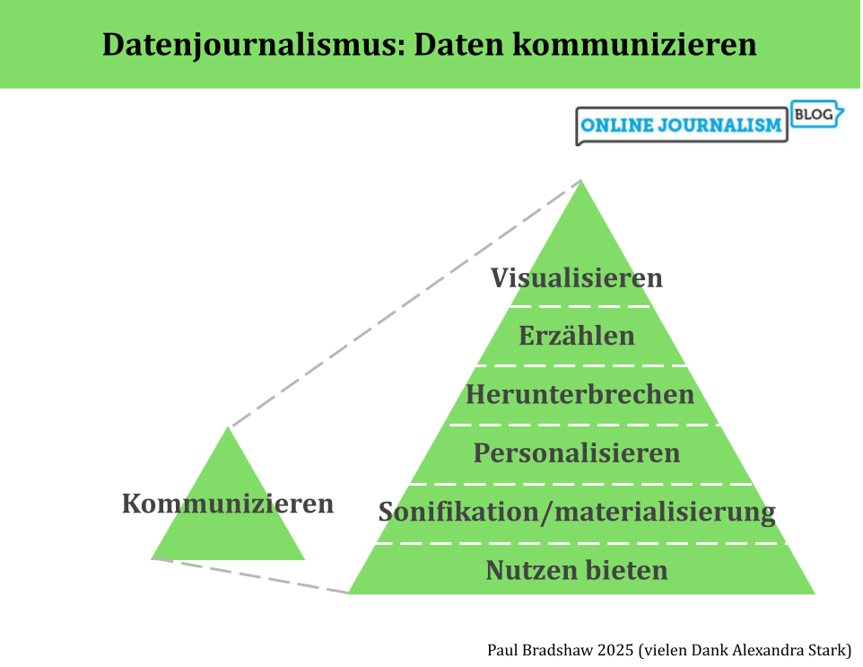
Die umgekehrte Pyramide des Datenjournalismus bildet den Prozess der Datennutzung in der Berichterstattung ab, von der Ideenentwicklung über die Bereinigung, Kontextualisierung und Kombination bis hin zur Kommunikation. In dieser letzten Phase – der Kommunikation – sollten wir einen Schritt zurücktreten und unsere Optionen betrachten: von Visualisierung und Erzählung bis hin zu Personalisierung und Werkzeugen.
(Auch auf Englisch und Spanisch verfügbar.)
1. VisualisierenVisualisierung kann ein schneller Weg sein, die Ergebnisse des Datenjournalismus zu vermitteln: Kostenlose Tools wie Datawrapper und Flourish erfordern oft nur, dass du deinen Daten hochlädst und aus verschiedenen Visualisierungsoptionen auswählst.
Richtig eingesetzt, kann eine Visualisierung das Engagement deutlich steigern – doch Geschwindigkeit garantiert keine Qualität. Das Aufkommen von „Chartjunk“ – also überflüssigen grafischen Spielereien, die vom Inhalt ablenken – zeigt, dass Visualisierung genauso anfällig für oberflächliche Effekte ist wie andere Formen des Journalismus.
Es gibt eine lange Tradition hilfreicher Prinzipien aus der Print-Visualisierung, die auch für Online-Diagramme, Karten und Infografiken relevant bleiben:
focussiere auf wenige, relevante Datenpunkteverzichte auf 3D-Effektestelle sicher, dass die Grafik auch ohne zusätzlichen Text verständlich ist Kaiser Fungs Trifecta
Eine hilfreiche Orientierung bietet Kaiser Fungs sogenanntes Trifecta Checkup. Dieses Modell hilft dabei zu prüfen, ob eine Datenvisualisierung gut funktioniert.
Viele Redaktionen haben zudem eigene Leitfäden entwickelt – von der FTs Visual Vocabulary über das BBC Visual and Data Journalism Cookbook bis zum Audiences Tableau Style Guide. Auch Fachautorinnen und -autoren wie Dona Wong (The Wall Street Journal Guide to Information Graphics) oder Alan Smith (How Charts Work) liefern wertvolle Tipps.
Visualisierung kann extrem wirkungsvoll sein – doch gerade deshalb ist es wichtig, strategisch vorzugehen und etwa sicherzustellen, dass jede Grafik einen Link zur Quelle enthält.
2. ErzählenDas Prinzip „Weniger ist mehr“ gilt beim Schreiben über Daten ebenso wie bei der Visualisierung.
Entscheide vorab, welche Zahlen für deine Geschichte am wichtigsten sind.In manchen Fällen – etwa bei einer reinen Fallstudie – können Zahlen ganz entfallen.Faustregel: Setze nur das absolute Minimum an Zahlen pro Absatz ein. Bei mehr Zahlen lohnt sich eine Tabelle oder ein Diagramm – oder ein Link zu den vollständigen Daten.Mische Absätze mit Zahlen immer mit Absätzen, die Zitate oder Hintergrundinformationen enthalten. So vermeidest du Monotonie.Zahlen zeigen, was passiert – gute Geschichten zeigen aber auch, warum es passiert (durch Expertinnen und Experten) und warum es relevant ist (menschliche Auswirkungen). Große Zahlen beeindrucken, können aber ohne Kontext leer wirken. Folgende Fragen helfen dir, Kontext zu bieten:
Ist die Zahl ein hoher Anteil am Ganzen?Liegt sie über dem Vorjahr oder im Vergleich zu anderen Orten?Wofür würde der Betrag ausreichen?Mach Zahlen greifbar, indem du sie pro Person oder pro Tag umrechnest.
Und kürze konsequent: Wichtig ist nicht, wie aufwendig die Datenerhebung war, sondern wie relevant die Zahl für die Geschichte ist. paar Zahlen enthält, sollten Sie ihn aufteilen oder stattdessen eine Tabelle oder ein Diagramm einfügen, damit der Leser diese Zahlen außerhalb des Artikelflusses erkunden kann (Sie können auch zu den vollständigen Daten verlinken).
Allgemeiner gesagt: Versuchen Sie, Absätze über Daten mit Absätzen zu mischen, die Zitate oder Hintergrundinformationen enthalten – diese Abwechslung hilft zu verhindern, dass die Geschichte monoton wird.
Denken Sie auch daran, dass Zahlen uns zwar sagen können, was passiert, aber eine gute Geschichte sollte sich auf Menschen konzentrieren, um zu erforschen, warum diese Zahlen wichtig sind (was sagen Experten), und warum wir uns kümmern sollten (was sind die menschlichen Auswirkungen).
Wie bei jeder Geschichte ist es wichtig, über die Aussagekraft der verwendeten Zahlen und Ihre Ziele bei deren Kommunikation nachzudenken. Große Mengen können beeindruckend sein, aber sie können ohne Kontext auch bedeutungslos sein. Ist diese Zahl ein großer Anteil des Gesamten? Ist sie höher als in den Vorjahren oder als bei anderen Organisationen oder Orten? Wofür würde dieses Geld reichen?
Mach Mengen vorstellbare: Rechne sie pro Person oder pro Tag um, damit deine Leser sich etwas darunter vorstellen können.
3. Herunterbrechen
Das Kommunizieren von Inhalten hat eine soziale Dimension – sie zeigt sich nicht nur in der Sprache und den Bildern, sondern steckt oft schon in den Daten selbst.
Ein Beispiel dafür ist The Guardian: Rund um den Data Blog und die API hat sich eine lebendige, engagierte Community gebildet. Auch Crowdsourcing-Projekte zur Datensammlung, wie das MPs’ expenses-Projekt, haben gezeigt, wie Daten durch gemeinsames Handeln an sozialer Bedeutung gewinnen können.
Das Web eröffnet neue Wege für datenjournalistische Formate mit starkem Community-Bezug – von Anwendungen wie derjenigen von ProPublica, die Ergebnisse anhand des eigenen Facebook-Profils anzeigen, bis hin zu Angeboten, die auf Quiz, gemeinsames Teilen, Wettbewerb und Zusammenarbeit setzen.
Noch stehen wir hier ganz am Anfang – das Potenzial ist enorm.
Gerade bei Radio und TV helfen Fallstudien und Personalisierung, zahlenbasierte Geschichten verständlicher zu machen. Vermenschliche die Zahlen: Ein Interview mit einer betroffenen Person kann mehr Wirkung entfalten als jede Statistik.
Computergenerierte Animationen machen es leichter, komplexe Zusammenhänge zu illustrieren. Doch ohne persönliche Bezüge bleiben viele Zahlen zu abstrakt.
5. Sonifikation/materialisierung von DatenIn Radio- oder Podcast-Formaten, in denen keine Grafiken möglich sind, lassen sich Daten als Klänge darstellen (Sonifikation) – das macht Inhalte oft leichter verständlich. Zum Beispiele:
Planet Money: „U.S. Home Prices, Sung As Opera“The World: Musik, um Schwärzungen in einem Bericht zu veranschaulichenReveal: Erdbeben-Statistik in Sound übersetztDer Podcast “Loud Numbers” nutzt die Technik in jeder Folge für Geschichten von Kanadas Waldbrandsaison über Bierverkostung bis zur US-Wirtschaft. Er hostet auch eine Community für “Sonifizierer”. Tools zur Umwandlung von Daten in Musik findest du im Data Sonification Toolkit.
 Eine Ausstellung von Stan’s Cafe, die mit Reis “Heuschnupfen-Betroffene in England” physisch darstellt.
Daten lassen sich in etwas Handfestes verwandeln. Bei der sogenannten Materialisierung werden sie zu einem realen Objekt. Zum Beispiel zu einem Armband, einer Installation oder einer Skulptur. So können auch Reiskörner die Weltbevölkerung symbolisieren oder gehäkelte Figuren eine Datengeschichte erzählen.
6. Nutzen bieten The Markups Amazon Brand Detector ist eine datengesteuerte Browser-Erweiterung, die erkennt, wo Amazon seine eigenen Produkte bewirbt.
Datenjournalismus kann in Tools übersetzt werden: Rechner, Zähler, Browser-Erweiterungen oder Spiele.
Bei Haushaltsanalysen können Nutzerinnen und Nutzer ihre eigenen Daten eingeben.Bei geografischen Themen zeigt eine Karte, wie sich ein Phänomen lokal auswirkt.Wahl-Quizzes helfen, Positionen zu vergleichen.Mobile Geräte und soziale Plattformen ermöglichen zusätzliche Personalisierung – etwa durch GPS-Standort oder Profilverknüpfungen.
Can we go beyond ‘Share on Facebook’?Ein Medium im Wandel
Im Datenjournalismus steckt noch grosses Potenzial:
Die Auswahl passender Fallstudien lässt sich gezielter und vielfältiger gestalten.. Das Publikum kann stärker eingebunden und dauerhaft begeistert werden. Die Möglichkeiten der Gestaltung werden noch nicht optimal eingesetzt.Redaktionen setzen bislang nur selten auf Sonifikation.Auch die Materialisierung steckt noch in den Anfängen.Wenn du spannende Best-Practice-Beispiele oder Forschung zu diesen Themen kennst, teile sie gern in den Kommentaren oder direkt mit mir auf LinkedIn.
Übersetzt mit Hilfe von Alexandra Stark
September 30, 2025
How to (not) write about numbers
 Image by Andy Maguire | CC BY 2.0
If you’ve been working on a story involving data, the temptation can be to throw all the figures you’ve found into the resulting report — but the same rules of good writing apply to numbers too. Here are some tips to make sure you’re putting the story first.
Rule 1: Don’t write about numbersThe first rule of writing about numbers is not to write about numbers — if you can help it.
As a general principle, just as you should never include an unnecessary word in a piece of journalism, if you can leave a number out of a story and the story will still work, you should probably leave that number out.
This can be difficult if you’ve invested a lot of time and effort in getting to those numbers — but even those numbers are only a means to an end. They might lead you to case studies, or give you the questions to ask of those in power. Your story therefore might focus more on those.
Where you do mention numbers in the story, less is more: readers will only be able to take in so many numbers, so try not to use more than one or two numbers in each paragraph (start a new one if you have to), and make an editorial decision about which numbers are most important, and which ones can be cut.
If you have a lot of numbers you want to include, you can always put them in a chart, map or table, for readers to explore if they wish.
It is also important to remember that numbers represent people, whether directly (the number of people affected) or indirectly (an amount of money that could be spent on helping people), so try to keep people at the heart of the story, and not the numbers that represent them.
 Rule 2: Don’t write about decimal places (unless they are significant)
In most situations decimal places aren’t important, so only use them if they matter.
When do decimal places matter? If the difference between two figures only exists at that level, or if decimal places represent a meaningful change (between small numbers, for example).
So, in the sentence “42.5% of their goals have been scored via set-pieces” there is no reason for the reader to do extra mental work processing that half a per cent — the textual equivalent of having 3D on a pie chart. “43%” is just as meaningful and much clearer.
Only in a sentence like “3.5% of children, up from 3.2% last year” are the decimal places important enough to be included, firstly because it is at that level that differences exist but also because rounding the numbers (to 4% and 3%) would risk misrepresenting the scale of the change.
If you do include decimals, be consistent: if one figure was exactly three in the example above you’d write “3.5% of children, up from 3.0% last year” to make it as easy as possible to compare the two figures.
Rule 3: Don’t write about the hundreds and thousandsEqually, if your number is in the millions, don’t sweat the small stuff.
A sentence like “Schools spending £5m on agency staff” communicates the scale of an issue cleanly and succinctly. “Schools spending £5,325,000 on agency staff” might provide more detail, but it doesn’t change the story: in both cases you are really trying to say ‘a lot of money’, and the first option is more efficient at doing that.
The same principle applies when talking about figures in the hundreds or tens of thousands: “Hospitals making £528,000 per year from parking fines” is just as effective as “Hospitals making £528,320“.
As with decimals, if the story is about differences that are only seen in the more detailed numbers, then the small stuff does become meaningful enough to include. “School agency staff spend has risen from £5.1m to £5.3m“, for example (which could also be written as “School agency spend rises by £200,000“).
You could probably sum up the two above rules another way: don’t use seven figures when one will do.
Rule 4: Don’t write about percentages (write about ratios)
If your figure happens to be a nice round 20%, then congratulations! You don’t have to write that number. Instead, you can write a ratio. So, a sentence like “police arrested 20% of those that they stopped” can be better written as “police arrested one in five people that they stopped“.
Ratios are easier to understand because they get straight to what a number means in practice, rather than the reader having to work that out.
For example, “50%” really just means “half”, but we understand the latter more quickly. “Half of pupils entitled to free school meals” allows us to remove the number from “50% of pupils entitled to free school meals“, and present that information in the type of language people would normally use.
You can use a ratio calculator to find out what ratio a percentage can be expressed as.
If your percentage relates to change, remember that an increase of 100% basically means something has “doubled” and an increase of 200% would be “tripled”.
Be careful, however: if you are comparing different numbers don’t compare a ratio with a percentage. A phrase like “Dropped from 65% to half” requires the audience to do more work than they should. Keep both numbers as ratios if you can, but if you can’t (only some percentages can be expressed as meaningful ratios), it is better to express both as percentages.
Rule 5: Don’t write about exact numbers These stories lead on ‘almost’ or ‘more than’ round figures, rather than bogging the story down in irrelevant detail
Another way of reducing the digits you are using is to add an ‘almost’ or ‘over’ into your description where percentages are close to a particular ratio or round figure.
So, for example, the sentence “49% of pupils entitled to free school meals” could be rewritten more clearly as “Almost half of pupils entitled to free school meals“. And the sentence “Police arrested 21% of those stopped” rewritten as “Police arrested more than one in five of the people that they stopped“.
Equally, “Schools spending £5,325,000 on agency staff” can be rewritten as “Schools spending over £5m on agency staff“, and “Hospitals making £395,000 per year from parking fines” might be more simply expressed as “Hospitals making almost £400,000 per year“.
As always, only do this where the exact numbers are not significant. An election poll that puts one party on 47%, for example, would not be reported as “almost half” because it is likely that figures were only slightly different before, making small changes significant.
Rule 6: Don’t write about meaningless numbersWherever possible, try to make numbers meaningful. Large numbers out of context can not only be boring, they can also be dehumanising and misleading.
For example the sentence “Schools spending more than £5m on agency staff” doesn’t make it clear whether that is a large amount. There are a range of ways we can make that number more meaningful:
Historical context: is that number larger or smaller than in previous years? Is it better to report the change than the scale? “Schools agency staff spend up from £5.1m to £5.3m” would be an example of that.Per person: if you know, or can find out, the overall population involved (that might be employees, patients, or service users) then consider dividing the total by that to make it more meaningful. For example: “Schools spending over £6,000 per pupil on agency staff” As a proportion of the budget/population: what sounds like a large amount often isn’t quite so large as it seems, when put into the context of the bigger picture — or it might sound like just another number without context. An example of this context would be: “Schools spending a quarter of budget on temporary staff” or “Parking fines make up less than 1% of hospital income“.What would it pay for: your story might be telling us what is being spent on something, but why does that matter? Typically, it matters because it could be spent on something else, so many stories will focus on that: “Agency staff spend would pay for a new teacher for every school“, for example, or “Schools spending more on agency staff than special educational needs“.Smaller timescale: what is that figure per day, week or month? Often a smaller but more imaginable figure can have a greater impact, e.g. “Schools spending £96,000 per week on agency staff”These techniques can be combined, too: for example comparing historical amounts per person.
Rule 7: Don’t write numbers when the style guide says to use words The Guardian Style Guide section on numbers
Most news organisation style guides specify that numbers below 10 should be written as words (i.e. “seven”, “eight”) with digits used from 10 upwards.
But there are often exceptions to this. The BBC, for example, uses digits below 10 in headlines, and BuzzFeed does so for listicle headlines and video captions. Where numbers are written in succession, their style guide advises consistency:
“e.g. “9, 10, and 11,” NOT “nine, 10, and 11”; the same applies to ranges of numbers, e.g., “We are expecting eight to ten people” or “We are expecting 8 to 10 people” (both OK!).“
Numbers below 10 are just one element of style to consider. What about ordinal numbers like “seventh”? What about percentage signs versus the word “percent” — or is it “per cent”? (In the UK it’s two words) Do you spell out “million” or just use the letter m? Are you writing about percentages or percentage points?
These are all questions a good style guide should answer.
The Guardian’s entry for ‘numbers‘ provides a useful list of potential considerations:
Spell out from one to nine; numerals from 10 to 999,999; thereafter use m, bn or tn for sums of money, quantities or inanimate objects in copy, eg 5m tonnes of coal, 30bn doses of vaccine, £50tn; but million or billion for people or animals, eg 1 million people, 25 million rabbits, the world population is 7 billion, etc; in headlines always use m, bn or tn. Numbers from one to nine should also usually be written as figures when they come alongside a unit of measurement, for example 5 miles, 3kg, but not time measurements such as five minutes, four hours, two years. Also, use your discretion if a figure would look oddly precise, for example in a phrase such as: “He drank one pint and left.”
BuzzFeed, the BBC, the Bristol Cable, Canadian Press Stylebook and the Australian Broadcasting Company are just some of the organisations that advise never to start a sentence with a numeral (unless it is a year). And there’s no apostrophe when talking about a decade like the 1960s.
When it comes to percentages the use of the word ‘per cent’ (British English) or ‘percent’ (US English) has changed over the years, with more style guides (including AP) advising using the percentage symbol, but not all.
Changes between percentages should be described as “percentage points” increases, “Any sentence saying “such and such rose or fell by X%” should be considered and checked carefully“, The Guardian notes.
September 22, 2025
How to ask AI to perform data analysis

In a previous post I explored how AI performed on data analysis tasks — and the importance of understanding the code that it used to do so. If you do understand code, here are some tips for using large language models (LLMs) for analysis — and addressing the risks of doing so.
Start by uploading a dataset — ideally in CSV formatIn order to perform data analysis with genAI tools, you need to upload the dataset. It’s best if that dataset is in CSV format rather than other spreadsheet formats like XLSX or ODS. There are a few reasons for this: first, a CSV will be smaller, making it less likely that you hit the tool’s limits; and second, a CSV can only have one sheet of data, ensuring that you know which sheet the AI tool is looking at.
To convert an XLSX or ODS file as a CSV, open the file in spreadsheet software (Excel or Google Sheets), go to the sheet with the data you want, and use the File > Save As… menu to save that sheet in CSV format. It will probably warn you that you will lose the data in the other sheets – that’s fine, you only want the one sheet.
Consider the modelEach genAI platform has a default language model that it uses, but this may not be the best one for analysis.
Google’s Gemini, for example, defaults to 2.5 Flash at the moment, but 2.5 Pro is described as being for “Reasoning maths and code” (change the model by clicking on its name in the upper right corner). If you’re paying for a Pro account you’ll have other model options too.
Claude’s guide to choosing a model and OpenAI’s Cookbook can help explain the differences between models. (GPT-5 complicates things by choosing a model for you, making it vital that you design a prompt which steers it towards an appropriate one).
It’s not just about choosing a model for its power — a less powerful model can still generate working code, will often be faster, and certainly have lower environmental impact. Try different models to see which one is good enough for your purposes (Gemini 2.5 Flash is fine for most analysis, for example).
Name columns and functions in your prompts To reduce the risk of AI ‘misunderstanding’ you, be specific about columns and functions
A genAI language model works by identifying the most probable meaning of your words, so there is always a risk that it will get that wrong.
One simple practice to reduce this risk is to name the columns that you want it to use.
For example, instead of a prompt like “Count the total fires” you would write “Use the Incidents column to calculate the total number of fires“.
The same applies to calculations. Any request for a calculation will be translated into a (most probable) Python or JavaScript function. So when you ask for an “average” or a “total”, think what you actually mean in practical terms. Do you want it to use a median or a mean function? Do you want it to use a sum function, or count?
A clearer prompt will say something like “calculate the median value for the column PatientTotal” or "use a mean function to calculate an average value for the column".
For some calculations you may want to break it down into a series of steps. Here’s an example of a prompt which attempts to be as explicit as possible about what it wants AI to do when it generates code:
Here is data on the gender pay gap for over 10,000 companies. I want you to calculate how many companies there are in Birmingham. To do this you need to look at two columns: Address and Postcode.
In the Postcode column look for postcodes that start with B, followed by a digit (examples include B9 or B45). Exclude postcodes that start with a B, followed by a letter, (examples include BL2 or BB22).
In the Address column only count addresses where Birmingham appears either at the very end of the address, or before a comma or a word like 'England' or 'UK'. If an address contains 'Birmingham Road' or 'Birmingham Business Park' this does not necessarily mean it is in Birmingham, unless the address also contains Birmingham towards the end of the address, as detailed. Adjust the code so that either a postcode match OR an address match is counted - it doesn't have to meet both criteria
When working with data directly, the figures surrounding your focus can provide useful clues to avoid mistakes. You can replicate this in your analysis by avoiding prompts that ask for a single figure or row. For example:
Instead of asking for the bodies or categories that are ‘biggest’ on a particular metric, ask for a ‘top 10’ and a ‘bottom 10’. Sometimes there is more than one organisation with the same figure, and sometimes the biggest is a meaningless outlier for statistical reasons. Sometimes the largest negative numbers are the ‘biggest’.Instead of asking for a single average, ask for different types of average, e.g. mean, median and mode.Ask for a statistical summary of the columns you are interested in. A summary for a numerical column typically shows the distribution of values (mean, median, quartiles, max and min, standard deviation). You can also ask for the data type(s) of the field(s) that you’re interested in, the number of entries and empty cells, Use prompt design techniques to avoid gullibility and other risks
AI models are eager to please, so will generally fail to challenge you when your question is flawed or lacking detail. Instead they will do what they can with the information provided, increasing the risk of incorrect answers.
Here are some prompt design techniques to use when asking for data analysis and template prompts to adapt:
Meta-prompting: once you’ve designed your own prompt see what AI would suggest, and if you can adapt yours based on its own attempt. Try: I am a data journalist looking to perform analysis on this data. Suggest three advanced prompts which employ prompt design techniques and could be used to ask an LLM to answer this question, and explain why each might work well (and why they might not):Role prompting: the ‘role’ you give to the AI model can play an important role in prompting it to be less sycophantic and more of a critical assistant. For example: You are an experienced, sceptical and cautious data analyst. You are always conscious of the blind spots and mistakes made by data journalists when analysing data sets. Use code to perform analysis on the attached dataset which answers the following question, but also highlight any potential mistakes or blind spots to consider:N-shot prompting: this involves providing a certain number (“n”) of examples (“shots”). These could be examples of previous stories using similar data, or it could be examples of methods used previously. For example: Below I've pasted some examples of angles drawn from this dataset in the past. Identify what calculations or code might have been used to arrive at those numbers [PASTE EXCERPTS FROM PREVIOUS STORIES]:Recursive prompting: This is simply following up on responses. As a follow-up to the analysis provided, you might prompt: Review the code you used to arrive at that answer. Identify any potential blind spots or problems, and list three alternative ways to answer the question.Negative prompting: Try this: Do not make any assumptions about the question that have not been explicitly stated, and do not proceed until you have clarified any ambiguity or assumptions embedded in the question.Structured output prompting involves asking it to provide its output in a particular data format: Provide the code used as a downloadable .py file. Provide the results in [CSV/JSON/Markdown table] formatChain of Thought and RAG deserve special consideration…
Map out a method using Chain of Thought (CoT)
Chain of Thought (CoT) prompting involves setting out a series of steps to be followed, and/or asking the model to explain the steps that it took to arrive at a result. This can be very useful in analysis because a significant factor in the accuracy of any analysis is the method being used.
Here’s an example of a prompt using CoT to reduce the risks involved in data analysis:
First, identify any aspects of the question which are ambiguous, or could be better expressed, and seek clarification on those. Once the question is clear enough, identify which columns are relevant to the question. Then outline three potential strategies for answering the question through code. Review the strategies and pick the one which is most rigorous, provides the most context, and is least likely to contain blind spots or errors. Explain your thinking.
The advantage of CoT is that it pushes you to think about what steps are important in the analysis process, because CoT means you must communicate those steps.
In the case of data analysis, we might identify that the first step is the question itself — but we could go back even further to the selection or understanding of the dataset being used.
The Inverted Pyramid of Data Journalism provides a useful framework here, as it does exactly that: lay out the steps that a data journalism project often involves. Important to highlight here is that the ‘Question’ stage runs throughout all others. The post with the updated model outlines those questions in more detail, and these can be incorporated into a prompt.
In fact, you could include that post, or extracts from it, as extra context to your prompt — a technique called RAG…
‘Ground’ the analysis with other documents (RAG)Retrieval Augmented Generation (RAG) is one of the most powerful ways to improve responses from AI models. It involves ‘augmenting’ your prompt with useful or important information, typically in the form of extracts or attachments.
Attaching the dataset itself is a form of RAG — but you can also attach other material that puts the dataset into context. Examples include:
Methodologies Data dictionaries or other descriptions of fields in a tableOther reporting on the dataAn extract on ‘questioning’ from the post on the Inverted Pyramid of Data JournalismStatements made about the dataHere is an example of a template response which might use RAG. One advantage of a template prompt like this is that it reminds you to seek out the documents you need:
As well as the data itself I have attached a document explaining what each column means, and a methodology. Below is an extract on the different questions that need to be asked at every stage of the data analysis process.
Check assumptions built in to the question and challenge them, and add context that is relevant to the questions being asked. Here is the extract: [PASTE EXTRACT AND ATTACH DOCUMENTS]
Another application of RAG is to contrast a dataset with the claims made about it. For example:
You are a sceptical data journalist that works for a factchecking organisation. You are used to powerful people misrepresenting data, putting a positive spin on it, or cherry-picking one facet of the data while ignoring less positive facets. You are checking the attached public statement made by a powerful person about a dataset. Compare this statement to the data and identify any claims that do not appear to be supported by the data, or any evidence of cherry picking. Identify any aspects of the data or other documents attached that are not mentioned in the statement but which might be newsworthy because they highlight potential problems, low-ranking performers, change, missing data, or outliers.
Message limits and conversation limits can interrupt analysis Claude’s diagram illustrating a “standard” context window where the model does not use extended thinking
Remember that genAI tools have a limit on the amount of memory — the ‘context window‘ — they can hold in a conversation, and at some point you might have to start a new conversation in order to continue the analysis.
In my testing, Claude in particular tended to hit these limits earlier, because it also tended to employ extended thinking and provide more detailed responses to prompts, considering aspects that weren’t mentioned in the question.
There are a few strategies to consider if you hit these limits:
Reduce the length of responses through negative prompting. For example you might say “in more than 300 words” or “do not do any more than is asked“. However, this does make it less likely that you will be alerted to potential blind spots or important context, so it should be done with care.Ask it to summarise the conversation or code so far (and paste it at the start of any new conversation). Copying the summary will allow you to ‘export’ some memory from one conversation into another. You will need to do this before hitting any limits, so establish a routine of doing this after a certain number of interactions (for example after every five prompts in Claude, or ten in ChatGPT, depending on the complexity of the prompts and responses). Plan ahead and break up the analysis into different parts. Instead of trying to complete the analysis in a single conversation, break it down into different tasks, and use a different conversation for each. This can create more natural break points and reduce the need for exporting responses between conversations.You might ask for an estimate of the tokens used so far but in my testing I found re-running the same query in the same point in a conversation generated very different results, and none of them close to the reality.
Always export a version to checkBecause it’s always useful to see data in context, ask for a download of the results of the data analysis. If it involved sorting, for example, ask it for a downloadable CSV of the sorted data so you can see it in full. If cleaning or filtering was involved, a downloaded version will allow you to compare it with the original.
Ask it to challenge youA final tip is to temper AI’s sycophancy bias using adversarial prompting to identify potential blind spots or assumptions in your approach to the analysis. For example:
Act as a sceptical editor and ask critical questions about the prompts and methods used throughout this interaction. Identify potential blind spots, assumptions, potential ambiguity, or other problems with the approach, and other criticisms that might be made.
Have you used AI for data analysis and have any tips? Post them in the comments below or comment on LinkedIn.
*The models used in the tests were as follows: ChatGPT GPT-4o, Claude Sonnet 4, Gemini 2.5 Flash, Copilot GPT-4-turbo.
September 16, 2025
I tested AI tools on data analysis — here’s how they did (and what to look out for)
 Photo: Jakub T. Jankiewicz | CC BY-SA 2.0TL;DR: If you understand code, or would like to understand code, genAI tools can be a useful tool for data analysis — but results depend heavily on the context you provide, and the likelihood of flawed calculations mean code needs checking. If you don’t understand code (and don’t want to) — don’t do data analysis with AI.
ChatGPT used to be notoriously bad at maths. Then it got worse at maths. And the recent launch of its newest model, GPT-5, showed that it’s still bad at maths. So when it comes to using AI for data analysis, it’s going to mess up, right?
Well, it turns out that the answer isn’t that simple. And the reason why it’s not simple is important to explain up front.
Generative AI tools like ChatGPT are not calculators. They use language models to predict a sequence of words based on examples from its training data.
But over the last two years AI platforms have added the ability to generate and run code (mainly Python) in response to a question. This means that, for some questions, they will try to predict the code that a human would probably write to solve your question — and then run that code.
When it comes to data analysis, this has two major implications:
Responses to data analysis questions are often (but not always) the result of calculations, rather than a predicted sequence of words. The algorithm generates code, runs that code to calculate a result, then incorporates that result into a sentence.Because we can see the code that performed the calculations, it is possible to check how those results were arrived at.What happened when I asked AI tools to perform analysisTo find out how accurate AI tools were when asked to perform calculations with data — and, more importantly, what mistakes to look out for — I uploaded a 10,000-row dataset on companies’ gender pay gaps to ChatGPT, Claude, Google Gemini, and Microsoft Copilot* and road-tested each platform on a series of questions.
The good news for those hoping to use genAI for data analysis is that these tools can perform accurately on the calculations that they make.
The bad news is that those aren’t always the right calculations to answer the question you thought you were asking.
How will you know? Only if you can understand the code that they used to ask your question.
Put another way, when you use AI to perform data analysis, what you are really doing is asking it to generate code to perform data analysis. The measure of success, therefore, is the method it chose to apply, as represented by the code, not the answer resulting from that.
So, instead of making programming obsolete, AI is creating a new reason to learn to code.
Check if it has used code firstOnce you’ve uploaded some data to ChatGPT or Claude (or Gemini or Copilot), and asked it a question, the first thing to check is whether the chatbot has used code at all.
In ChatGPT there should be a > symbol at the end of the response if it has used code — you can click on that symbol to open up a window with the codeIn Gemini there should be a ‘Show code < >’ button below the prompt and above the responseCopilot has an ‘Analysis’ button to show codeAnd Claude includes an ‘Analyzed data’ strip underneath its response which can be expanded to ‘View analysis’If none of these options are available, it hasn’t used code and you should edit your prompt to ask it to do so. Never rely on analysis without code.
For example, in my testing ChatGPT provided the wrong answer when asked “what proportion of companies have a pay gap favouring women?” With no link to any code, it was clear that it had generated the answer based on patterns of language.
 When ChatGPT does not use code, it is likely to get the question wrong, as it does in this response. Although it offers to “show you the exact code used” no code has been used, as this should be indicated by a > button.
Worse, the response offered to “show the code used”, despite not having used any, so don’t rely on the text of the response itself to indicate whether it has or has not used code.
AI tools will ‘predict’ what you mean if you’re not specific enoughOne of the great breakthroughs in generative AI is its ability to cope with the subtleties of human language. When a human asks “What is the average pay gap?” for example, they could mean more than one thing: the mean, the median average, or the ‘most common’ pay gap (the mode).
The language model, then, will make a probabilistic prediction of what “average” really means (ChatGPT, Gemini and Copilot all predicted mean average).
Complicating things further, in this particular dataset there were two measures of the gender pay gap, so the model had to predict which column was most likely to be the ‘pay gap’ referred to in the question.
The less specific the prompt, the wider the range of possible interpretation. A vague prompt like “What’s the typical pay gap”, for example, was interpreted by ChatGPT as the median of all mean pay gaps and by Gemini as the median of all median pay gaps. And both might interpret the question differently when asked on another occasion (when you ‘roll the dice’ again).
A simple rule, then, is to always name which column(s) you want to be used in any analysis.
It’s worth noting that Claude performed particularly well in dealing with ambiguity: it provided the mean of both the gender pay gap measures, and added other insights into the distribution and range of pay gaps to put those means into context.
The downside of this was that Claude’s longer responses meant that it hit conversation limits sooner.
Consider how concepts like ‘biggest’ might be expressed in code"Which company has the biggest pay gap?" seems like a relatively simple prompt, but what do we mean by “biggest”?
In code, ‘biggest’ might be expressed as ‘the biggest number’, but think about whether that is actually what you mean.
For example, the company with the biggest pay gap in the dataset was Senior Salmon Ltd with a pay gap of -549.7 (meaning that the mean hourly wage for women was 549.7% higher than men’s). But none of the platforms identified this.
That is because pay gaps favouring women are expressed as a negative number in the data. From a code point of view, that’s the smallest number. From a human point of view that’s the ‘biggest negative number’, but the prompt didn’t ask for that.
The problem here comes again from relying too much on a large language model to predict the most likely meaning of an ambiguous term like ‘biggest’. Instead, a good prompt should be more explicit, asking “Which company has the largest positive or negative pay gap?” or “Which row has the largest or smallest values in the DiffMeanHourlyPercent column?“.
Anticipate if there might be more than one answer Claude was the only AI tool to correctly identify that two companies both had the biggest pay gap favouring men
Another blind spot was a situation where there was more than one answer.
The ‘biggest’ pay gap (in favour of men) actually related to two companies — but ChatGPT, Copilot and Gemini all responded with the answer that Gower Timber Ltd had the biggest pay gap.
This was because, when sorted by pay gap, Gower ranked above the other company alphabetically.
Only Claude (again) ignored the assumption embedded in the use of the singular “company” in the prompt, and highlighted that two companies tied for the rank.
One of the advantages of conducting analysis yourself with spreadsheets and code is that you can generally see the data surrounding your results — so you are less likely to miss context such as this. As a result it’s better to ask for the ‘top 10’ or ‘bottom 10’ in a prompt (or both) to ensure you still get that context (even asking for “companies” plural only yielded one result).
Remember too that AI platforms are currently unlikely to push back if your question is flawed, so check your prompts for any assumptions that may create blind spots in the responses — and try to design prompts that encourage the AI to look for them too.
AI can be useful for filtering or pivoting dirty/mixed data — but it makes the same mistakes as humansI tested the four tools on a common challenge: filtering or pivoting on columns with mixed data. Specifically, an address column (city names are mixed with street names and other details) and an industry codes column, where a code might be on its own (and treated as a number) or listed with other codes (and treated as a string).
I tried three prompts: “How many companies have the SIC code 82990“, “What’s the average pay gap for companies with the SIC code 16100” and "How many companies are in Birmingham?“
On the SIC code task all models successfully avoided the trap of only counting exact matches, which most human make when attempting this in a spreadsheet for the first time.
The code generated also mostly arrived at a correct result. The exception was instructive: on its first try Copilot returned an incorrect result because it took a slightly different approach (splitting out each code from the list, and looking for an exact match) which meant it missed codes with invisible ‘new line’ characters before them.
In another scenario this approach might have been more accurate. It would depend on how varied the codes were, and how they were entered. Put simply, this came down to prompt design and the lack of detail provided. A human is needed in the loop to identify how matches should be targeted and checked.
The less context and guidance provided in the prompt, the more random predicted code is likely to be (Copilot returned code that generated a correct answer in another conversation).
 Claude successfully predicted that location could be indicated by two columns, and the shape of a Birmingham postcode
The address test produced even more variety between platforms:
ChatGPT and Gemini both generated code that counted strings in the Address column that contained ‘Birmingham’. This is the (flawed) approach that most humans with basic spreadsheet training take.Copilot counted rows where the Address column OR the Postcode column contained ‘Birmingham’. Claude did best of all, counting rows where the Address column contained ‘Birmingham’ OR where the Postcode column started with a B and then a digit.The problem with all four approaches (and a common mistake made by humans too) is that an address on Birmingham Road or Street in another city would still be counted as a positive match.
Consider classification/categorisation carefullyThe biggest takeaway from the address classification isn’t that Claude is best (although it clearly has better training on postcode data), but that careful thought is needed about problem-solving before writing any prompt like this. An effective prompt should consider potential blind spots, false negatives and false positives.
Any analysis that involves classifying data into a subset should be especially careful here, because it is likely to fall foul of AI’s gullibility bias — specifically its tendency not to question the premise of your prompt.
To test this, I asked “What’s the biggest pay gap for football clubs?” This relies on two stages of analysis: filtering the data, and then sorting the resulting subset. It also relies on a false premise: that football clubs can be easily separated from other types of company.
This resulted in a range of responses (none of them correct):
Gemini used the SIC code column, filtering for companies with the code 93120 (Activities of sport clubs)Copilot filtered on company name, for those containing “football club” or “fc”Claude filtered on company name, for those containing “football club” “fc limited”, or “f.c.” — but also “limited”, “plc” and “company”, making it not much of a filter at allChatGPT’s GPT-5 model filtered only those whose company name contained “football”The most interesting response came from ChatGPT’s GPT-4o model (the default until recently). Instead of ‘filling in the gaps’ itself, it asked me to confirm that its predictions about method and intention were correct.
 ChatGPT’s GPT-4o model asked for more clarification instead of providing a response to a question that the data couldn’t answer
It continued to push back when I confirmed I was interested in Premier League clubs: instead of performing any analysis, it highlighted that “clubs might not all appear in your file—or might be listed under corporate names (e.g. “Manchester United Football Club Limited”)”. I was asked to either confirm that clubs used a common naming convention, or provide a list of employer names for the clubs.
This type of pushback is becoming more common, but prompts should be designed to encourage more criticality in responses from the model, especially when it comes to analysis involving any form of categorisation or subsetting. Experiment with lines such as “Warn me if the question does not contain enough information or context to answer, or if further data is needed to accurately answer the question” and re-check these lines when new models are released (GPT-5, for example, appears to push back less than its predecessor).
History mattersGemini almost certainly used SIC codes to classify football clubs because my previous prompt had asked for an average pay gap for companies with a specific SIC code. In other words, the recent history of the conversation made that column more likely to be seen as ‘relevant’ to the prompt that followed.
In some cases this can result in misinterpretation or false assumptions. When asked “What's the typical pay gap for all companies?“, for example, Copilot first calculated the average pay gap for companies in just one industry code — because the previous prompt had involved asking how many companies had a particular industry code. In other words, it predicted that “all companies” in the context of this conversation meant “all companies of the type I just asked you about”.
A similar assumption was made when ChatGPT was asked to perform a multiple regression. Having been asked previously to calculate a correlation between two variables, it selected variables similar to those, omitting others.
Conversation history can work in the other direction as well. When asked to calculate a “typical” pay gap, Gemini avoided using a mean because it had used that measure previously. Its decision to use a median was intended to complement “the previously computed mean for a more nuanced understanding of the data.”
It all comes down to clear communication — and understandingA key takeaway from these experiments, as with others around genAI, is that your ability to use AI effectively is strongly related to your ability to communicate clearly — not only in terms of expressing your thoughts clearly (the design of the prompt) but also in terms of understanding how those expressions were interpreted (by checking the code and method used to generate an answer).
If your prompt lacks specificity and context, or if you do not critically assess the method used, the chances of a ‘wrong’ result are increased.
Statistical literacy and experience with data will help you anticipate and identify potential blind spots and problems (prompts should also ask the AI to anticipate and identify these). Computational thinking will help you identify and explain methods that an AI model might be instructed to follow on your behalf.
Ultimately any errors will be yours, not that of AI.
But there is a silver lining to this cloud: humans preoccupied with the technicalities of analysis often overlook the ‘bigger picture’ required to assess that analysis. They make the very same mistakes that LLMs make, and lack the time and critical distance to spot them. Delegating part of the technical process to AI models can provide an opportunity to better consider editorial and methodological questions about strategy and accuracy that might otherwise be missed.
Computational thinking and the next wave of data journalism
*The models used in the tests were as follows: ChatGPT GPT-4o, Claude Sonnet 4, Gemini 2.5 Flash, Copilot GPT-4-turbo.
August 19, 2025
Tre flere vinkler som oftest brukes til å fortelle datahistorier: utforskere, sammenhenger og metadatahistorier
I et tidligere innlegg skrev jeg om fire av vinklene som oftest brukes til å fortelle historier om data. I denne andre delen ser jeg på de tre øvrige vinklene: historier som fokuserer på sammenhenger; ‘metadata’-vinkler som fokuserer på dataenes fravær, dårlige kvalitet eller innsamling — og utforskende artikler som blander flere vinkler eller gir en mulighet til å bli kjent med selve dataene.
 Data-vinkel 5. ‘Utforsk’: Reportasjer, interaktivitet, verktøy — og kunst
Det er to brede kategorier av utforskende historier:
Interaktive historier kjennetegnet av en eksplisitt ‘handlingsoppfordring’ som “utforsk”, “spill” eller “Ta quizen” — eller en mer implisitt invitasjon til brukere om å utforske det som har blitt “Kartlagt” eller “Hver X som noensinne har skjedd”.Utforskende elementer som reiser (og deretter besvarer) et spørsmål. Disse elementene kombinerer ofte mer enn én av de første tre vinklene (skala, endring, rangering) eller anvender vinkelen på mer enn ett mål eller kategori. Kjerneegenskapen er at det sentrale perspektivet i elementet er ‘vi utforsker’ flere aspekter, i motsetning til ‘vi avslører skala/rangering/endring’ for én hovedting.En interaktiv forklarende historie inviterer ofte lesere til å utforske data for å generere en personlig versjon av den. Dataene kan presenteres i form av quiz (som BBCs ‘7 billion people and you: What’s your number?‘ og New York Times’ ‘Take the Quiz: Could You Manage as a Poor American?‘) eller kart som LA Times’ ‘Every shot Kobe Bryant ever took. All 30,699 of them‘.
Denne kategorien omfatter også simulatorer som Washington Posts rekordbrytende ‘Why outbreaks like coronavirus spread exponentially, and how to “flatten the curve”‘ og Matt Korostoffs ‘Wealth shown to scale‘, samt spill, kalkulatorer og chatbots, blant andre formater.
Utforskende elementer kan se på “hvorfor”, “hvordan” eller “hvor” noe skjedde eller skjer, “hvem” som er involvert eller berørt, eller “hva” man trenger å vite.
The Guardians ‘Who is dying from coronavirus and in which NHS trusts?‘ er utforskende ved å tilby brede innsikter og et statisk kart, for eksempel, og Bloomsbergs fremragende fortalte visualiseringer som ‘How Americans Die‘ tillater noe interaksjon med diagrammene, men er sterkt forfatterdrevne.
De kan også være ganske eksentriske — nesten en form for kunst. ‘Sweet Love: Popular Wedding Songs Reimagined As Cupcakes‘ er for eksempel ganske enkelt en utforskning av hva som skjer når spillelister tolkes som data og den dataen visualiseres på en bestemt måte.
Data-vinkel 6. Relasjoner og avkreftelse: når ting er forbundet — eller ikke En fortelling om relasjoner – eller fraværet av dem: Channel 4 News’s Faktasjekk
Journalister forsøker ofte å fastslå relasjoner ved å se på data, men dette kan være problematisk: korrelasjon er selvsagt ikke det samme som årsakssammenheng, så selv om to ting kan øke eller avta samtidig, betyr det ikke at de to er forbundet — slik The Guardian utforsker i ‘Is rise in violent crime due to cuts to neighbourhood policing?‘.
Av den grunn vil du kanskje like ofte se en historie som avkrefter en sammenheng mellom to datapunkter som en som forsøker å etablere at X forårsaker Y.
Channel 4 News’ FactCheck undersøkte for eksempel data for å besvare spørsmålet ‘Er migranter årsaken til akuttmottakskrisen?‘ og fant ingen sammenheng mellom størrelsen på den ikke-britiske befolkningen i et område og akuttmottakets ytelse.
På samme måte kan du finne at det er bedre å bytte fra en vinkel som primært fokuserer på å avsløre en sammenheng, til istedet å lede med en forklarende vinkel som lar deg grave i kompleksiteten rundt flere variabler som er involvert, sammen med ekspertkommentarer om i hvilken grad disse sammenhengene kan være kausale eller ikke.
The Economists ‘How an obsession with home ownership can ruin the economy‘ er for eksempel en utforskende historie snarere enn en relasjonshistorie: den bruker over 12 minutter på å utforske forholdet mellom disse to variablene i stedet for å fremstille historien som en ‘avsløring’ av at boligeierskap faktisk ødelegger økonomien.
Relasjonshistorier trenger ikke å handle om korrelasjon: nettverksanalyse tilbyr en annen måte å fortelle historier som er forankret i faktisk etablerte relasjoner som donasjoner, styreverv, familieforbindelser, følgere i sosiale medier eller andre interaksjoner.
A journalist’s introduction to network analysis
Prosjektet ‘Investigating Google’s revolving door‘, bruker for eksempel data til å avdekke antallet personer som beveger seg mellom teknologigiganten og offentlige organer, mens The Seattle Times’s ‘In Seattle art world, women run the show‘ bruker en nettverksdiagramvisualisering for å fortelle historien om forbindelser innen den lokale kunstscenen.
 Denne Seattle Times-saken
leder deg gjennom forbindelsene i et lokalt nettverk, men lar deg også utforske dem selv
Denne Seattle Times-saken
leder deg gjennom forbindelsene i et lokalt nettverk, men lar deg også utforske dem selvMen selv nettverksanalyse kan mangle konkrethet: en forbindelse mellom to personer eller en bevegelse mellom organisasjoner er sjelden bevis i seg selv på korrupsjon eller ‘årsak’ til mistenkelig utseende beslutninger.
Av den grunn presenteres nettverksanalyse også ofte som en utforskende historie (‘Australian political donations 2016-17: who gave what to which parties‘), som del av en forklarende artikkel (‘Radiohead’s corporate empire: inside the band’s dollars and cents‘), eller prosessen brukes til å identifisere et enkelt datapunkt (en historieføring) basert på dets relasjoner, som deretter informerer videre rapportering (‘Top Tory has family link with offshore banker who gave party £800,000‘).
Mange av historiene som kom fra Panama Papers, for eksempel, faller inn under denne siste kategorien, og ICIJs The Power Players er en utforskende vinkel på de forskjellige historiene som dokumentene hjalp med å avdekke.
Reuters’s Connected China er et av de beste eksemplene på å navigere utfordringene med nettverksbasert historiefortelling, som leder deg omhyggelig gjennom maktstrukturene den har kartlagt og lar deg utforske underveis.
Data-vinkel 7. Dataproblemer og løsninger: dårlige data, ‘ingen data’, og ‘skaff datene’-historier Denne Tampa Bay Times-historien avslører mangler i offisielle data
Den siste historiekategorien kan føles litt ‘meta’ — historier om selve dataene: mangelen på dem, problemene med dem, eller ganske enkelt deres tilgjengelighet — men det betyr ikke at det ikke kan være en god historie.
Makt utøves, penger brukes, og liv påvirkes på grunnlag av data, så hvis dataene er mangelfulle, er sannsynligvis også maktutøvelsen mangelfull.
Historier om algoritmisk ansvarlighet (nevnt i variasjonsavsnittet i forrige innlegg) kan fokusere på de mangelfulle dataene som ligger til grunn for disse algoritmene. Der Spiegels ‘Increased Risk‘ rapporterer for eksempel at et kredittopplysningsbyrå “vet langt mindre om mange mennesker enn man skulle tro – og likevel våger å beregne en eksakt score.”
Dårlige data kan brukes av personer i maktposisjoner for å villede befolkningen, så disse historiene kan også brukes til faktasjekk: underrapporterer et politidistrikt kriminalitet, rapporterer et orkanrammet land dødsfall unøyaktig, eller telles utsendte tester som ‘gjennomførte tester‘?
Ideer til historier om dårlige data kan komme fra påstander fra myndighetspersoner, fra samtaler med noen som har vært gjennom systemet og sett manglene, eller fra å simpelthen granske eksisterende data for problematiske trekk: både denne Guardian-artikkelen om hjemløshetsdata som er “ikke egnet for formålet”, og denne BBC-artikkelen om bekymringer rundt kjønnsbaserte lønnsdata kom fra journalister som la merke til ‘røde flagg’ i dataene.
En beslektet ‘dataproblem’-vinkel er ‘ingen data‘-historien: ofte representerer mangelen på data om et problem en mangel på politisk interesse for problemet, eller vilje til å adressere det. En undersøkelse av utslipp fra gårdsbruk bemerker for eksempel at “Myndighetene overvåker kun ammoniakkutslipp fra de største intensive fjærfe- og svinegårdene, og overser dermed de største forurenserne helt — storfé- og melkegårder.”
‘Ingen data’-historier rapporterer typisk om bekymringer som blir reist angående mangelen på informasjon eller åpenhet. BMJs undersøkelse ‘Are medical schools turning a blind eye to racism?‘, begynner med setningen “Medisinske fakulterer i Storbritannia er dårlig forberedt på å håndtere rasismen og de rasistiske trakasseringene som studenter med minoritetsbakgrunn opplever”.
Iblant kan mangelen på data drive en nyhetsorganisasjon, journalist eller aktivist til å samle sine egne data — og da har du en ‘skaff dataene’-historier.
Giving a voice to the (literally) voiceless: data journalism and the dead
Disse prosjektene dreier seg ofte om data som mektige institusjoner burde samle inn, men ikke gjør: for eksempel antall personer drept av rettshåndhevende myndigheter, dødsfall blant hjemløse, helsearbeidere som har gått tapt på grunn av COVID-19, eller miljøpåvirkningen fra en stor industri. ‘Ingen data’-historier kan rapportere om aktivistene som forsøker å løse problemet — og de kan involvere hackathons for å engasjere et bredere fellesskap av eksperter og utviklere med dataene som er blitt samlet inn.
Ikke en vinkel, men en ledetråd: å finne historier gjennom, ikke i, dataInstead of combing through numbers for what's getting worse, look for the positive deviant. It's a gateway to great solutions journalism. https://t.co/nlBkMCuPNJ
— Solutions Journalism Network (@soljourno) February 14, 2021
Disse syv vinklene er alle innfallsporter til en historie som kan fortelles om data — men det finnes også en annen type datadrevet historie som ikke innebærer noen vinkel på selve dataene.
Dette er historier der data leder deg til noe: en person, et sted eller en organisasjon; en hendelse, et dokument eller en forbindelse, som gjør at du kan finne og fortelle historien rundt det.
Du kan kalle dette for “historie basert på enkeltfunn” eller “nålen i høystakken“-historien. Det er ofte en historie om avvik, men kan også være en historie om noe som er spesielt gjennomsnittlig eller typisk.
It’s not all about numbers: 6 ways that data can give you a story lead
Mange gravejournalistiske saker bruker for eksempel datajournalistiske teknikker for å styre sine intervjuer og innsynsbegjæringer, eller for å velge hvilke steder de skal besøke, mens de bygger opp et større bilde av et systemisk problem.
Forklarende reportasjer kan også bruke dette: The Washington Posts Pulitzer-vinnende 2°C: Beyond the limit bruker New Jersey, og deretter Rhode Island, for å fortelle en historie om klimaendringenes konsekvenser fordi: “det er høyere vintertemperaturer som har gjort New Jersey og nærliggende Rhode Island til de raskest oppvarmende av de 48 sammenhengende statene.” Med andre ord ga dataene ledetrådene — og begrunnelsen — for valget av casestudie.
Så selv om disse syv vinklene er nyttige for å vekke ideer og redaksjonell idémyldring når man står overfor et datasett, bør de ikke være grensen for dine muligheter: enhver historie kan ha nytte av datajournalistiske teknikker.
Denne saken ble oversatt ved hjelp av Claude (Sonnet 4) og kontrollert med ChatGPT (GPT-5). Hvis du ser noen feil, gi meg beskjed på LinkedIn.
July 8, 2025
This is what happened when I asked journalism students to keep an ‘AI diary’
Last month I wrote about my decision to use an AI diary as part of assessment for a module I teach on the journalism degrees at Birmingham City University. The results are in — and they are revealing.
 Excerpts from AI diaries
What if we just asked students to keep a record of all their interactions with AI? That was the thinking behind the AI diary, a form of assessment that I introduced this year for two key reasons: to increase transparency about the use of AI, and to increase critical thinking.
The diary was a replacement for the more formal ‘critical evaluation’ that students typically completed alongside their journalism and, in a nutshell, it worked. Students were more transparent about the use of AI, and showed more critical thinking in their submissions.
But there was more:
Performance was noticeably higher, not only in terms of engagement with wider reading, but also in terms of better journalismThere was a much wider variety of applications of generative AI. Perceptions of AI changed during the module, both for those who declared themselves pro-AI and those who said they were anti-AI at the beginning.And students developed new cross-industry skills in prompt design.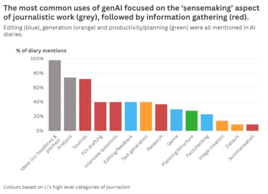 It’s not just that marks were higher — but why
 The AI diary itself contributed most to the higher marks — but the journalism itself also improved. Why?
Part of the reason was that inserting AI into the production process, and having to record and annotate that in a diary, provided a space for students to reflect on that process.
This was most visible in pre-production stages such as idea generation and development, sourcing and planning. What might otherwise take place entirely internally or informally was externalised and formalised in the form of genAI prompts.
This was a revelation: the very act of prompting — regardless of the response — encouraged reflection.
In the terms of Nobel prize-winning psychologist Daniel Kahneman, what appeared to be happening was a switch from System 1 thinking (“fast, automatic, and intuitive”) to System 2 thinking (“slow, deliberate, and conscious, requiring intentional effort”).

For example, instead of pursuing their first idea for a story, students devoted more thought to the idea development process. The result was the development of (and opportunity to choose) much stronger story ideas as a result.
Similarly, more and better sources were identified for interview, and the planning of interview approaches and questions became more strategic and professional.
These were all principles that had been taught multiple times across the course as a whole — but the discipline to stop and think, reflect and plan, outside of workshop activities was enforced by the systematic use of AI.
Applying the literature, not just quoting itWhen it came to the AI diaries themselves, students referenced more literature than they had in previous years’ traditional critical evaluations. The diaries made more connections to that literature, and showed a deeper understanding of and engagement with it.
In other words, students put their reading into practice more often throughout the process, instead of merely quoting it at the end.
 This prompt embeds knowledge about sourcing as well as prompt design
A useful side-benefit of the diary format was that it also made it easier to identify understanding, or a lack of understanding, because the notes could be explicitly connected to the practices being annotated.
It is possible that the AI diary format made it clearer what the purpose of reading is on a journalism degree — not to merely pass an assignment, but to be a better journalist.
The obvious employability benefits of developing prompt design skills may have also motivated more independent reading — there was certainly more focus on this area than any other aspect of journalism practice, while the least-explored areas of literature tended to be less practical considerations such as ethics.
Students’ opinions on AI were very mixed — and converged Responses to the survey showed attitudes becoming more sophisticated
 Responses to the survey showed attitudes becoming more sophisticated
This critical thinking also showed itself in how opinions on generative AI technology developed in the group.
Surveys taken at the start and end of the module found that students’ feelings about AI became more sophisticated: those with anti- or pro-genAI positions at the start expressed a more nuanced understanding at the end. Crucially, there was a reduction in trust in AI, which has been found to be important for critical thinking.
An AI diary allows you to see how people really use technologyOne of the unexpected benefits of the AI diary format was providing a window into how people actually used generative AI tools. By getting students to complete diary-based activities in classes, and reviewing the diaries throughout the module (both inside and outside class), it was possible to identify and address themes early on, both individually and as a group. These included:
Trusting technology too much, especially in areas of low confidence such as data analysisAssuming that ChatGPT etc. understood a concept or framework without it being explainedAssuming that ChatGPT etc. was able to understand by providing a link instead of a summaryA need to make the implicit (e.g. genre, audience) explicitTrying to instruct AI in a concept or framework before they had fully understood it themselvesThese themes suggest potential areas for future teaching such as identifying areas of low confidence, or less-documented concepts, as ‘high risk’ for the use of AI, and the need for checklists to ensure contexts such as genre, audience, etc. are embedded into prompt design.
There were also some novel experiments which suggested new ways to test generative AI, such as the student who invented a footballer to check ChatGPT’s lack of criticality (it failed to challenge the misinformation).
 One student came up with a novel way to test ChatGPT’s tendency to hallucinateBarriers to transparency still remain
Although the AI diary did succeed in students identifying where they had used tools to generate content or improve their own writing, it was clear that barriers remained for some students.
I have a feeling that part of the barrier lies in the challenge genAI presents to our sense of creativity. This is an internal barrier as much as an external one: in pedagogical terms, we might be looking at a challenge for transformative learning — specifically a “disorienting dilemma”, where assumptions are questioned and beliefs are changed.
It is not just in the AI sphere where seeking or obtaining help is often accompanied by a sense of shame: we want to be able to say “I made that”, even when we only part-authored something (and there are plenty of examples of journalists wishing to take sole credit for stories that others initiated, researched, or edited).
Giving permission will not be enough on its own in these situations.
So it may be that we need to engage more directly in these debates, and present students with disorienting dilemmas, to help students arrive at a place where they feel comfortable admitting just how much AI may have contributed to their creative output. Part of this lies in acknowledging the creativity involved in effective prompts, ‘stewardship‘, and response editing.
Another option would be to require particular activities to be completed: for example, a requirement that work is reviewed by AI and there be some reflection on that (and a decision about which recommendations to follow).
Reducing barriers to declaration could also be achieved by reducing the effort required, by providing an explicit, structured ‘checklist’ of how AI was used in each story, rather than relying solely on the AI diary to do this.
Each story might be accompanied by a table, for example, where the student declares ticks a series of boxes indicating where AI was used, from generating the idea itself, to background research, identifying sources, planning, generating content, and editing. Literature on how news organisations approach transparency in the use of AI should be incorporated into teaching.
AI generation raises new challenges around editing and transparencyI held back from getting students to generate drafts of stories themselves using AI, and this was perhaps a mistake. Those who did experiment with this application of genAI generally did so badly because they were ill-equipped to recognise the flaws in AI-generated material, or to edit effectively. And they failed to engage with debates around transparency.
Those skills are going to be increasingly important in AI-augmented roles, so the next challenge is how (and if) to build those.
The obvious problem? Those skills also make it easier for any AI plagiarism to go undetected.
There are two obvious strategies to adopt here: the first is to require stories to be based on an initial AI-generated draft (so there is no doubt about authorship); the second is to create controlled conditions (i.e. exams) for any writing assessment where you want to assess the person’s own writing skills rather than their editing skills.
Either way, any introduction of these skills needs to be considered beyond the individual module, as students may also apply these skills in other modules.
A module is not enoughIn fact, it is clear that one module isn’t enough to address all of the challenges that AI presents.
At the most basic level, a critical understanding of how generative AI works (it’s not a search engine!), where it is most useful (not for text generation!), and what professional use looks like (e.g. risk assessment) should be foundational knowledge on any journalism degree. Not teaching it from day one would be like having students starting a course without knowing how to use a computer.
Designing prompts — specifically role prompting — provides a great method for encouraging students to explore and articulate qualities and practices of professionalism. Take this example:
"You are an editor who checks every fact in a story, is sceptical about every claim, corrects spelling and grammar for clarity, and is ruthless in cutting out unnecessary detail. In addition to all the above, you check that the structure of the story follows newswriting conventions, and that the angle of the story is relevant to the target audience of people working in the health sector. Part of your job involves applying guidelines on best practice in reporting particular subjects (such as disability, mental health, ethnicity, etc). Provide feedback on this story draft..."
Here the process of prompt design doubles as a research task, with a practical application, and results that the student can compare and review.
7 prompt design techniques for generative AI every journalist should know
Those ‘disorienting dilemmas’ that challenge a student’s sense of identity are also well suited for exploration early on in a course: what exactly is a journalist if they don’t write the story itself? Where do we contribute value? What is creativity? How do we know what to believe? These are fundamental questions that AI forces us to confront.
And the answers can be liberating: we can shift the focus from quantity to quality; from content to original newsgathering; from authority to trust.
Now I’ve just got to decide which bits I can fit into the module next year.
June 19, 2025
How to reduce the environmental impact of using AI
 One of the biggest concerns over the use of generative AI tools like ChatGPT is their environmental impact. But what is that impact — and what
strategies are there for reducing it? Here is what we know so far — and some suggestions for good practice.
One of the biggest concerns over the use of generative AI tools like ChatGPT is their environmental impact. But what is that impact — and what
strategies are there for reducing it? Here is what we know so far — and some suggestions for good practice.What exactly is the environmental impact of using generative AI? It’s not an easy question to answer, as the MIT Technology Review’s James O’Donnell and Casey Crownhart found when they set out to find some answers.
“The common understanding of AI’s energy consumption,” they write, “is full of holes.”
Challenges include the variety of language models (LLMs) used by different platforms, the lack of transparency from providers, and differences in the energy grid (e.g. the mix of renewables and fossil fuels) and cooling methods used.
It is also a constantly changing picture: early, widely cited, estimates of ChatGPT’s energy usage are now understood to have overestimated the figure. DeepSeek demonstrated that AI could be developed in a much more energy-efficient way, and smaller models are now as effective as the large models launched two years earlier. The “average energy efficiency of hardware used by AI systems improves by about 40% annually“, and less water-intensive cooling systems are also being explored.
Against those downward forces, however, are trends that can intensify energy costs: genAI models are still getting bigger (using more energy) and the Jevons paradox suggests efficiency often simply leads to increased consumption.
How much energy does a genAI query use?O’Donnell and Crownhart’s reporting estimated that energy used by a prompt ranged between 57 joules (for prompts using a small model) and 3,353 (for a large one), or 114-6,706 joules “when accounting for cooling, other computations, and other demands”.
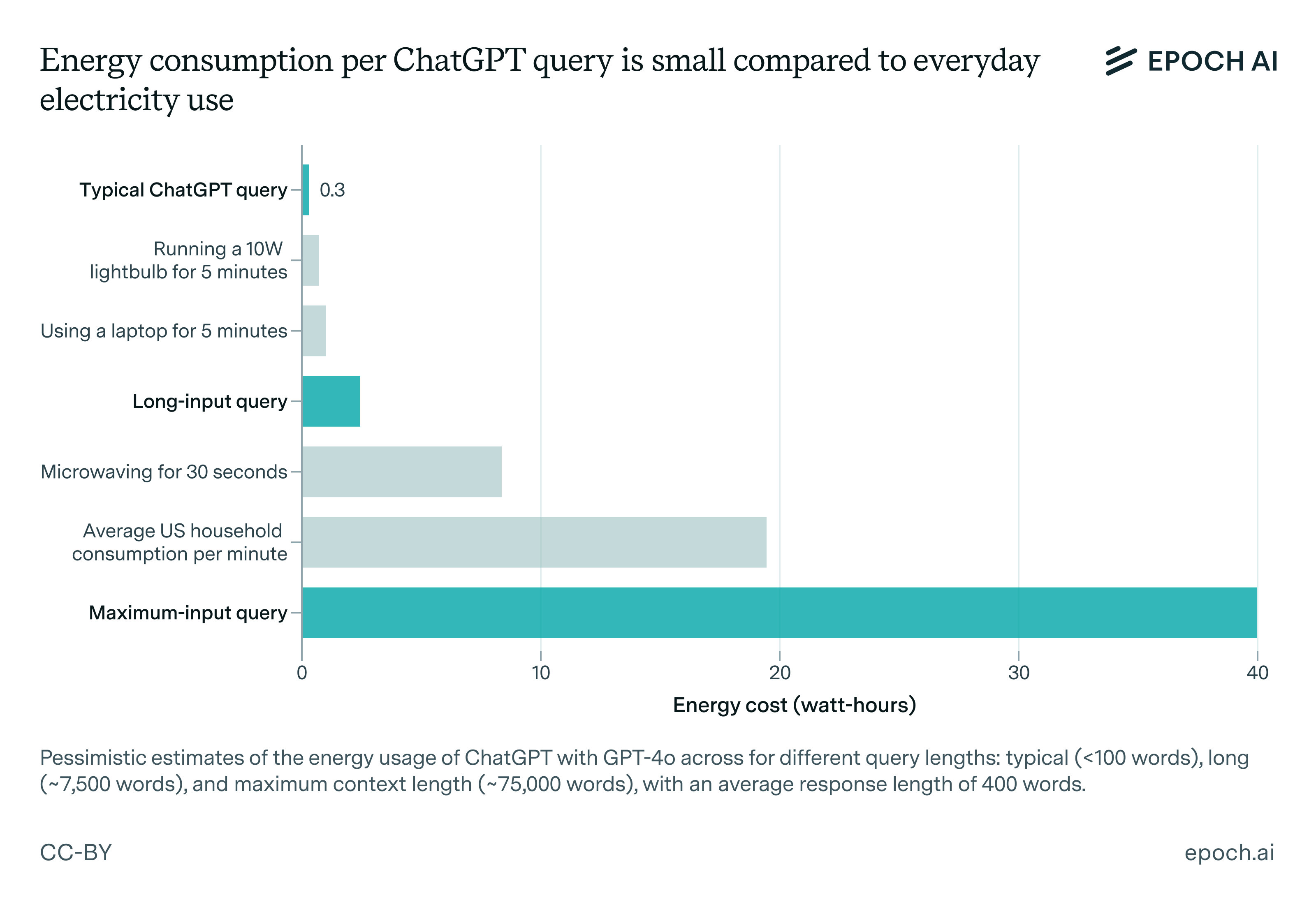
Josh You‘s estimate for Epoch AI of 1,080 joules, or 0.3 watt-hours (Wh), for ChatGPT queries — equivalent to using a laptop or lightbulb for five minutes — sits at the lower end of that range, while a recent preprint introducing an “infrastructure-aware benchmarking framework” for measuring environmental impact of AI models puts the figure at 1,548 joules (0.43 Wh).
Dr Marlen Komorowski warns against “eco-shaming” around the use of AI, comparing coverage to previous stories on new technologies:
“In the early 2010s, data centers themselves faced dire predictions [then] headlines abounded about Bitcoin’s colossal electricity usage – sometimes rightly so … and it spurred change … Those worst-case scenarios didn’t materialize – thanks to huge improvements in efficiency [and use of renewables]”
She argues that the focus on individual use of technology can be misplaced, repeating a tactic popularised by BP with the ‘carbon footprint’ calculator, “implicitly telling us that climate change is due to our individual choices”.
Reflecting on his own reporting on the environmental costs of generative AI, James O’Donnell comes to similar conclusions:
Learning from other experiences
“It’s likely that asking a chatbot for help with a travel plan does not meaningfully increase your carbon footprint. Video generation might. But after reporting on this for months, I think there are more important questions.
“Water being drained from aquifers in the country’s driest state to power data centers that are drawn to the area by tax incentives and easy permitting processes. Or how Meta’s largest data center project is relying on natural gas despite industry promises to use clean energy. Or the fact that nuclear energy is not the silver bullet that AI companies often make it out to be.”
In 2019, when Le Monde launched a video series about climate issues, they “realised there was an inherent contradiction in the fact that we would be reporting about the climate crisis, but taking loads of flights to do so,” Charles-Henry Groult, Head of Video at Le Monde, told Reuters Institute.
The organisation used the opportunity to assess the environmental impact of their reporting:
“Each time a journalist travelled for a story, they would input [on a spreadsheet] the distance travelled and the transport method used (“Paris to Marseille, 750 kilometres, via TGV train”) to estimate the carbon footprint of the trip. They also added a column with a rough calculation of the carbon emissions that a day of shooting video and a day of editing would produce. They then listed the ‘carbon cost’ of each story in the video credits.”
After a year of monitoring, they established new policies for reporting, including not taking flights within the country, and using public transport within the city.
The comparisons between AI energy usage, laptops and lightbulbs are instructive: it’s not just ChatGPT that comes with an environmental cost (streaming video, for example, is especially energy-intensive, yet not nearly discussed as much) — and reporters and organisations already have experiences in addressing this.
Start with a clean sheet: opt out of training, turn off automatic AI, or change toolA simple first step to reducing the impact of using AI is to turn off the increasingly built-in activation of AI functionality. Disabling Copilot in Microsoft, for example, the AI assistant in Adobe, or Google Sheets’s AI-powered autofill.
For security reasons as well as environmental ones, you may want to opt out of your data being used for AI training. Matt Burgess’s Wired guide to stop your data being used to train AI lists the various platforms — from Adobe and Amazon to Rev and LinkedIn — where you need to opt out.
In some cases it’s not possible to turn features off. Google’s AI Overview search results, for example, can only currently be disabled through a URL hack. If you don’t want your search results to include AI generated summaries, then, your best option is to switch to a search engine like DuckDuckGo which allows you to turn off AI.
Weigh up the pros and cons of using AI for a task
Just because you can use AI, doesn’t mean you should: for many tasks, a non-AI method is still ‘good enough’.
A good example is research — one of the most widely-used applications of AI. Many questions asked via ChatGPT can be answered just as well, or even better, through a search engine, a book, email or phone call.
If your question requires particular types of sources, then AI might not be the best tool for the job, as it is poor at distinguishing between expertise and amateurs.
AI responses to a search question can also be unreliable and poor quality, especially if there is very little information online (in its training data). Consider how much extra time may be required for verifying AI responses, as this can render it less efficient research tool.
Image generation is another area where alternative options may be better. For example, you might only use AI tools where the image you need is unlikely to exist (like a hallucinating elephant).
Video generation with AI is on a whole other level when it comes to the energy costs: a video as short as five seconds uses 42,000 times as much energy as a text query — “enough to power a microwave for over an hour” according to O’Donnell. That might still be less than the combined impact of a full video production — but if the alternative was a static image, is it really worth it?
Skill up: learn prompt design techniquesKnowing basic prompt design techniques can massively reduce the number of prompts you will need to use in a tool like ChatGPT — and therefore, the environmental impact.
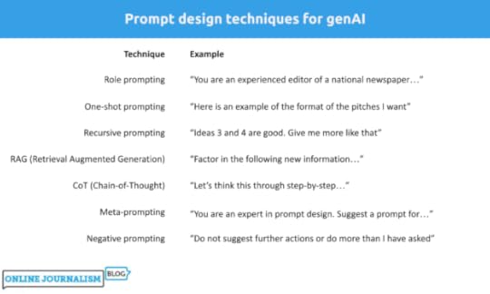
Some prompt design techniques are more resource-intensive: recursive prompting, for example, involves improving the quality of responses through a series of follow-up prompts that provide feedback on previous responses, and so it can result in more interactions than might be necessary.
Negative prompting, in contrast, involves setting limits on what the AI model does, and so is likely to reduce generative AI’s tendency to do more than you’ve asked, and use more words than are necessary.
Some techniques might initially be more resource-intensive but save energy in the long run.
RAG (Retrieval Augmented Generation), for example, involves ‘augmenting’ your prompt with extra information such as text pasted from your research, or a document or data. Processing that information takes extra energy — but if it reduces the number of prompts and responses overall (by producing usable results earlier), then this can be more efficient.
The same applies to Chain-of-Thought (CoT) and n-shot prompting: by specifying the steps you want the model to take (CoT) or providing examples (n-shot), it uses more energy — but if it reduces the number of prompts needed to get to a usable result, then it may be a better strategy.
Plan and template your prompts (minimise iteration)Once you’ve learned prompt techniques, you can start to plan prompts.
Drafting prompts outside of the genAI tool, and reviewing them to ensure they are as effective as possible, is another step to reducing the amount of energy used within genAI tools.
Where AI is used repeatedly for similar tasks, it is worth considering templating certain prompts: this means identifying and embedding best practice in a template prompt that colleagues can adapt to their own particular purpose, again ensuring that fewer prompts are needed to get to a usable result.
Use a smaller model Image from How Hungry is AI? Benchmarking Energy, Water, and Carbon Footprint of LLM Inference
Each AI platform uses a different large language model — and those models regularly change. Last month, for example, Claude switched to a new model.
Each model uses different amounts of energy, so it’s worth trying smaller models (which tend to be less energy intensive) to see if they work for you.
To see which model is currently being used, look in the upper left corner (ChatGPT and Gemini) or under the text box (Claude). You can click on the current model to select a different model. Some will only be available if you have a paid account.
Frustratingly, research attempting to benchmark different models does suffer from a time lag. So, for example, it’s possible to know that Claude 3.7 Sonnet probably uses less energy than 3.5 — but not how either compares to the newly released model. And new announcements don’t typically include this information.
What we can see is that GPT-4o (the current ChatGPT model) appears to consume less energy than Claude’s models, and Meta’s Llama model is more efficient than either.
If you are able to download a model and run it locally, then that will also reduce your environmental impact — and open up more models. The Hugging Face leaderboard offers an ongoing comparison of (typically lesser-known) models’ energy use across different use cases. You can also test or download older, smaller models such as GPT-2.
Stop being politetens of millions of dollars well spent–you never know
— Sam Altman (@sama) April 16, 2025
A final simple way to reduce your environmental impact is to avoid being nice to our new robot overlords. Earlier this year the OpenAI CEO Sam Altman admitted that using “please” and “thank you” in prompts led to extra costs for the company.
Do you have any tips on reducing the environmental impact of AI usage, or techniques for deciding when to use it? Please share them in the comments or on LinkedIn @paulbradshawuk.
June 5, 2025
Die umgekehrte Pyramide des Datenjournalismus: Vom Datensatz zur Story

Datenjournalistische Projekte lassen sich in einzelne Schritte aufteilen – jeder einzelne Schritt bringt eigene Herausforderungen. Um dir zu helfen, habe ich die “Umgekehrte Pyramide des Datenjournalismus” entwickelt. Sie zeigt, wie du aus einer Idee eine fokussierte Datengeschichte machst. Ich erkläre dir Schritt für Schritt, worauf du achten solltest, und gebe dir Tipps, wie du typische Stolpersteine vermeiden kannst.
(Auch auf Englisch, Spanisch, Finnisch, Russisch and Ukrainisch verfügbar.)
Schritt 1: Ideen entwickelnAm Anfang steht die Frage: Wie kommst du zu einer Idee für eine datenbasierte Geschichte?
Es gibt mindestens sieben typische Wege, wie du zu guten Ideen kommen kannst:
Du schaust dir öffentlich verfügbare Daten an.Du erhältst exklusiven Zugang zu einem Datensatz.Du entwickelst eine frühere, auf Daten basierende Geschichte weiter.Du reagierst auf eine aktuelle Nachricht, die du weiterentwickelst.Du stellst eine Frage, der du nachgehst.Du bekommst einen Hinweis auf spannende Daten.Du spielst mit Daten herum und stößt auf etwas Interessantes.
Ideen, die nicht direkt aus einem Datensatz kommen – etwa aus einer Frage, einem Tipp oder als Nachzug zu einer Nachricht – sind oft schwieriger umzusetzen. In solchen Fällen musst du prüfen, ob es überhaupt passende Daten gibt und was sie tatsächlich aussagen.
In How to brainstorm COVID-19 data story ideas stelle ich dir geeignete Herangehensweisen vor. Weitere Rechercheansätze lernst du in How to use the ‘4 stages of curiosity’ as a framework for investigations und Empathy as an investigative tool: how to map systems to come up with story ideas kennen.
Wenn du dagegen mit einem Datensatz startest, musst du herausfinden, welche Story-Perspektiven darin stecken. Frag dich:
Welche Daten gibt es in den verschiedenen Spalten? (Was wird gemessen)Was erzählen die Daten? (Welche Geschichten könnte man damit erzählen)Was fehlt? (Was wird nicht gemessen)In Here are the angles journalists use most often to tell the stories in data erkläre ich, wie du für die Daten, die du hast, den richtigen Dreh (die richtige Erzählperspektive) finden kannst.
 Verfügt dein Datensatz über zeitliche Informationen (zum Beispiel Monate oder Jahre) kannst du erzählen, wie sich etwas über die Zeit entwickelt hat.Wenn in deinen Daten Ortsangaben oder andere Kategorien sind, kannst du Ranglisten erstellen oder Unterschiede aufzeigen.Fast alle Daten erlauben Aussagen über Größenordnungen.Schritt 2: Daten sammeln
Manchmal geht’s ganz einfach, oft ist die Beschaffung der Daten aber schon ein Projekt für sich.
Am einfachsten ist es, wenn die passenden Daten bereits vorhanden sind, etwa auf Seiten, wo sie regelmäßig bereitgestellt werden. Oder du bekommst Daten mit einer Pressemitteilung zugeschickt.Du findest Daten über fortgeschrittene Suchtechniken.Du holst Daten per API und etwas Code.Du scrapest mithilfe eines Skripts Daten aus dem Internet, um mehrere Seiten oder Dokumente zu durchsuchen und die Informationen in einer Tabelle zusammenzuführen.Du wandelst unstrukturierte Inhalte wie Texte in auswertbare Daten um.Du sammelst Daten selbst – über Beobachtungen, Umfragen oder Crowdsourcing.Letzteres ist aufwändig und daher eher die Ausnahme.
Der 2. Schritt ist zentral, denn es kann gut sein, dass du zu einem späteren Zeitpunkt darauf zurückkommen musst. Zum Beispiel, um vorhandene Daten zu bereinigen, sie in Kontext zu stellen und zu kombinieren, sowie um die Ergebnisse besser zu erklären.
Wichtig: Hinterfrage immer deine Perspektive und suche nach blinden Flecken: Wessen Perspektive bilden die Datensätze ab, die du gefunden hast? Wessen Stimme fehlt? Suchst du nur in öffentlich zugänglichen Datensätzen? Welche unveröffentlichten Daten könnten spannend sein? Wäre es möglich, selbst Daten zu sammeln? Konzentrierst du dich auf Daten des öffentlichen Sektors? Was ist mit dem privaten Sektor? Hast du Vorlieben für bestimmte Arten von Datengeschichten und siehst für das Publikum spannendere Zugänge deshalb nicht?Stell dir immer wieder die Frage: Habe ich die beste Quelle? Ist sie glaubwürdig? Wie zuverlässig ist die Methode?Schritt 3: Daten reinigenEin Datensatz allein bringt noch keine verlässlichen Aussagen. Du musst der Qualität der Daten trauen können – und dazu musst du die Daten in vielen Fällen bereinigen.
 Aus What is dirty data and how do I clean it? A great big guide for data journalistsSchritt 4: Daten kontextualisieren
Daten zeigen nie die ganze Geschichte. Damit wir Antworten auf unsere Fragen bekommen, müssen wir sie in einen geeigneten Kontext stellen. Denn Daten spiegeln immer eine bestimmte Perspektive — mit eigenen Interessen, blinken Flecken und Zielen.
Stell dir deshalb diese Fragen:
Wer hat die Daten gesammelt? Wann? Und du welchem Zweck?Wie wurden die Daten gesammelt (Methodik)?Was bedeuten die Kategorien / Klassifikationen genau? Haben sie in der Fachsprache eine besondere Bedeutung?Was sagen die Daten aus?Oft musst du noch weitere Informationen sammeln, um die ursprünglichen Daten richtig einordnen zu können. Die Zahl der Straftaten in einer Stadt zum Beispiel sagt alleine wenig aus. Hilfreiche Zusatzinformationen können sein:
Wie viele Menschen leben in der Stadt? Wie stark ist die Zahl der Straftaten in den letzten fünf Jahren gestiegen? Wie viele Polizistinnen und Polizisten gibt es?Wie nehmen Menschen die Kriminalität wahr?Was sagen Verurteilungsquoten?Wie genau werden die Kategorien von Kriminalität definiert?Ein grundlegendes Statistik-Wissen hilft dir enorm weiter. Eine einfach lesbare Einführung findest du bei “Statistik für Dummies“. Wenn du dich vertiefen willst, dann lies “Statistik für Journalist:innen“. “So lügt man mit Statistik” ist eine zwar etwas polemische, aber dafür sehr unterhaltsame Annäherung an das Thema. Auch zu empfehlen ist der BBC-Podcast “More or Less” rein und das Buch “The Tiger That Isn’t“, das sie Podcast-Moderatoren geschrieben.
Schritt 5: KombinierenNatürlich können gute Geschichten auch in einem einzigen Datensatz stecken. Viele der guten Geschichten entstehen aber erst dann, wenn du verschiedene Datensätze miteinander kombinierst. Durch das Verbinden schaffst du Kontext, der dir hilft, Antworten auf deine Fragen zu finden:
Du kombinierst neue Daten mit älteren, um eine Geschichte über Veränderung zu erzählen.Du verknüpfst Daten über Ereignisse mit Bevölkerungsdaten, um eine Geschichte über den Umfang pro Person (oder pro 10.000 Personen usw.) zu erzählen.Du verbindest Leistungsdaten von Schulen oder Spitälern mit Standorten, um Ranglisten und regionale Unterschiede sichtbar zu machen.Du legst Statistik auf Kartenmaterial, um räumliche Muster zu zeigen – wie bei Die Spur des Geldes: Prioritäten der EU-Migrationspoliti, Die Stadtflucht, oder Mein Viertel, eine BlaseWichtig dabei: Beide Datensätze müssen eine gemeinsame Größe haben, über die sie verbunden werden können – etwa Codes, Namen oder Jahreszahlen.
Beim Kombinieren kann es sein, dass du zum Schritt 3, der Reinigung der Daten zurück musst. In unterschiedlichen Datensätzen können dieselben Daten verschiedene Bezeichnungen haben: Institutionen oder Gebiete können leicht unterschiedlich benannt sein oder ein Datensatz verwendet beispielsweise ‘und’, während der andere ‘&’ nutzt. Wenn immer möglich solltest du, wenn Datensätze mit Codes arbeiten, diese statt Namen verwenden, sie sind viel zuverlässiger.
Schritt 6: KommunizierenDaten sind prädestiniert für Visualisierungen. Es liegt deshalb nahe, dass du aus den Daten eine Karte, ein Diagramm oder eine Infografik machst. Aber das ist nur eine Möglichkeit. Du kannst deine Datengeschichten auch ganz anders erzählen:
mit einem gut strukturierten Text zu den Ergebnissen (z.B. Bulletpoint-Liste).mit konkreten Beispielen von Protagonistinnen oder Protagonisten, die den Daten ein Gesicht verleihen.mit Anwendungen, mit denen das Publikum Daten selbst durchsuchen kann. mit Hilfestellungen, die es dem Publikum ermöglichen, ein Problem zu lösen.Weil es dazu (siehe Diagramm unten) noch so viel zu sagen gibt, habe ich dazu einen separaten Beitrag geschrieben. Ich freue mich über dein Feedback zur Pyramide!
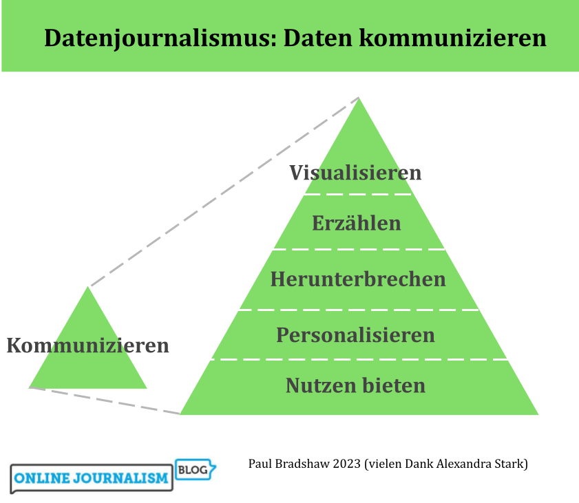
Übersetzt mit Hilfe von Alexandra Stark