Analyzing an Extremely Deceiving Covid Deaths Graph
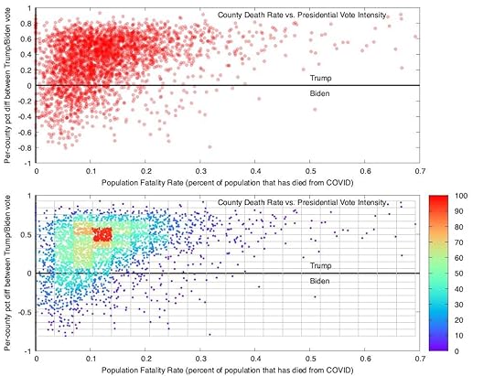
The graph on the top of the page compares covid death rates in United States counties based on the percentage of the popular vote of the…


No comments have been added yet.
The graph on the top of the page compares covid death rates in United States counties based on the percentage of the popular vote of the…