Poll
Hi everyone, I would really love to hear your opinion...
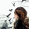
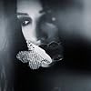
I received a big surprise last week. One of my readers, the talented Derek Murphy, spontaneously decided to design a new cover for my post-apocalyptic paranormal, Wormwood. He did three separate mock-ups, all of which are amazing.
But which should I pick?
Could you help me decide by telling me which is your favourite?
To help get a feel for the story, here's a quick blurb:
Against a devastated, post-apocalyptic landscape, a legion of one hundred fierce half-angels is hell bent on purging the Earth of all humans. But one of them, the tormented Tiamat, struggles against his mission, and when he rescues a beautiful woman named Kali, he finds the attraction as troubling as it is dangerous. Can Kali trust the one creature who could be responsible for her ultimate demise?
Thanks so much! ~D.H. Nevins


Poll added by: D.H.
This Poll is About

Comments Showing 1-44 of 44 (44 new)
date newest »
message 1:
by
Gertie
(new)
Jun 01, 2014 09:31AM
 I can't decide!
reply
|
flag
 Either 1 or 3...
 I'm partial to #1. When you decide visit my site at www.thehawthornebooks.com/wall.html - I'd love to see your book there!
 I voted for no. 3, but I also love No.1...
Deborah wrote: "I voted for no. 3, but I also love No.1..."
I voted for no. 3, but I also love No.1...
Deborah wrote: "I voted for no. 3, but I also love No.1..."I like #1 and #2... maybe a combination of the two... more colors and the 'Wormwood' font from #1 incorporated into #2.
Christopher wrote: "Deborah wrote: "I voted for no. 3, but I also love No.1..."I like #1 and #2... maybe a combination of the two... more colors and the 'Wormwood' font from #1 incorporated into #2."
That sounds good - it's the extra colour in #1 that makes it stand out for me.
 I like #1 in theory, but it almost feels like too much. Like it is over stimulating and hard for my eyes to focus on what is going on, so I lean towards favoring #2. Its simpler, so it draws my eyes straight to the girl, and then I didn't realize those were feathers on #1 until I saw the wings on #2. If it were me, maybe I'd lean towards #2 with just a touch more orange, which I like from #1. :) . . . But the top 2 are both eye catching. I like the face less, because I prefer to decide for myself how characters look, and that shows so much.
 I like #3 :) I have a thing for cool eyes :)
 As a graphic designer and having been in the business 35 years, #3 is the best choice. It's the only one where you can clearly read the title and the only one which shows your protagonist. Readers are much more intrigued by a facial image than things. And the cover is ALL about making the book intriguing enough to pick up and browse through it.
 #3 has my vote. You can't go wrong with women and angels.
 I like #2, it seems to be more of what the book is like than #3. but I would make your name at the bottom the same size as #3

 I am in love with the original but if I had to choose a new one I would pick #2

 The cover, like any story, is subjective to the reader. But regardless of what you put on the book here are the absolute facts:
A reader will dwell on the front for a maximum average of 3 seconds – it’s called ‘the grab’ – doesn’t matter if they read your name or your title – the picture must say a thousand words in those 3 seconds.
In the next two seconds, (if grabbed), 32.4% will look for the title and your name, the majority, 67.6% will flip it over to read the blurb. IT’s the blurb that sends them to the cash register. Some, 17.25%, will go there directly, 82.75% will read a few inside pages first—but either way, it’s the blurb that is your greatest tool AFTER the first 3 seconds.
For me—and remember I said this is subjective—book 1 is the only cover that will make me pick it up and flip to the blub.
 Number three for me, I love the simplicity of it, the title stands out and your name stands out, if I were buying your book in anyone of our bookshops I would definitely pick this one up first.....

 Wow! How nice of him. All of these are good! If your audience is primarily female, I'd go with 3. If your audience is male and female, I'd go with 2.

 Craig wrote: "As a graphic designer and having been in the business 35 years, #3 is the best choice. It's the only one where you can clearly read the title and the only one which shows your protagonist. Readers ..."
I agree!
 These are all awesome!!!! One or three. Can't decide.

 My daughter and I like #1 BUT I am also partial to #3... :)

 Can you put the wormwood font from cover #1 onto cover #3?

 I like #1 best and believe it best fits the brief description of the book, but I also believe #3 is currently more in vogue and might sell better.
 #3 is the one I was immediately drawn to.
 My preference is #1; it wins on color and font for me.
 #3 speaks to me and draws me in, while #2 asks me to follow her into your world. The rich colors in #1 are eye-catching. Tough choice, but I'm partial to #3.
 Those are all so gorgeous, any one of them would do! but, I am going with the Majority, the top one!
Truly awesome-epic cover art!
:)
 All these covers are good. Great use of color and design. But Cover #3 is striking, memorable. I choose #3.
Sharon Pennington
 The top one really is exciting, and draws you in to the art. I also love the typeface, and the fact that it is partially obscured and yet is still highly readable. As a post-apocalyptic, a clear, blunt type-style is not as appropriate as a 'broken' one.
 The second one is more "washed out" than anything. It doesn't draw my eye as much as either of the others do.
The third one bothers me because it looks much more like a Paranormal Romance cover than anything else. If I were looking at the cover on a shelf, I would be surprised to find that it is a post-apocalyptic tale. As others have said, the eyes are really nice - however, if you pull up every PR book on the shelves you will note that it has much in common with that style genre cover - as well as lending a feeling of a young adult novel. Not exactly appropriate to your work.
Overall, all are awesome though. Derek Murphy is an amazing artist!
Leiah
soireadthisbooktoday.com
Hamilton wrote: "The cover, like any story, is subjective to the reader. But regardless of what you put on the book here are the absolute facts:A reader will dwell on the front for a maximum average of 3 seconds ..."
Exactly! Great, well reasoned comment.
 I like #1, I think it ties in with the story and definitely got my attention!
 #2 haha but you know that. Hey can we be friends in here?
 i voted for the first cover- but i think they all look great. I would read all of them just based on the cover
 WOW Derek. Awesome job. I love them all, but I chose the first one. I am addicted to eye candy. I couldn't help but keep looking and trying to pick out all the wonderful elements. Very colorful too. It is so nice to hear from you and I hope all is going well in your world. If you change the cover and need a promo, let me know. ^_^
 1 or 3, having read the book. They're gorgeous!
 I'm a very visual person, as are most readers I know. My eyes stopped at the third cover regardless of it being placed last. I went through the first, second and the third captured my interest. I love it.
 I've voted for the 3rd, since it is the only one that hints on romance. The first one is good too, but it gives the idea that it is "strait" fantasy without romance - it is more "violent", while the 3rd is more "emotional". :)
 The pictures aren't loading for me...
 Faith wrote: "The pictures aren't loading for me..."
Thanks for the heads up, Faith. I noticed they aren't loading for me either. This poll happened almost 4 years ago, and the new cover was picked long ago, but it's still fun to see the other cover mock-ups. I'll have to look into why the pictures don't seem to be there anymore.
Huh. Weird!