
Todd Klein's Blog
November 26, 2025
Rereading: THE HUNGRY TIGER OF OZ by Ruth Plumly Thompson
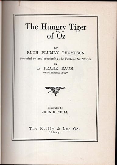
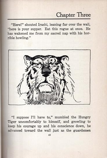
Thompson’s sixth Oz book is showing her settling into a pattern, and repeating some plot points from her previous books, but also creating interesting new characters and unseen corners in Oz and nearby Ev. The Pasha of Rash is ruler of one such Ev kingdom, a nasty and irritable ruler who keeps throwing his subjects into jail for hardly any reason. His Chief Scribe, Ippty is just as nasty, and they come up with a plan to get rid of all their prisoners. They will bring the Hungry Tiger of Oz to their jail, lock him up, and force him to eat the other prisoners. They succeed in getting him there, but he won’t cooperate.
Meanwhile, Betsy Bobbin is on her own adventure, and soon arrives in Rash too, with a new friend, the Vegetable Man Carter Green. And while they all hope Ozma will find out where they are and save them, Ozma is on another adventure in the upper atmosphere with a sky man, Atmos, who has carried her up there. And of course, in Ev one is soon likely to run into the Nomes and their king, who has his own ideas.
Reasonably fun to reread, not one of Thompson’s best, but entertaining.
The post Rereading: THE HUNGRY TIGER OF OZ by Ruth Plumly Thompson appeared first on Todd's Blog.


November 25, 2025
My Logos A-Z: CHAMELEON to COMIC
 Image © DC Comics
Chameleon Boy. Client: DC Comics. Medium: pen and ink or marker. Date: 1985. For Who’s Who #4, pretty bland, but I didn’t have much room.
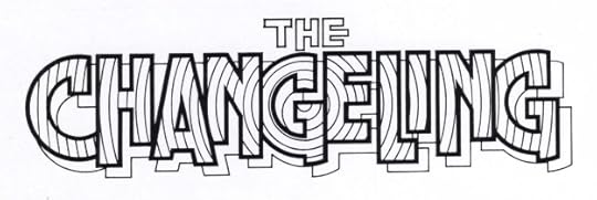 Image © DC Comics
The Changeling. Client: DC Comics. Medium: pen and ink. Date: 1981. Created for TALES OF THE NEW TEEN TITANS #3. I’m not sure where the concentric circles idea came from, it may have just occurred to me when I had laid out the block letters with the circular G in the center. They do add motion, but could be distracting if colored in contrasting alternate colors.
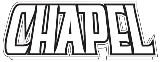 Image © Image Comics
Chapel. Client: Image Comics. Medium: digital. Date: 1995. At this time there was a small trend toward religious-sounding character names, Bishop was another one. I started with one of my title fonts and modified most of the letters. Used on eight issues from Image and one from Awesome.
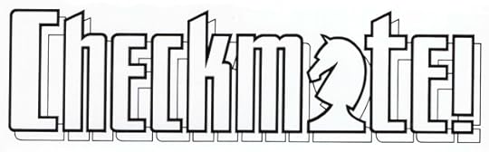 Image © DC Comics
Checkmate! Client: DC Comics. Medium: pen and ink. Date: 1987. I can’t tell you how pleased I was to use that knight chess piece in place of the A. I played chess a little growing up, and was probably the worst player in my high school chess club, but here I was able to play the game in my own way. Appeared on 33 issues.
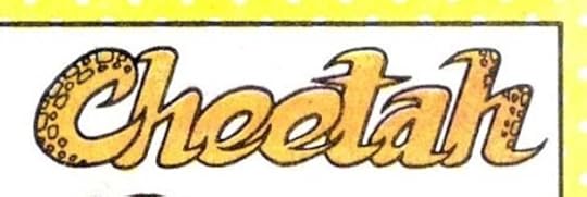 Image © DC Comics
Cheetah. Client: DC Comics. Medium: pen and ink or marker. Date: 1985. One of two I did for Who’s Who #4, this was the golden age version of the character.
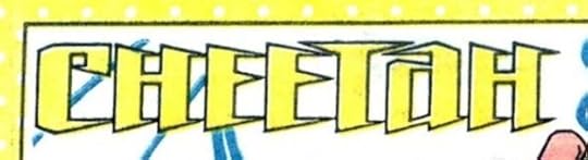 Image © DC Comics
Cheetah. Client: DC Comics. Medium: pen and ink or marker. Date: 1985. And this was the modern version of the time. The points kind of suggest claws on both, I guess.
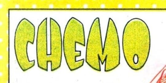 Image © DC Comics
Chemo. Client: DC Comics. Medium: pen and ink or marker. Date: 1985. Another for Who’s Who #4, I like these egg-shaped letters, though I can’t say why. Should have put small bubbles in them like the character has in his chemical body.
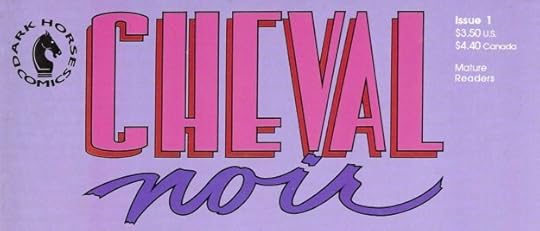 Image © Dark Horse Comics
Cheval Noir. Client: Dark Horse. Medium: pen and ink. Date: 1989. One of my first jobs for this publisher, and looking it up on the Grand Comics Database, the logo is co-credited to myself and Dave Stevens, who did some of the covers. Dave was an excellent designer as well as a wonderful artist, and I’m happy to share credit with him, though if I worked from his ideas, I didn’t know it. More likely he made changes after my version was accepted and sent in. The first issue, above, uses my script NOIR, but the CHEVAL might be by Dave. I’ve written about my process and sketches HERE.
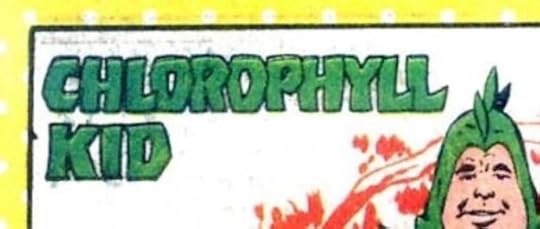 Image © DC Comics
Chlorophyll Kid. Client: DC Comics. Medium: pen and ink or marker. Date: 1985. These letters have a little bounce and personality to take them a small step above the usual bland block letters. For Who’s Who #4.
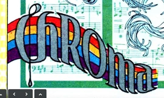 Image © DC Comics
Chroma. Client: DC Comics. Medium: pen and ink or marker. Date: 1987. For Who’s Who Update #2. More creative than most of these, combining music with a rainbow.
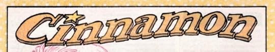 Image © DC Comics
Cinnamon. Client: DC Comics. Medium: pen and ink. Date: 1978. This female western character was created as a backup for one of DC’s western titles, and I lettered this name logo on the splash page of her first story in WEIRD WESTERN TALES #48. She also appeared in issue #49. I pulled out that logo for Who’s Who #5, seen here.
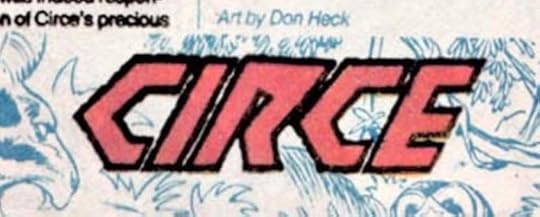 Image © DC Comics
Circe. Client: DC Comics. Medium: pen and ink or marker. Date: 1985 For Who’s Who #5.
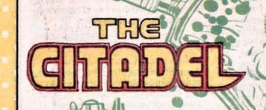 Image © DC Comics
The Citadel. Client: DC Comics. Medium: pen and ink or marker. Date: 1985. This one has a little more personality at least. For Who’s Who #5.
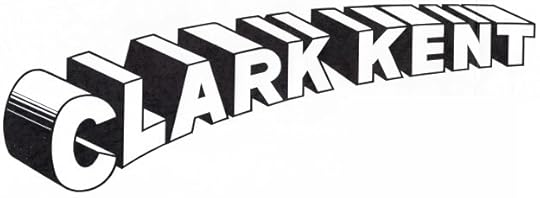 Image © DC Comics
Clark Kent. Client: DC Comics. Medium: pen and ink. Date: 1986. Somewhat puzzling, not sure if it was done for DC Licensing or for a comic. There’s a similar one on the cover of DC COMICS PRESENTS #79, but this has somewhat thicker letters and more accurate telescoping. That issue was published about a year before this was designed, so perhaps licensing saw it and wanted a better one.
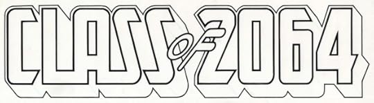 Image © DC Comics
Class of 2064. Client: DC Comics. Medium: pen and ink. Date: 1983. Designed for the series I wrote for NEW TALENT SHOWCASE, which appeared in issues 1-3 and 7-8. Most of the features did not have real logos, but of course I had to do one for mine! The date was almost 100 years ahead of my own high school time, 1965-69. Now we’re more than halfway there.
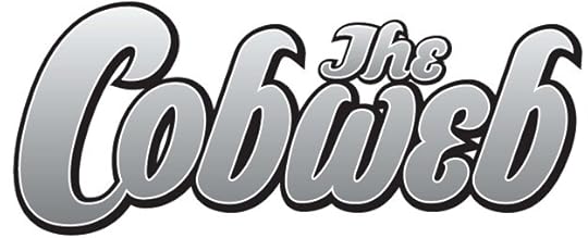 Image © DC Comics
The Cobweb. Client: America’s Best Comics. Medium: digital. Date: 1999. One of the features in TOMORROW STORIES written by Alan Moore, this one drawn by Melinda Gebbie and others, also used on a few covers. I think this began as a sketch and was developed in Adobe Illustrator. Appeared in 12 issues and a Special.
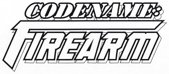 Image © Marvel
Codename: Firearm. Client: Malibu Comics. Medium: digital. Date: 1995. The first line uses a commercial stencil font, the second line uses one of my title fonts with the F extended to suggest a gun. Appeared on six issues.
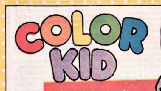 Image © DC Comics
Color Kid. Client: DC Comics. Medium: pen and ink or marker. Date: 1985. For Who’s Who #5. For some reason there were lots of characters beginning with C that didn’t have logos. Here the round letters are given a little energy with a rough outer line, and the coloring makes it work.
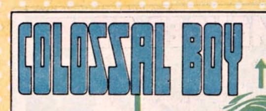 Image © DC Comics
Colossal Boy. Client: DC Comics. Medium: pen and ink or marker. Date: 1985. Another one for Who’s Who #5. Made it as tall as I could, and in this case allowed the bottom of each letter to be distorted thickly to add to the tall feeling, like platform shoes.
 © unknown
ComicArtCommissions.com. Client: GeorgiaWebPro. Medium: digital. Date: 2008. There’s still a website with this name, but I don’t see my logo on it, and the owner is someone else. Websites are so flighty. I used one of my title fonts.
Posts in this series are listed on the Logo Links page of my blog.
The post My Logos A-Z: CHAMELEON to COMIC appeared first on Todd's Blog.
November 23, 2025
My Music: I SIT BESIDE THE FIRE
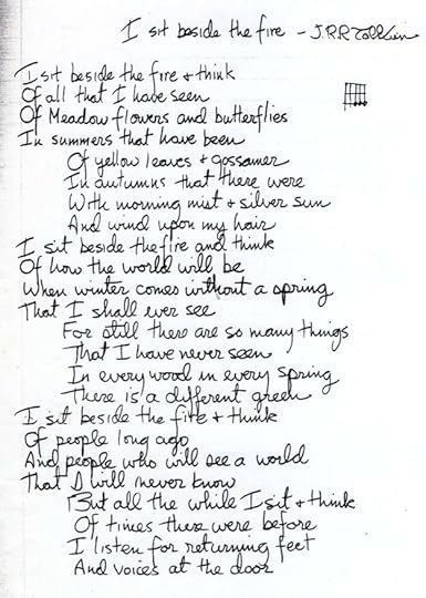
Around 1970, in addition to writing a few original songs, I tried putting short poems I liked to music, and this is the only one I still like and remember. Tolkien is one of my favorite writers, and this poem spoke to me back then, and does so even more now. I recorded it in September 2025 mixing several tracks for guitar, mountain dulcimer, vocal, and sound effects. I’ve heard several other songs adapting these words, my arrangement is simple, and I think effective. I Sit Beside the Fire.
No © on this one, the words are © the Tolkien Estate. And that wraps up this musical journey through 55 audio tracks, all listed on the My Music page of my blog. Thanks for listening.
The post My Music: I SIT BESIDE THE FIRE appeared first on Todd's Blog.
November 21, 2025
My Logos A-Z: CAPTAIN ATOM to CHALLENGERS
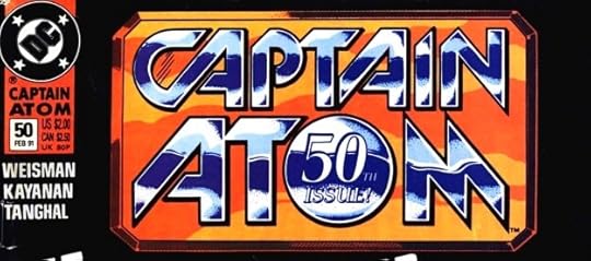 Image © DC Comics
Captain Atom (Issue 50). Client: DC Comics. Medium: pen and ink. Date: 1990. Sometimes DC asked for a special logo treatment for a particular issue. Here I started with Ken Bruzenak’s series logo and made it look shiny and metallic with inserts held here in purple. I also added the “50th Issue!” in the O, and probably the beveled frame around everything.
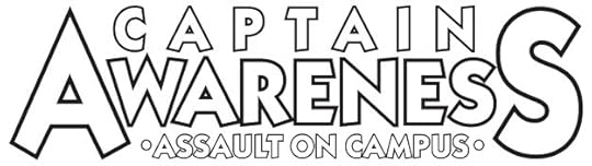 Image © Danny DeAngelo
Captain Awareness. Client: Danny DeAngelo. Medium: digital. Date: 1998. For a charity comic raising funds for “Assault on Campus.” This used a commercial font, and I didn’t do a lot with it. I probably designed it for no fee, as I do for charity projects. Used on one issue.
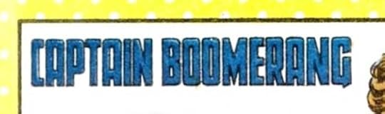 Image © DC Comics
Captain Boomerang. Client: DC Comics. Medium: pen and ink or marker. Date: 1985. For Who’s Who #4, standard tall block letters. I should have included a boomerang somewhere.
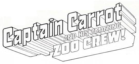 Image © DC Comics
Captain Carrot and his Amazing Zoo Crew. Client: DC Comics. Medium: pen and ink. Date: 1981. Gaspar Saladino had done a clever logo for this using letters shaped like carrots in his design, but DC wanted something simpler and more heroic. All the facets on the telescoping add complexity to this one, and should have been simplified, but it works okay in color. Gaspar’s version can be seen HERE. Used on 20 issues, and a modified version on a 2007 three-issue series.
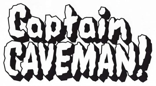 Image © DC Comics.
Captain Caveman. Client: DC Comics. Medium: digital. Date: 1999. DC was doing an anthology, CARTOON NETWORK PRESENTS, and I was asked to create or recreate logos for some of the Hanna-Barbera characters. This first appeared on issue #23 I think, I’m not sure where else. For some of these I was given reference, I think this one was just my idea. It has a Flintstones feel.
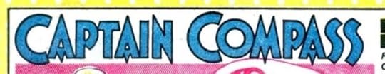 Image © DC Comics
Captain Compass. Client: DC Comics. Medium: pen and ink or marker. Date: 1985. This is a recreation of the logo on the backup series that ran in Detective Comics in the 1950s. I guess there was no image to be found in the DC files that could be used, so I probably photocopied a splash page from a bound volume in the DC library and traced it. The original might be by Ira Schnapp, I’m not sure.
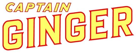 Image © Ahoy Comics
Captain Ginger. Client: Ahoy Comics. Medium: digital. Date: 2017. A space opera with anthropomorphic animals, the editor suggested I look at science fiction pulp magazine logos for ideas. We settled on Thrilling Wonder Stories, and this is based on the first two lines of that.
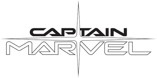 Image © Marvel
Captain Marvel. Client: Marvel Comics. Medium: digital. Date: 2002. An Alex Ross design that I traced in Adobe Illustrator over his pencils. I think it’s the sleekest and best logo design for any of the Captain Marvel characters.
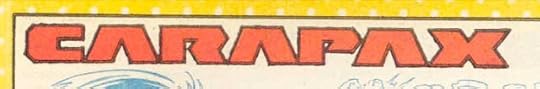 Image © DC Comics
Carapax. Client: DC Comics. Medium: pen and ink or marker. Date: 1987. Created for Who’s Who Update #1, clearly I had just that much space to fill.
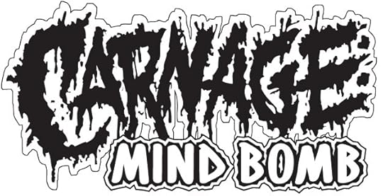 Image © Marvel
Carnage: Mind Bomb. Client: Marvel. Medium: digital. Date: 1995. The top line looks like it was created with a brush or ink bottle topper, and then traced in Illustrator. The second line is one of my title fonts. I didn’t get this messy very often in logo designs. Appeared on a single issue.
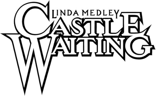 Image © Linda Medley and Cartoon Books
Castle Waiting. Client: Cartoon Books. Medium: digital. Date: 2000. Linda Medley self published this title for a while with a perfectly fine type-based logo, but when it moved to Jeff Smith’s Cartoon Books, he asked me to do a new logo that was somewhat similar in size to his BONE logo, with large first letters. I guess Linda thought it was okay, because when she took the book back to her own Olio imprint, she kept the logo.
Catwoman (licensing). Client: DC Comics. Medium: pen and ink. Date: 1982. I have this as a paid logo in my payment records, but no copy of it, and I don’t see it online anywhere, so perhaps it wasn’t used.
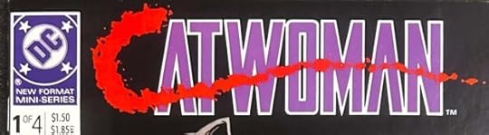 Image © DC Comics
Catwoman. Client: DC Comics. Medium: pen and ink. Date: 1988. I don’t have this one in my files either, but I remember working on the bloody C made with drips from an ink bottle topper. Possibly DC art director Keith Wilson was involved in that. The rest is standard block letters. Appeared on four issues.
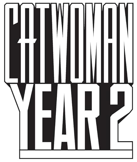 Image © DC Comics
Catwoman Year 2. Client: DC Comics. Medium: digital. Date: 1996. This is the way to do a very tall logo, have the designer plan it that way from the start. It appeared on issues 38-40 of the ongoing Catwoman series of the time, with issue 39 having a variant where YEAR and 2 were stacked. I used one of my title fonts.
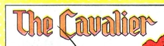 Image © DC Comics
The Cavalier. Client: DC Comics. Medium: pen and ink or marker. Date: 1985. Appeared in Who’s Who #4, I used a somewhat Old English style, or as I’d call it “Old English Light.”
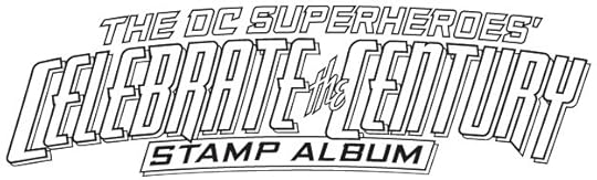 Image © DC Comics
(The DC Superheroes’) Celebrate the Century Stamp Album. Client: DC Comics. Medium: digital. Date: 1998. Stamp collecting was a hobby I enjoyed at the time, so it was fun being part of this collaboration between DC and the US Postal Service. Unfortunately, they didn’t use this logo. The design was changed to make SUPER HEROES by far the largest words, and it was done by someone else.
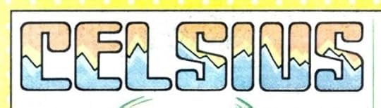 Image © DC Comics
Celsius. Client: DC Comics. Medium: pen and ink or marker. Date: 1985. Another for Who’s Who #4, not a bad idea and design, I’d say.
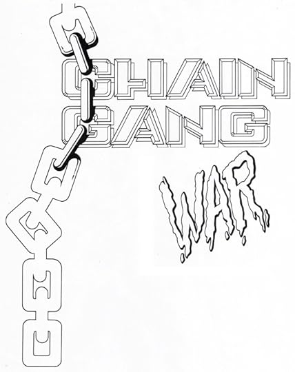 Image © DC Comics
Chain Gang War. Client: DC Comics. Medium: pen and ink. Date: 1993. This was done over a layout by someone else, perhaps cover penciller Dave Johnson. WAR was separated so it could be placed wherever they wanted it, which was over the end of GANG. Appeared on twelve issues.
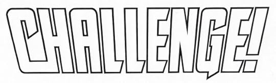 image © DC Comics
(DC) Challenge. Client: DC Comics. Medium: pen and ink. Date: 1984. Positioned on covers so that the DC symbol was just under the edge of the C, allowing it to read as part of the name. Appeared on twelve issues.
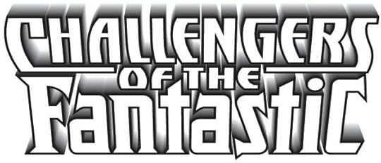 Image © Marvel and DC Comics
Challengers of the Fantastic. Client: Amalgam Comics (Marvel and DC Comics). Medium: digital. Date: 1996. Combines my recently designed Challengers of the Unknown logo (see below) with the Fantastic Four logo I had done for Marvel licensing (Toy Biz) in 1994. The fadeaway telescoping was another of the KPT Vector Effects add-ons to Adobe Illustrator, and I thought it was cool. The only problem was it ended in white, which did not always look good on the cover art. On this one-shot they made it all a solid color.
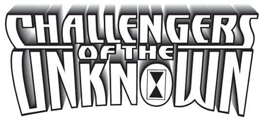 Image © DC Comics
Challengers of the Unknown. Client: DC Comics. Medium: digital. Date: 1996. The same idea as above, but with UNKNOWN in a slight arc, and having a sand dial symbol in the O. This used my title font derived from the logo for The Adventures of Cyclops and Phoenix of 1993. Appeared on sixteen issues.
Posts in this series are listed on the Logo Links page of my blog.
The post My Logos A-Z: CAPTAIN ATOM to CHALLENGERS appeared first on Todd's Blog.
November 19, 2025
Rereading: WHERE THERE’S A WILL… by M. E. Atkinson
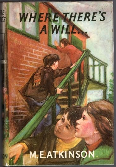 Illustrated by Wendy Marchant
Atkinson’s final novel for young readers is connected to the previous one, “Horseshoes and Handlebars,” by three characters: sisters Guin and Margaret and young boy Michael, here with his older brother Digby. Otherwise it’s quite different.
The children have been invited to stay at a large country home, Weylands, with Guin and Margaret’s mother and an elderly housekeeper, Mrs. Adamson. Guin and Margaret’s father is recuperating from an illness he caught in India in a nearby hospital, but is able to get out to join them for the upcoming Christmas holidays.
As the group learns more about the house, it turns out it was owned by an elderly woman who died, but no will could be found, so her property went to the nearest relative in Australia. This left her companion and caretaker without a job or any money from the estate, which she had been expecting. The group makes it their project to find the missing will, which they think must have been hidden somewhere in the house. All kinds of adventures follow.
Not a bad story, but far from the author’s best work, which I feel was in her earliest few books. Still, worth a read and recommended.
The post Rereading: WHERE THERE’S A WILL… by M. E. Atkinson appeared first on Todd's Blog.
November 18, 2025
My Logos A-Z: BRAVE to CAPTAIN AMERICA
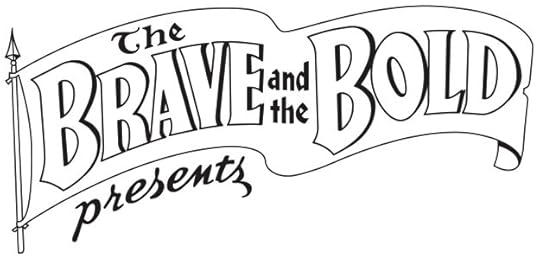 Image © DC Comics
The Brave and the Bold (recreation). Client: DC Comics. medium: digital. Date: 2001. My tracing in Adobe Illustrator of Ira Schnapp’s classic logo, appeared on THE BRAVE AND THE BOLD ANNUAL #1 1969, but of course actually first issued in 2001. I liked doing these when asked, it was a way to closely study the work of Schnapp and other early designers.
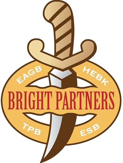 Image © Bright Partners
Bright Partners. Client: Holly Kavanagh. Medium: digital. Date: 2015. Around the same time I did the Angry Babies logo for Terry Kavanagh, I did this for his wife Holly. I don’t know where it was used, or what it’s about.
The Broken Sword. Client: Fantagraphics. Medium: pen and ink. Date: 1983. I have no copy of this, and I find none online, so I’m guessing it was never used. The Broken Sword was the title of a fantasy novel by Poul Anderson, possibly a comics adaptation was planned.
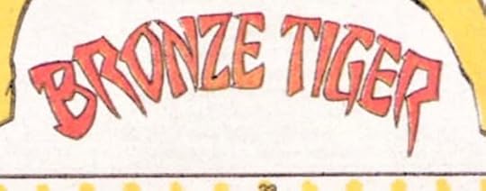 Image © DC Comics
Bronze Tiger. Client: DC Comics. Medium: pen and ink or marker. Date: 1984. For issue #3 of Who’s Who, I used the faux Chinese style that was common at the time for any oriental character, but is now frowned upon by the Asian community. At least, it has elements of that along with my pointy style.
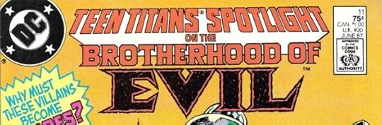 Image © DC Comics
The Brotherhood of Evil. Client: DC Comics. Medium: pen and ink. Date: 1987. Commissioned for TEEN TITANS SPOTLIGHT #11, above. Pointy rough letters with black inner shapes for Evil.
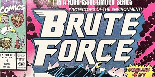 Image © Marvel
Brute Force. Client: Marvel. Medium: pen and ink. Date: 1990. This looks like a cool comic, though I never saw it. I had fun adding bird and animal elements to the B and C. One of those designs I didn’t get a copy of before I sent it off. I didn’t have my own copier until about 1992, and of course with digital logos, I can always get an image from my files if I have it (I don’t always). A little more on this is HERE.
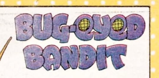 Image © DC Comics
Bug-Eyed Bandit. Client: DC Comics. Medium: pen and ink or marker. Date: 1984. From Who’s Who #3, I wasn’t familiar with this 1960s character, but the eye design was an obvious choice.
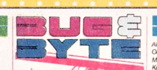 Image © DC Comics
Bug & Byte. Client: DC Comics. Medium: pen and ink or marker. Date: 1984. Another one for the same issue. Not as interesting or as much fun, though I kind of like the odd B shapes.
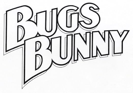 Image © DC Comics
Bugs Bunny. Client: DC Comics. Medium: pen and ink. Date: 1990. When DC started doing comics with Warner Bros. cartoon characters, they wanted fresh logos. Bugs had appeared for decades in comics from Dell/Western, this was a different, almost a super heroic approach. Appeared on three issues.
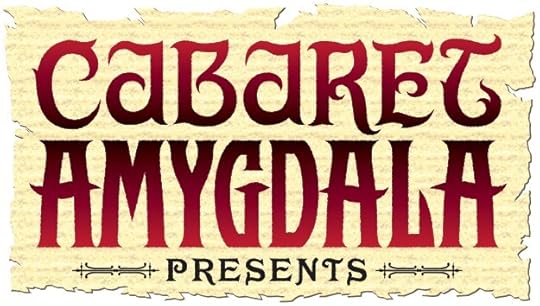 Image © Electricomics
Cabaret Amygdala. Client: Electricomics. Medium: digital. Date: 2014. Another feature created by Alan Moore and produced by Leah Moore for the Electricomics app that seems to no longer be around. I think this was created from sketches, except PRESENTS, which is a commercial font.
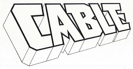 Image © Marvel
Cable. Client: Marvel. Medium: pen and ink. Date: 1992. Blocky, with perspective and telescoping similar to the classic X-Men logo by Jim Steranko from the 1960s. A little pointy in the A and E. Appeared on 95 issues and an annual as well as other places, including a modified version on CABLE AND DEADPOOL. More on this HERE.
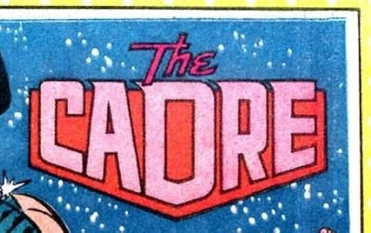 Image © DC Comics
The Cadre. Client: DC Comics. Medium: pen and ink or marker. Date: 1985. For Who’s Who #4. The background shape holds this one together nicely.
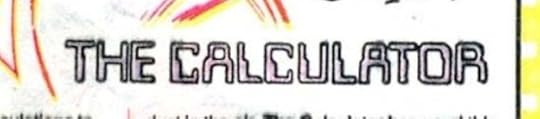 Image © DC Comics
The Calculator. Client: DC Comics. Medium: pen and ink or marker. Date: 1985. Another one, and I used the letters seen on some checks and other bank documents, which at the time seemed modern, and now seems old-fashioned.
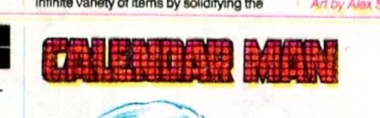 Image © DC Comics
Calendar Man. Client: DC Comics. Medium: pen and ink or marker. Date: 1985. And another one, an awful logo that also reproduced badly. What was I thinking? I probably did all three of these in an evening at home, and by this one was exhausted and out of good ideas.
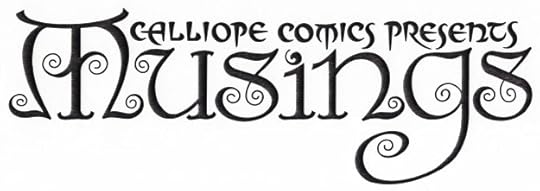 Image © Steve Tice
Calliope Comics Presents Musings. Client: Steve Tice. Medium: pen and ink. Date: 1992. My favorite small press logo, done for a fanzine with a focus, at least initially, on The Sandman. I couldn’t get in any more curly ends. They were inspired by the art of Frank C. Papé on books by James Branch Cabell. More HERE.
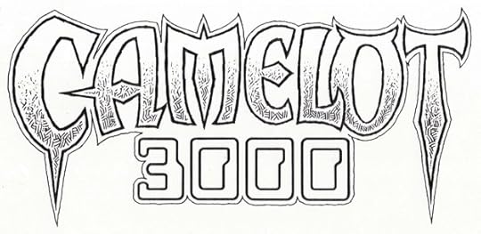 Image © DC Comics
Camelot 3000. Client: DC Comics. Medium: pen and ink. Date: 1982. Something about this combination worked, even with those bank check numbers for 3000. The top line uses shapes that suggest Celtic or Norse alphabets with lots of points, and the inner texture is something I enjoyed using when I could, copied from science fiction/fantasy illustrators like Virgil Finlay and Stephen Fabian. Appeared on twelve issues.
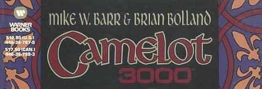 Image © DC Comics
Camelot 3000. Client: DC Comics. Medium: pen and ink. Date: 1987. I don’t have this in my files, but the cover above seems like the right date. I can’t say I remember doing it either, so I may have worked over a layout from someone else, or possibly what I did wasn’t used.
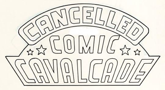 Image © DC Comics
Cancelled Comics Cavalcade. Client: DC Comics. Medium: pen and ink. Date: 1978. One of my earliest DC logos, I think I did it for editor Mike Gold in exchange for a copy of this very limited photocopy print run collection made to secure copyrights on material that was cancelled by the DC Implosion. It uses the 1940s logo from the All-American division of DC Comics, designer unknown, with my new top line. It appeared on two thick issues of photocopies, one set went to the copyright office in Washington, DC, the others were given to DC staffers and freelancers who had work in them or that Gold felt should have copies. I made a pretty good decision, I sold my copy for $1,200 in 1989 to help raise a deposit for the house I’m still living in. Probably the most I ever received for a logo design, though it took eleven years to get it.
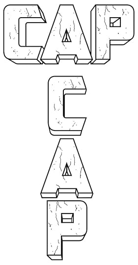 Image © Marvel
Cap (Universe X). Client: Marvel. Medium: digital. Date: 2000. Digitally inked from pencils by Alex Ross. I’m not sure if the distress marks were in his design or if I added them. The vertical and horizontal versions were both used on different cover variants. Appeared on one issue.
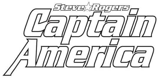 Image © Marvel
(Steve Rogers) Captain America. Client: Marvel. Medium: digital. Date: 1995. I was still learning to design in Adobe Illustrator, and I used the commercial font Serpentine Bold with modifications to the C and A. My design included Cap’s shield, as seen on the first few appearances, but I don’t have a copy of that version. Appeared on twelve issues beginning with #444. More on it HERE.
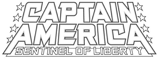 Image © Marvel
Captain America: Sentinel of Liberty. Client: Marvel. Medium: digital. Date: 1998. Here I used one of my title fonts. The title is too long, but having the hero’s name large allows it to work fine. Slightly similar to the Joe Simon logo on the first issue of CAPTAIN AMERICA COMICS from 1941. Appeared on twelve issues. More HERE.
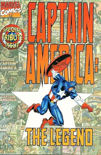 Image © Marvel
Captain America The Legend. Client: Marvel. Medium: digital. Date: 1996. Around this time, Marvel editors were also exploring digital cover design, and they had a thing for very tall logos, but instead of asking the designer to make a tall version that was proportionally correct, they stretched what they had in a way that I hated. Other travesties can be found from the time. This also uses one of my title fonts. Appeared on one issue.
Posts in this series are listed on the Logo Links page of my blog.
The post My Logos A-Z: BRAVE to CAPTAIN AMERICA appeared first on Todd's Blog.
November 16, 2025
My Music: HOW LONG?
 Ellen and I in Costa Rica, 2003
Life with Ellen was busy and happy, so I didn’t write any songs for a long time, but in 2002 she went for an extended visit with her mother about an hour and a half away to help with some health issues. I’m not sure how long she was gone, at least a few weeks. At the time I was working on gathering old songs and recording a few new ones for a CD to give to family and friends, and I wrote this song to a standard blues progression, tongue in cheek, but based on real feelings of missing her. How Long?
It was recorded soon after I wrote it, and it’s all me except the digital drum track: vocal, guitars and harmonica. This is the song I played in June 2025 at an open mic at the Old Songs Festival. Almost done with these, last one next week.
How Long? is © Todd Klein, all rights reserved.
The post My Music: HOW LONG? appeared first on Todd's Blog.
November 14, 2025
My Logos A-Z: BIZARRO to BRAIN STORM
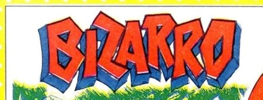 Image © DC Comics
Bizarro. Client: DC Comics. Medium: pen and ink or marker. Date: 1984. By the second issue of the original Who’s Who, the Definitive Directory of the DC Universe, I was set in a routine of creating quick, generally simple logos that we didn’t have. Where possible we pulled logos from the files or cover lettering, but as we didn’t have an organized stock of saved cover lettering (the collection of cover lettering mostly by Gaspar Saladino was done the following year), or an easy way to browse through past covers as the internet provides today, that was a limited option. Nothing great about this logo, which appeared in issue #2.
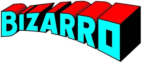 Image © DC Comics.
Bizarro. Client: DC Comics. Medium: digital. Date: 2015. The idea was for this logo to be the opposite of the classic Superman logo. To get there, I made a copy of that logo flipped left to right, and worked over it. That succeeded, but there was something missing. I decided to make the final O a cube, like the Bizarro World, and everyone liked it. More HERE. Appeared on six issues.
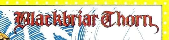 Image © DC Comics
Blackbriar Thorn. Client: DC Comics. Medium: pen and ink or marker. Date: 1984. Another one from Who’s Who #2, using an Old English style.
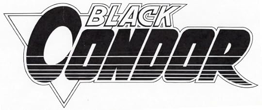 image © DC Comics.
Black Condor. Client: DC Comics. Medium: pen and ink. Date: 1991. Rags Morales, the co-creator of this version of the character, and artist of the series, has said he designed this logo. I have two marker sketches in my files, one is exactly like this, but possibly I used what Morales did as my guide. I’m happy to share credit, though I was paid for the final logo. It appeared on twelve issues.
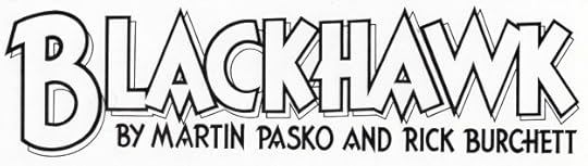 Image © DC Comics
Blackhawk. Client: DC Comics. Medium: pen and ink. Date: 1988. This one is confusing, even to me. Howard Chaykin wrote and drew a three-issue Blackhawk miniseries in 1988. The logo on that is by Ken Bruzenak, who also did the cover and interior lettering. When a new monthly series began in 1989, Chaykin was not involved, but DC apparently wanted to visually tie the look and logo to his series. I was asked to do this logo in Ken’s style, but I made a few changes, like the larger B and the open drop shadow, as well as the credit line in the same style. Why they didn’t have Bruzenak do it I don’t know. The book ran 16 issues.
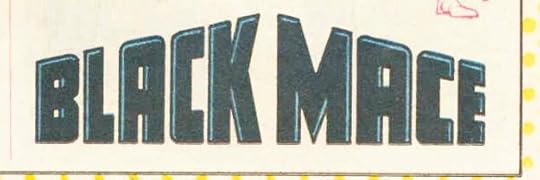 Image © DC Comics
Black Mace. Client: DC Comics. Medium: pen and ink or marker. Date: 1987. Appeared in Who’s Who Update #1. Simple, but the implied three dimensional angles are interesting.
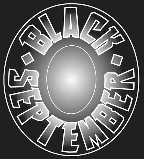 Image © Marvel
Black September. Client: Malibu Comics. Medium: digital. Date: 1995. This was a crossover event symbol that ran large on a single issue and I think also on a number of other titles. Malibu added an infinity symbol in the center oval. The type is one of my title fonts.
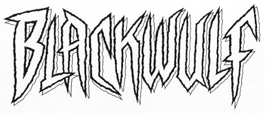 Image © Marvel
Blackwulf. Client: Marvel. Medium: pen and ink. Date: 1994. Part of the Marvel boom in new titles of the time, fits the “sharp and pointy” style, and is also rough and energetic. The letter shapes are somewhat similar to the new Spider-Man I did for them around that time. Appeared on ten issues. A little more on this HERE.
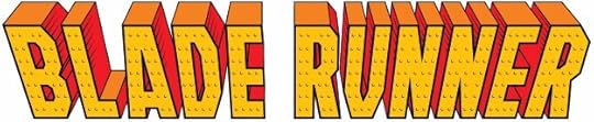 Image © Entertainment Weekly
Blade Runner. Client: Entertainment Weekly. Medium: digital. Date: 2016. I think you had to read the articles in this Comic-Con Preview issue to know why the logo styles were chosen, like this one in the style of Marvel’s Iron Man. It makes little sense on its own.
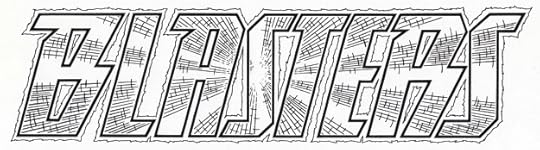 Image © DC Comics
Blasters. Client: DC Comics. Medium: pen and ink. Date: 1988. I enjoyed doing the radiating texture in this one, it adds depth and lots of energy. Appeared on the BLASTERS SPECIAL one-shot.
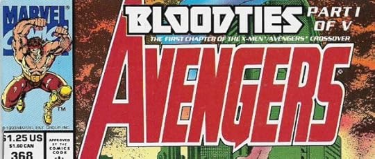 Image © Marvel
Bloodties. Client: Marvel. Medium: pen and ink. Date: 1993. During the late 1980s and 1990s, story arcs running on multiple issues were a thing. Usually I considered them cover lettering, and billed it as that, but occasionally it was commissioned and paid like a logo, as this was, and the Black September one above. The main title was done once, like a logo, and used with type defining which part it was, as seen here. Appeared on five issues, obviously.
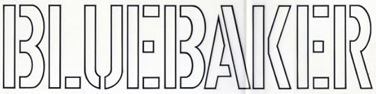 Image © unknown
Bluebaker. Client: Ross Andru. Medium: pen and ink. Date: 1984. This was a project that Ross was working on privately that he planned to sell to DC, but it didn’t go far. I think I designed the logo directly for him, and he paid me for it. If he did any pages, I never saw them. Ross had been on staff at DC for a while, but was freelancing for them at this time, and I always enjoyed talking to him. The letters are standard stencil style, I think it was a military book of some kind.
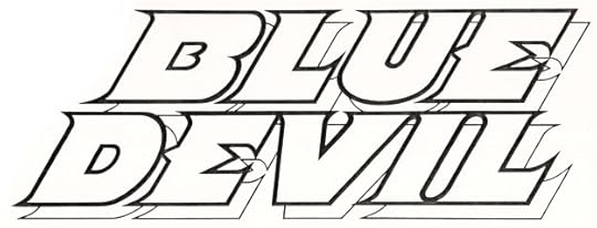 Image © DC Comics
Blue Devil. Client: DC Comics. Medium: pen and ink. Date: 1983. Another logo I like, the character looked like a devil, but his personality was not that at all, leading to sometimes funny situations. So, I tried to make it devilish in an appealing way rather than a scary one. Appeared on 31 issues and an annual, and probably other places.
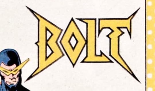 Image © DC Comics
Bolt. Client: DC Comics. Medium: pen and ink or marker. Date: 1984. I had room on this entry in Who’s Who #3 to make a more interesting logo, and I like the zig-zag in the T.
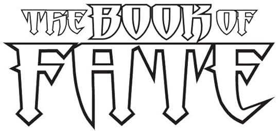 Image © DC Comics
The Book of Fate. Client: DC Comics. Medium: digital. Date: 1996. This continued from the FATE series just previous, but I used one of my title fonts to create a different style for that word and the rest of this logo. Pointy and dangerous. Appeared on twelve issues.
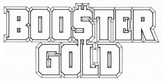 Image © DC Comics.
Booster Gold. Client: DC Comics. Medium: pen and ink. Date: 1985. I don’t recall if creator Dan Jurgens provided any ideas for this, but he probably did. The dollar sign for the S is something I might not have thought of myself. The bevels add depth when they aren’t overwhelmed by heavy colors. Appeared on 25 issues.
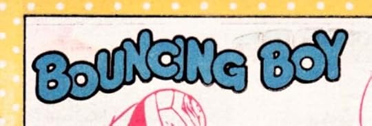 Image © DC Comics
Bouncing Boy. Client: DC Comics. Medium: pen and ink or marker. Date: 1984. The name may be corny, but it sure is easy to design a logo for. Appeared in Who’s Who #3.
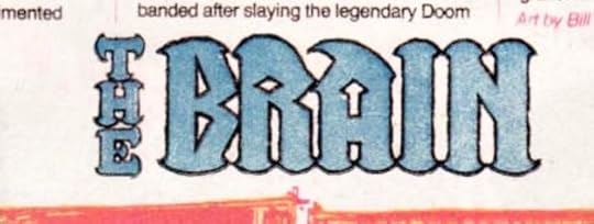 Image © DC Comics
The Brain. Client: DC Comics. Medium: pen and ink or marker. Date: 1984. Another one for the same issue with interesting shapes. I might have been thinking of Brainiac, see below.
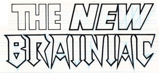 Image © DC Comics.
Brainiac (The New). Client: DC Comics. Medium: pen and ink. Date: 1983. This was created along with a similar “The New Luthor” for ACTION COMICS #544, where they appeared on pinups of the characters. This shows I was already into pointy and dangerous for certain kinds of villains. A little more on this is HERE.
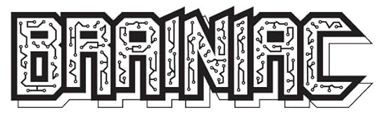 Image © DC Comics
Brainiac. Client: DC Comics. Medium: digital. Date: 1996. Created for DC’s Licensing department, I don’t know where or if it was used. The circuit design looks old fashioned now, but it took a lot of time to do it.
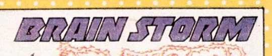 Image © DC Comics
Brain Storm. Client: DC Comics. Medium: pen and ink or marker. Date: 1984. Another for Who’s Who #3, not very interesting or original, but it fit the space well.
Posts in this series are listed on the Logo Links page of my blog.
The post My Logos A-Z: BIZARRO to BRAIN STORM appeared first on Todd's Blog.
November 12, 2025
Rereading: THE FIVE OF US—AND MADELINE by E. Nesbit
 Illustrations by Nora S. Unwin
The last book by Nesbit, published in 1925, the year after her death. It’s similar to her books about the Bastable family, in that the oldest child, Clifford, is the narrator of the family’s adventures. They are entertaining adventures in several locations, as the family’s fortunes change from rich to poor and back to sort of rich again. As with all Nesbit’s children, these are quite realistic and believable, and their escapades arise out of boredom or trying to right a wrong, or escaping from adult authority. Madeline is a cousin who arrives several chapters in, and at first she and the family don’t get on well, but gradually they learn to work together. The stories include burglary (to get some things that should not have been sold or given away), finding lost treasure, trying to stop burglars, camping in an abandoned house, and accidentally falling into a large cave. One chapter has a little fantasy in that Clifford has a dream in which he turns into a worm, and after the end of the main book, there’s a reprint of one of Nesbit’s dragon stories from many years earlier, but mostly this is non-magic. Still well written and fun to read.
Recommended.
The post Rereading: THE FIVE OF US—AND MADELINE by E. Nesbit appeared first on Todd's Blog.
November 11, 2025
My Logos A-Z: BATMAN to BISHOP
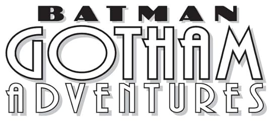 Image © DC Comics.
Batman Gotham Adventures. Client: DC Comics. Medium: digital. Date: 1998. Made from two commercial fonts with art deco style. Appeared on 17 issues.
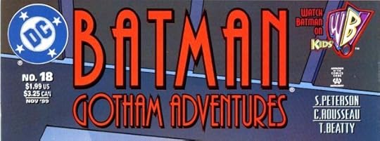 Image © DC Comics
Batman Gotham Adventures. Client: DC Comics. Medium: digital. Date: 1999. With this issue, a version was requested that pushed BATMAN to prominence. I used the same commercial art deco font for that as for the bottom line. Even with digital logos, where I should have images in my files, I sometimes can’t find them or no longer have them, as here. Seen on 24 issues.
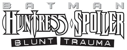 Image © DC Comics
Batman Huntress Spoiler: Blunt Trauma. Client: DC Comics. Medium: digital. Date: 1997. Team up books like this can be difficult because you’re forced to combine styles that don’t go together, as here. BATMAN is from his then current series, not by me, I don’t know who designed this 1994 Huntress logo. Spoiler is from a modified title font of my own. The subtitle is a commercial font that looks like it was made with a label maker. Kind of a mess, but what else can you do? Appeared on a single issue.
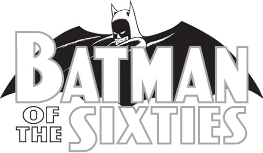 Image © DC Comics
Batman of the Sixties. Client: DC Comics. Medium: digital. Date: 1999. This hardcover and paperback collection came out with a slight title change to Batman IN the Sixties, and a logo by someone else, but I was paid for this. I digitally recreated the Batman logo of the time with its Ira Schnapp letters, and then did the rest in the same style. They might have used my bat shape.
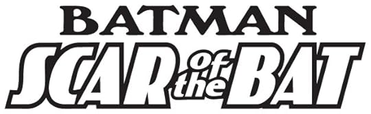 Image © DC Comics
Batman Scar of the Bat. Client: DC Comics. Medium: digital. Date: 1995. Another art deco commercial font for the main title, and a different font for Batman. I like the way SCAR and BAT stand out. Appeared on a single 52-page graphic novel.
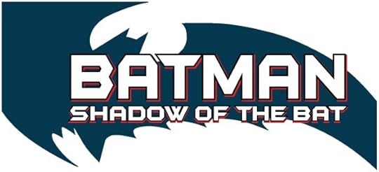 Image © DC Comics
Batman Shadow of the Bat. Client: DC Comics. Medium: digital. Date: 1996. Uses the bat shape I did from Frank Miller’s thumbnail sketch first seen on Batman Year One, BATMAN is in the style then being used on his own book, I added the second line in the same style. Appeared on 44 issues I think, sometimes with no bat shape, sometimes with a different one.
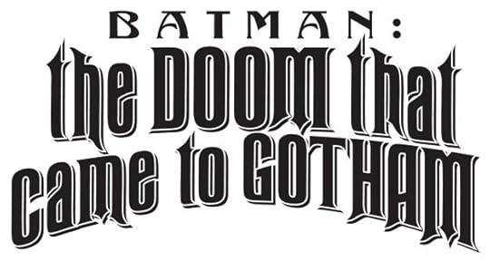 Image © DC Comics
Batman: the DOOM that came to Gotham. Client: DC Comics. Medium: digital. Date: 2000. This used two commercial fonts with a Victorian flavor. Dover Publications put out some fine ones in a book with a CD of the font files. Appeared on three issues.
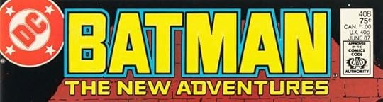 Image © DC Comics
Batman The New Adventures. Client: DC Comics. Medium: pen and ink. Date: 1986. Uses the Batman I designed for Batman Year One with a slightly heavier outline, and was on the issues following that four issue series within the regular Batman title. I added THE NEW ADVENTURES in a similar style. Appeared on nine issues, and this Batman alone appeared on five issues.
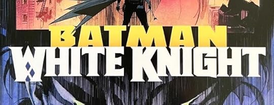 Image © DC Comics
Batman White Knight. Client: DC Comics. Medium: digital. Date: 2017. The first White Knight series and logo, which I think works best in color on the cover. Each line uses one of my title fonts as the starting point. Appeared on eight issues.
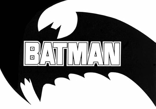 Image © DC Comics
Batman (for Year One). Client: DC Comics. Medium: pen and ink. Date: 1986. One of my most popular logos I think, and mostly due to the bat shape, which began as a tiny thumbnail sketch by Frank Miller. More HERE. The Batman letters were much like what had come before, but less tall to fit better in the shape. Quite an easy and fun design job. The bat shape was used on other logos by me and other designers. Appeared on four issues of Batman, #404-407.
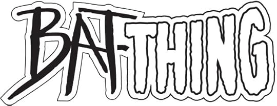 Image © Marvel and DC Comics
Bat-Thing. Client: Amalgam Comics (Marvel and DC). Medium: digital. Date: 1996. Combination of a then-current Man-Bat logo at DC and the classic Man-Thing logo at Marvel by Gaspar Saladino, I don’t know who designed the other one. Used on one issue.
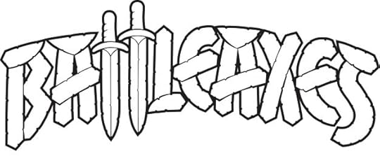 Image © DC Comics
Battleaxes. Client: Vertigo/DC Comics. Medium: digital. Date: 2000. This began with elaborate marker sketches, more HERE. The version that appeared had some minor design changes not by me, and heavy photoshop textures, but I thought it worked fine. Appeared on four issues.
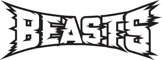 Image © Marvel
Beasts (Universe X). Client: Marvel. Medium: digital. Date: 2001. I think all the Universe X logos through three series and many one-shots were pencilled by Alex Ross and digitally inked and/or finished by me, this is one of those. I like the feeling of wide-screen surrounding motion created by the burst points. Used on one issue.
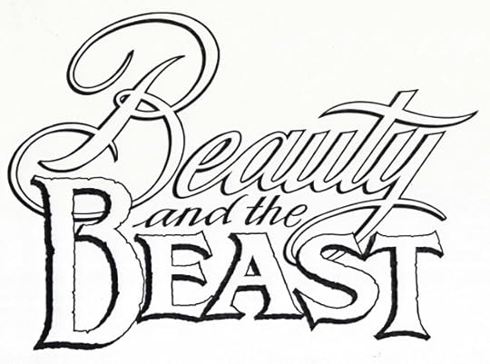 Image © Disney
Beauty and the Beast. Client: Disney Comics. Medium: pen and ink. Date: 1992. I don’t recall getting any direction for this logo, I went for contrasting styles that I thought played well with each other. It appeared on two issues of DISNEY’S NEW ADVENTURES OF BEAUTY AND THE BEAST.
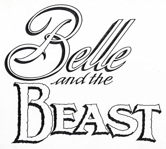 Image © Disney
Belle and the Beast. Client: Disney Comics. Medium: pen and ink. Date: 1992. They also asked for this version, but I don’t think it was used.
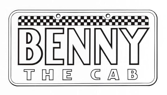 Image © Disney
Benny the Cab. Client: Disney Comics. Medium: pen and ink. Date: 1990. One of the character logos I did for Roger Rabbit’s Toontown. It first appeared in the second issue. I enjoyed researching and imitating a cab license plate.
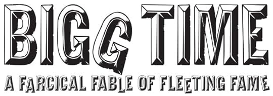 Image © DC Comics
Bigg Time. Client: DC Comics. Medium: digital. Date: 2002. This used a commercial font that would look like letters on a movie marquee, and then I distressed them and gave them uneven alignment. Appeared on a graphic novel by Ty Templeton.
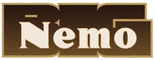 Image © Electricomics
Big Nemo. Client: Electricomics. Medium: digital. Date: 2014. One of several feature logos for this company created by Alan Moore and his daughter Leah that did online comics for a new app. I never saw the app, and it doesn’t seem to be around anymore, but I enjoyed working on the logos.
 Image © Anina Bennett and Paul Guinan
BigRedHair.com. Client: Anina Bennett and Paul Guinan. Medium: digital. Date: 2016. Website logo for the creator-own projects of Anina and Paul. The name came from Anina’s own hair. It uses two commercial fonts. It’s still active HERE.
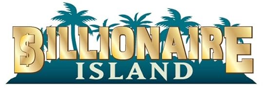 Image © Ahoy Comics
Billionaire Island. Client: Ahoy Comics. Medium: digital. Date: 2019. This uses a commercial font to which I added the dollar sign and metallic shine. I think I copied the palm tree silhouettes from a photo I found online, and Island is another commercial font. Appeared on two six-issue series.
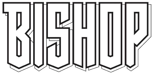 Image © Marvel
Bishop. Client: Marvel. Medium: pen and ink. Date: 1994. The comics market was booming at the time, and I was getting lots of logo work from Marvel. A little more on this one is HERE. Not as pointy as some I did for them, but certainly angular. I like the sloped shapes along the bottom. Used on a four-issue series and two later series, somewhat modified.
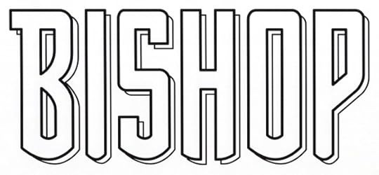 Image © Marvel
Bishop (Flashback). Client: Marvel. Medium: digital. Date: 1997. One of several logos I did for Marvel under a Flashback banner, Justin Copp found it on WHAT IF…? -1. Softening all the angles gave it a Sam Rosen feel.
Posts in this series are listed on the Logo Links page of my blog.
The post My Logos A-Z: BATMAN to BISHOP appeared first on Todd's Blog.
Todd Klein's Blog

- Todd Klein's profile
- 28 followers

